
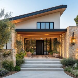
A pergola can feel like a simple shade frame, or it can feel like an actual outdoor room. The difference almost never comes from adding more furniture or throwing in extra decor.
Nice-looking spaces usually do the opposite: they keep the ground plane calm, keep the objects edited, and let the overhead frame set the mood. When a pergola is treated like an interior ceiling, everything underneath starts to behave like an interior composition.
Seating looks more intentional. Walkways feel organized.
Even a very neutral palette feels rich because the ceiling is giving you rhythm, shadow, and a sense of scale. What follows is a visual-and-styling guide to making pergola spaces look modern, finished, and high-end: timber hammock corridors, crisp white courtyard pergolas, steel rooftop rooms, dusk terraces with glowing frames, outdoor kitchens that look like indoor millwork, and poolside lounges where fire and water stay slim and graphic.

Overhead first, then everything underneath stays calm
Modern pergola design can do the hardest visual work in the entire outdoor space. Once the top plane has a clear rhythm—deep beams, tight slats, adjustable louvers, translucent panels, or a vine canopy—everything below can stay quiet without looking empty.

The ceiling effect: why depth and spacing matter visually
A flat pergola with thin members can feel like a temporary garden feature. A pergola with beam depth and consistent spacing starts to feel like a ceiling.
Examples:
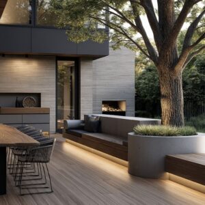
- Heavy timber corridors where thick posts and warm beams create a long shaded passage. The slat grid filters sun into thin stripes, turning the floor into a moving graphic. Hammocks, pale pavers, and a few lanterns suddenly feel like a designed destination because the overhead rhythm frames it all.
- Dark steel grids where the pergola reads like an outdoor ceiling outline. Even when the roof stays open to the sky, the thickness of the lines creates a strong room boundary. This is especially effective on rooftops, where you need a sense of enclosure without tall walls.
- White beam grids in courtyard settings, where sunlight turns the pergola into a soft checkerboard of shade on pale stone. Because the structure is bright, the entire space stays sun-washed and crisp, and the shadows become gentle patterning rather than harsh contrast.
- Glass or translucent roof panels on city terraces, where the sky remains visible but glare is softened. In the evening, warm bulbs or discreet ceiling points reflect subtly in the roof surface, multiplying the glow without adding clutter.
Two ceiling tones
A high-end looking move is to use a darker outer frame and a warmer inner ceiling note—so the pergola feels like it belongs to the house rather than sitting in front of it.

A dark pergola frame can be paired with a warm wood soffit band or wood infill. The wood isn’t there to decorate.
It’s there to correct the temperature of the scene so charcoal beams don’t feel severe. It also creates a familiar indoor cue: warm overhead material above a seating group makes people instinctively read it as a room.
Even when the furniture palette is pale and restrained, that warmth above your head gives the whole setup a welcoming center.

Let shadow do the decorating
One of the cleanest modern looks comes from using shade pattern as the main surface interest. Slats and beam depth create bands of light that travel over the day, and those moving stripes do a surprising amount of work:
- They add texture to pale paving without changing the paving.
- They give plain cushions contrast without using loud textiles.
- They make a large rug field look layered even if it’s one simple color.
- They create a feeling of softness and motion even when the furniture stays rectilinear and minimal.
How to style for shadow so it looks intentional
Shadow only looks expensive if the surfaces underneath are calm enough to show it clearly.

Floors:
Large-format pale pavers with minimal visual noise are perfect because the shade bands show up cleanly. When you add a thin gravel border or a pebble strip at the edge of a platform, you get a fine-grain texture that contrasts with the big slabs—so the floor looks designed even before furniture arrives.
Textiles:
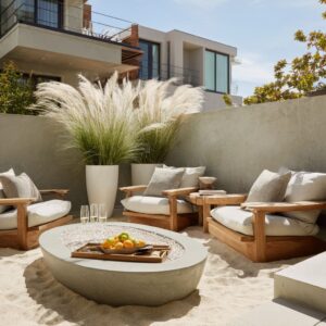
Keep fabrics matte and tonal: creams, oatmeals, sands, soft taupes, light grays. In hammock zones, a tight, structured fabric (not saggy) keeps the shape refined, and it catches the shade pattern beautifully.
In lounge zones, a restrained pillow mix—solids plus one or two subtle weaves—keeps the palette calm while still giving the eye something to land on.

Rugs:
Modern pergola rooms often use a rug like an island boundary. Rugs can be oversized enough that furniture legs sit comfortably on them, which stops the seating from feeling scattered on a hard surface.
A rug that is only a little different from the paving still matters because it changes texture, and texture is what makes neutrals feel rich.
Objects:
If the ceiling is giving you stripes or a checker pattern, you don’t need many tabletop items. A single low bowl with succulents, one vase with simple stems, or one tray moment is usually enough.

Lighting
Modern pergola rooms treat lighting like a system with separate roles. That is why they look warm and intentional after sunset rather than bright and flat.
Think in layers, each with a visual job:
1) Overhead points for practical clarity
This can be small recessed spots tucked between slats, or compact downlights aligned with beam rhythm. The key is restraint.
You want pools of light, not a ceiling full of dots. In outdoor kitchen zones, overhead points make the counters usable without the space turning into a bright stage.
In lounge zones, small points help faces look natural and keep the seating comfortable.
2) Perimeter lines that outline the room
A continuous LED line along the inner edge of the pergola frame is one of the strongest modern moves for evening. It turns the pergola into a floating outline and makes the ceiling legible after dark.
On rooftops, this does something extra: it gives the terrace a clear boundary against the open sky, so the whole space feels grounded and intentional.

3) Low glow for steps, edges, and calm guidance
Refined setups put light close to the ground: near a water edge, tucked by planters, near seating corners, or along a path line. This kind of lighting makes the space feel safe and composed without introducing tall fixtures.
Lanterns do the same job visually. A few oversized lanterns placed near circulation edges can function like outdoor floor lamps, especially when the furniture is low and modern.

4) Background wash to create depth behind seating
This is the layer many outdoor spaces miss. If the background goes dark, the seating looks like it’s floating in a void.
It can be fixed with gentle wall washes and planting highlights:
- A warm line washing a living wall from above so greenery looks lush instead of patchy.
- Subtle uplight into a tree so one vertical element becomes the evening anchor.
- A soft wash grazing textured stone so you get depth without harsh contrast.
When these layers work together, you can keep the furniture palette simple and still get a cinematic night scene: ceiling outline, warm glow on planting, soft light on faces, and one or two portable lantern points for intimacy.

A clear sequence of zones
A pergola room looks modern when the plan is calm. That usually comes from one simple decision: give the space an order.
Instead of treating the patio as one big rectangle filled with objects, strong layouts often follow a sequence:
- lounge first, then dining, then cooking
- or dining centered, with lounge to one side
- or a main social zone plus a quieter secondary zone set slightly apart
Why sequencing feels more expensive than adding more decor
When zones are clear, you don’t need extra partitions, screens, or lots of small furniture pieces. Movement becomes natural, and the whole terrace feels larger because the eye can read it in steps.

You can see this approach in several different styles:
Hammock corridors:
A straight path under a timber pergola with hammocks aligned along the axis. Low platforms at hammock ends replace loose tables and make the hammocks feel built-in.
The result feels like an outdoor nap suite rather than a random set of hammocks.

Formal courtyard symmetry:
Two sofas facing each other create a conversation hall, and a narrow water feature sits in the center like a long coffee table made of reflection. The eye is guided forward, and a deeper lounge at the far end becomes the destination.
The entire plan feels intentional because it’s organized like a ceremonial outdoor room.
Rooftop linear suites:
Lounge at the front, dining centered, and a compact kitchen at the back. Even deck board direction can quietly support this: one direction for circulation, another for the main zone, so you feel zoning without extra objects.
Fire-lounge plus dining split:
A curved modular sofa wraps a long fire table, while dining sits under the same roof language nearby. The space supports social time and meals without the two activities stepping on each other.

Planters as architecture
Planters can behave like low walls, benches, sideboards, and privacy buffers.
The planter moves that keep outdoor rooms looking finished
Planter runs:
Long troughs along a parapet or fence line create a continuous green edge that makes the terrace feel complete. On rooftops, these also act as a guardrail substitute visually—your eye reads a planted boundary instead of an exposed edge.
Planter rings:
A wrapped planter border around a lounge area can create a protected green room effect without building tall screens. When this planting is lit softly from below or washed from above, the greenery becomes the main decorative surface at night.

Raised beds at counter height:
Outdoor kitchens look far more polished when there is greenery at eye level behind the counter. A trough planter directly behind the grill line turns the cooking zone into a composed backdrop rather than a hard wall.
Planter pockets integrated into seating lines:
A built-in bench that includes a planted interruption does something subtle but powerful. It breaks a long cushion run so the seating does not look endless, and it replaces side tables with living material that can handle sun and wind.
Living walls as the outdoor artwork:
A dense vertical garden behind a sectional can do the job that indoor art does: it gives the seating a strong backdrop and provides texture variety so you don’t need many accessories. The lighting matters here: a warm wash from above keeps the wall flattering for people sitting nearby.

Plant shapes that suit modern pergola rooms
Modern outdoor designs tend to use planting like sculpture:
- spiky architectural forms (agave-like shapes) to give structure
- fine grasses for movement and softness
- clipped shrubs for calm mass
- silvery foliage to keep palettes cool and bright
- vines overhead on white pergolas to create filtered green shade without heaviness
- occasional boulders as grounding objects so gardens don’t feel too soft and fluffy

The goal is a planted perimeter that looks intentional year-round, even when flowers are minimal.

Fire and water
Modern outdoor designs often use fire and water as lines rather than bulky objects. A long flame slot or a narrow rill can organize a whole terrace because it gives the eye a clear direction.
Fire as a ribbon, not a bowl
Linear fire features do several things at once:
- They act like a coffee-table center while keeping sightlines open.
- They create a long focal line that matches modern paving grids.
- They make the flame feel crisp against dark media (black stone or lava rock).
- They help a large seating group gather around one shared center without needing extra furniture.
You see this approach in built-in bench patios where a long rectangular fire table becomes the main anchor, and in curved sectional lounges where a long fire block feels architectural rather than decorative. A second fire moment can work too, as long as it stays thin: a narrow fire slot in a backdrop wall adds vertical focus without adding clutter.
It can replace outdoor art entirely.

Water as a reflecting border, not a pool takeover
A narrow water strip beside a pergola lounge can make the terrace feel larger because it adds reflection and movement without dominating the plan. Some of the strongest visuals come from water used as an edge:
- a slim rill running parallel to circulation
- a narrow reflecting strip beside seating
- a pool edge placed close enough to reflect the pergola and evening light
- a shallow step-basin that adds a second reflective plane near the main pool
Water becomes a quiet mirror for the overhead frame, which is why pergola rooms beside water often look so crisp at dusk.

Modern palette formula
A repeated pairing shows up in many strong pergola concepts because it works in almost any setting:
- dark structure (charcoal/black beams, posts, and often cabinetry)
- light ground plane (pale pavers, light stone slabs, calm concrete tones)
- one warm element that is used sparingly but consistently (wood soffit, slatted wood cabinet faces, brass-toned accents, warm lantern glow)
This combination feels intentional because the contrast is clear but not chaotic.

Ways to use the warm note without making the space busy
- A wood band under the pergola edge that sits right above head height.
- Slatted wood cabinet faces on an outdoor kitchen block, paired with dark metal framing.
- Brass-toned furniture bases that lift white cushions slightly off the paving so the seating feels lighter.
- Warm metallic ceiling slats under a pale stone pergola frame for a resort-like glow in daylight.
- A single timber coffee table top or one teak furniture base detail that repeats the overhead warmth.

The trick is repetition. One warm note used in two or three places looks designed.
Ten warm notes look accidental.

Luxury that comes from visual clarity
A modern outdoor room often looks expensive because it stays visually clean over time. The styling choices that support that are mostly about surfaces and editing, not about adding more things.

Visual choices that stay sharp
Large-format paving with minimal visual breaks keeps the space calm and makes furniture feel grounded.
Tight, consistent joints create a cleaner overall texture, which matters when the palette is neutral.
Dark surfaces near cooking zones can look very sleek and also stay visually forgiving.
Raised planters keep greenery at eye level and keep the ground plane clearer.
Drought-tolerant plant mixes look sculptural and intentional rather than lush-but-messy.
Slatted cabinet faces bring warmth and texture while hiding minor marks better than glossy smooth fronts.
Gravel channels and pebble borders add fine texture at edges, making big slabs look more detailed without getting fussy.

Styling restraint that reads as luxury
Fewer objects for a polished look:
- One oversized lantern at the edge of a rug can replace several small decor items.
- One sculptural bowl planter on a coffee table can replace fragile tabletop styling.
- One strong backdrop (hedge wall, living wall, textured stone wash) can replace outdoor art.
- One clear focal line (fire ribbon, water strip) can replace multiple competing features.

When the overhead plane is doing the pattern work through shade rhythm, you can keep accessories minimal and the space still feels layered.

Three main narrative setups
1) The hammock colonnade: an outdoor quiet zone that feels designed, not beachy
Imagine walking into a long pergola corridor where the floor stays pale and calm, and the ceiling casts thin stripes that slide slowly over the day. The posts are thick enough to feel architectural, stained deep so the shadows look rich.
Hammocks sit in a row, each one hung with deliberate spacing so the curves repeat like a pattern rather than a random cluster.

Instead of side tables everywhere, low platforms sit at hammock ends. Lanterns rest on these platforms and near the posts, giving the base of each bay visual weight.
Along the edges, gravel beds hold fine grasses and small sculptural plants that look good up close. The palette stays quiet—cream fabric, warm timber, pale stone—and the shade pattern becomes the main surface detail.
Even before night arrives, you can already sense what evening will feel like: soft lantern glow near the floor and a ceiling rhythm that stays visually calm.

Key styling habits here:
- keep hammock textiles tonal and matte
- use built-in-feeling platforms to avoid clutter
- let grasses and gravel provide texture instead of lots of decor
2) The courtyard salon: symmetry, white structure, and a thin water rectangle
Now shift to a bright courtyard where the pergola is painted white and the beams form a simple grid. The shadows land in a gentle checker pattern, and the whole space feels sun-washed rather than harsh.
Two long sofas face each other, creating a clean conversation hall. Upholstery stays pale, but the bases are warm metallic, which stops the white palette from flattening.

A narrow water rectangle sits in the center, aligned like a long coffee-table zone made of reflection. At the far end, a deeper lounge becomes the destination, backed by dense greenery that gives the seating a strong dark background.
The scene feels formal but still modern because the furniture shapes stay clean and low, and the decor is minimal—no piles of objects, just a few controlled accents.

Key styling habits here:
- use symmetry to make the room feel composed
- add one warm metal note to keep white upholstery intentional
- use a dark green backdrop so pale textiles pop without extra patterns
3) The dusk terrace: a glowing pergola outline, low furniture, and one planted border that does everything
Finally, picture a terrace designed for evening. The pergola roof might be louvered or slatted, but the real magic is a warm perimeter glow tracing the frame.
A few small ceiling points add practical clarity, but the main effect is the outline: the pergola becomes a floating ceiling shape after dark.

Furniture stays low and neutral so the view remains open. A hammock can sit diagonally under the frame to soften the strict geometry without adding extra objects.
Planting gathers at edges and corners, creating a border system that keeps the terrace feeling sheltered while leaving the horizon side open.

If it’s a rooftop, deep planters can wrap the lounge like a green ring. If it’s a backyard terrace, a planted trough can run beside seating or behind an outdoor kitchen to create privacy and depth.
Either way, the plants become the backdrop at night when they are lit gently—enough to show texture, not enough to glare.

Key styling habits here:
- use one continuous perimeter glow plus a few small ceiling points
- let planters do privacy and decor at the same time
- keep floors light and simple so evening light looks clean

A styling checklist
Main points that make the pergola space look modern, finished, and calm:
- Overhead frame has a clear rhythm (deep beams, consistent slats, louvers, vine canopy, or translucent panels).
- Ground plane stays quiet (large calm paving, minimal visual noise).
- Shadow pattern is treated as a surface layer (so cushions and rugs don’t need loud prints).
- Lighting has roles (soft overhead clarity, perimeter outline, low guidance glow, background depth on planting/walls).
- Zones are ordered (lounge, dining, cooking, plus a quieter side zone if you have space).
- Planters act like perimeter furniture (runs, rings, raised beds, living walls).
- Fire and water stay slim (ribbons and strips, not bulky centerpieces).
- Palette is disciplined (dark frame + light ground + one warm note repeated).
- Decor is edited (one tray moment, one bowl planter, a few lanterns, not many small objects).

Closing: the luxury is visual clarity
Pergola space designs don’t win by piling on features. They win by giving your eye a clear order: ceiling rhythm first, calm surfaces underneath, then a few strong elements—plant borders, a thin fire line, a narrow water reflection, and lighting that supports the scene instead of competing with it.
If you set the overhead plane with intention and keep everything else restrained, even a simple palette of pale paving and neutral textiles can feel rich, layered, and undeniably modern.
Disclaimer: This article is shared for visual inspiration and styling ideas only. It focuses on the look and mood of pergola spaces, not construction, safety, or project planning.
Related Posts
Harmony Home Design brings 10+ years of residential interior design experience to the ideas shared here. We publish design concepts, layout thinking, and practical styling notes.