
Minimal kitchens have reached a point where design decisions are less about subtraction and more about clarity. What stands out in the most refined examples isn’t absence—it’s how precisely form, weight, light, and texture are handled.
A kitchen can feel quiet without being flat, and simple without being cold. Blocks of stone appear as if cut from a larger mass.
Wood grain isn’t background—it’s a direction. Even a slightly shifted shelf or offset island becomes part of the visual rhythm.

One of successful ideas for such design is focusing less on showing variety and more on how every surface and object plays its part. Whether framed by garden light or defined by a sharp mitered edge, each kitchen works by holding tension between stillness and structure.
This article breaks down the visual strategies behind that calm—why certain kitchens feel composed before anything is placed on the counter.

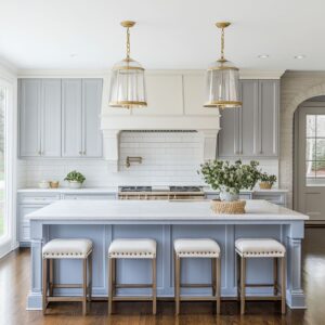
Mass Treated as Sculpture
In kitchens where simplicity is sharpened into clarity, volume becomes the core design move. Instead of breaking up counters, hood lines, or cabinet runs with hardware or segmentation, these spaces treat every major feature like a single formed block.
Islands are wrapped in stone that folds at the corners, turning in on itself with veining that doesn’t pause. Cabinetry aligns with precision so cleanly, the entire run reads more like a sculpted surface than a series of boxes.

Even toe-kicks disappear, replaced by slim shadows or glow lines that lift the monolith ever so slightly from the ground. And there’s no fear in letting the island slide a few inches off axis.
That subtle shift in alignment gives room for sightlines to reach a shelf, a view, or a piece of art—offering a small tilt in the geometry that keeps the room from feeling staged.

Grain Direction as a Silent Guide
Where stone brings weight, wood brings movement—but only if used with control. In the strongest examples of minimal kitchen design, grain isn’t treated like background texture.
It becomes a compositional line.

Horizontal grain pulls the eye from wall to wall, visually widening a space without physically expanding it. In taller kitchens, vertical cuts stretch the room upward, syncing with window frames and full-height cabinetry.
When drawers and doors are cut from a single veneer sequence, the flow becomes uninterrupted. This isn’t styling.
It’s drawing with material. The repetition across minimalist kitchen cabinets does more than look precise—it gives a rhythm to the surface that’s felt even when the room is empty.

Edges that Refuse to Shout
There’s no need to overdraw a line when the material can do it with a shift in shadow. In many modern minimalist kitchen design examples, edges are handled with a kind of quiet sharpness—never rounded for comfort, never heavy for effect.
Instead, they’re micro-eased just enough to catch the light and suggest precision without stiffness.

A marble slab might extend ever so slightly beyond the wood cabinet beneath it, casting a thin dark line that separates the forms with nothing more than a breath of depth. These details don’t ask for attention—they wait to be noticed.
And finishes stay soft, often honed instead of polished, so that reflections stay muted, never interrupting the structure or pulling focus from a window’s view.

Color as Whisper, Not Exclamation
The palette in these kitchens rarely tries to impress. It works instead like a low tone in the background, letting nature or daylight carry the stronger notes.
Most colors fall somewhere between stone, air, and clay—muted lavenders, chalky greens, pale olive, or warm putty—each selected more for how they shift throughout the day than for how they appear under fixed light.

In such rooms, boldness is introduced in ways that barely raise the volume: a blue-green cabinet finish softened by nearby travertine, or a black pendant that anchors an otherwise pale composition. These are minimalist kitchen ideas built not on silence, but on soft contrast—where the calmest tones give just enough presence to hold the space, without ever feeling static.

Outside Framed as Furnishing
In the quietest kitchens, glass is more than a window—it’s part of the composition. Full-height panes stretch from counter to ceiling with no trim, no breaks, and no need for framing.
The outside view—whether it’s a patch of trees, waterline, or garden wall—becomes a direct extension of the materials inside. Reflections play across glossy surfaces, especially in finishes like lacquered doors or polished counters, bringing shifting colors into the space without ever introducing them directly.

Even the placement of windows follows this thinking. A hood might shift slightly to one side, not out of compromise but to let the line of sight reach the best part of the view.
In kitchens that use modern minimalist kitchen cabinets, these moves allow architecture and nature to finish each other’s sentences.

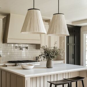
Light Choreography Rather Than Fixture Display
Here, lighting doesn’t perform—it draws. Instead of bold pendants or sculptural forms, the effect comes from placement.
Thin LED channels run under cabinets or shelves, outlining volumes with a quiet glow that makes surfaces feel lifted or cut from shadow. Recessed downlights are arranged in clean grids, often syncing with drawer seams and cabinet widths, so the room feels balanced even before the fixtures are noticed.
In a warm minimalist kitchen, this type of lighting control becomes part of the architecture itself—washing stone with softness, defining edges with clarity, and leaving the rest of the space open for reflection, shadow, or daylight to finish the scene.

Shelves Used Like Gallery Rails
In many minimalist kitchens, shelving doesn’t function as utility—it performs more like composition. Open storage is used with care, almost always in the form of long, uninterrupted planks that stretch wall to wall, lit from behind or below to float just slightly off the surface.

What rests on them is sparse and intentional. A clay pot, a single stem, a set of pale bowls—each chosen for shape rather than usage.
Negative space becomes part of the arrangement, allowing the eye to rest between pieces and giving each item its own presence. This approach works especially well in rooms that already use restraint as a structure.
The shelf doesn’t break the mood—it completes it.

Asymmetry Inside a Grid
Some of the most interesting rooms don’t follow their own structure too tightly. Kitchens built with strong lines and rigid geometry often benefit from a single shift—a hood that’s placed slightly to the left, an island nudged to follow a garden path rather than a ceiling beam.
These subtle adjustments stop the space from feeling too perfect.

Floating shelves installed on just one side of a cook zone, for instance, might balance with a window or open wall on the other side. This kind of asymmetry keeps things from becoming predictable.
It works especially well in minimalist small kitchen ideas, where every inch matters and small visual moves carry more weight. In these spaces, the slight misalignment isn’t a flaw—it’s the part that makes everything else feel considered.

Quiet Historical Echoes
Minimal spaces don’t always start from scratch. Some carry traces of older forms—but handled so lightly, they almost slip past notice.
A gentle curve beneath a plaster hood recalls classical arches, but softened and reduced to fit the surrounding lines. Stone counters might carry an ogee edge, smoothed out just enough to nod at tradition without stepping outside the frame.
Even crown molding can stay, if it’s pared down—no carved profiles, no flourish, just a slim line that holds the architecture in place. In contemporary minimalist kitchen design, these gestures allow past and present to sit together without tension.
They offer texture without decoration, form without flourish.

Furniture That Extends the Cabinet Story
In these kitchens, what’s around the island is never treated as extra. Stools, shelving, even trays carry the same thought as the cabinetry.
Materials repeat—walnut base panels might echo in seat backs, or vertical slats above might reappear in the legs below. Nothing feels selected as an accent; it all feels like part of the structure.
Woven seats or lightly curved frames break the repetition without disturbing the calm.

A low book niche at one end of an island doesn’t add clutter—it adds warmth, hinting at daily life inside the larger grid. That’s where minimalist contemporary kitchen planning really comes through: in the way form, function, and rhythm stretch past the cabinets into everything that touches them.

Material Thickness Signals Intent
The edge of a countertop might look like a detail, but in some kitchens it carries more meaning than color or finish. A thick slab of marble sitting atop deep walnut drawers can feel rooted, almost structural—pulling from the language of built stone or masonry.
That same marble, shaved to a fine edge and wrapped thinly around a lighter island, feels like a skin—precise, minimal, lifted.

These decisions are rarely decorative. They respond to the room’s proportions.
In a space with high ceilings or exposed beams, thick edges ground the weight above. In tighter layouts, thinner profiles help keep the composition airy.
In a modern minimalist kitchen, thickness becomes one of the most controlled tools—less about showing off the material, and more about showing restraint.

Soft Objects as Counterpoint
Even the quietest kitchens make space for something irregular. A pale wall, a clean island, a flat counter—all of it benefits from one or two elements that feel slightly undone.
A bunch of leafy branches in a ceramic vase, a bowl of bread, or a scattering of fruit isn’t styled for perfection. It’s chosen to add movement where everything else is still.
These objects often echo what’s already present: green matching what’s outside the window, wood matching the floor or shelf. In minimalist kitchen cabinet design, these choices don’t disturb the composition—they complete it.
The softness of a cloth, the slight curve of a loaf, the faded spine of a small book—all of it brings back the presence of life without tipping the balance.

Conclusion
The strength of these kitchens lies in how they hold themselves together—not with excess, but with discipline. Every visual move is measured.
A kitchen that feels quiet is rarely simple. It’s built through choices that shape mass, align linework, and allow space to breathe without breaking form.
Islands, hood blocks, and full cabinet walls are treated as complete objects—not constructed bit by bit, but drawn as single forms, wrapped in uninterrupted stone or fine timber. The visual weight is carried by material, not surface decoration.

Grain direction isn’t a background detail. It’s part of the structure.
A horizontal run expands the room outward. A vertical pattern adds height without changing the ceiling.
These decisions create continuity, and that clarity allows other elements—like lighting, objects, or color—to play a quieter role. In these spaces, daylight doesn’t fall on top of design—it completes it.
Soft greens outside, a shift in sky tone, or a canopy of leaves gets mirrored on lacquered doors or faint plaster walls. That’s where color lives.

Light, too, is handled as an extension of structure. Recessed lines and micro points follow cabinetry grids and shelf edges.
The effect isn’t theatrical—it’s grounding. It sharpens shapes and lifts materials with just enough glow to define their place.
And symmetry? It’s allowed to bend.
A centered island might shift slightly to the left if the view calls for it. Shelves might stop early if balance is better that way.
These are not errors—they’re part of the plan.

Texture replaces ornament. It shows up in fluted wood, unfinished plaster, lightly rippled stone.
A surface that reads flat from far away begins to move when viewed up close. Meanwhile, objects are kept few and meaningful—maybe a branch, a bowl, a vase—arranged with breathing space between them.
Their job isn’t to decorate, but to soften. The same goes for thickness.
One room might anchor its stone with a deep edge that holds its ground, while another pares it down to a fine slice so the volume feels lighter.

Even hardware follows this logic. If visible, it speaks the same language as the wood it lives on.
If hidden, it lets the shape lead. And the empty areas—the untouched floor zones, blank wall panels, or clear counter stretches—aren’t voids.
They’re what give the rest of the design its ability to land.

In the most successful examples, every choice respects the material, every element knows its role, and no space is asked to do more than it should. That’s how these kitchens achieve their quiet impact—by turning reduction into richness, and restraint into structure.
Related Posts
Harmony Home Design brings 10+ years of residential interior design experience to the ideas shared here. We publish design concepts, layout thinking, and practical styling notes.