
Framed art can do more than fill blank space. In rooms that feel thoughtfully composed, the placement, lighting, and layering of each piece begins to speak with the rest of the architecture.
Frames align with ceiling beams. A mirror tucked between sketches reflects a line of daylight.
Even a single throw pillow echoes the faded rust from a sketch tucked into the corner of a layout. Nothing feels decorative for decoration’s sake.

What separates these gallery walls from random grids or crowded collages isn’t a matter of style—it’s structure. There’s a quiet rhythm behind how pieces are grouped, how spacing carries weight, and how textures repeat across materials.
A black-and-white print might lean against a shelf where pottery rests just behind it, creating a moving relationship that shifts depending on where one stands. In the best rooms, the gallery wall behaves more like part of the architecture than an afterthought.
This article looks closely at those subtle moves: how small adjustments, tight palettes, and careful alignments help create layered, lived-in displays. The kind that blend in just enough to feel permanent—but hold your attention long after the first glance.

Gallery Walls That Behave Like Architecture
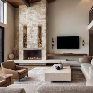
Some picture wall ideas for living rooms go far beyond hanging a few frames—they interact directly with how the walls themselves are constructed. Instead of treating artwork as a separate layer, these designs let the frames fall into alignment with millwork, molding, or structural rhythm.
In some settings, you’ll find art placed precisely on the vertical centerlines of paneled wall sections, creating the impression that the pieces were part of the build from the beginning.

This approach often includes recessed backdrops or wainscoting panels that guide the edges of the frames. Built-in shelving may absorb artwork into its own outlines, producing a seamless field where shelves, frames, and wall divisions move together.
Lighting can be tucked inside the recesses behind each frame, creating a subtle glow that makes even a simple sketch feel sculptural. When every detail aligns this way, the room feels visually balanced before a single piece of furniture is brought in.
The wall acts like a quiet organizer, setting order through layout alone.

Light as a Medium, Not a Utility
In many gallery wall ideas for living rooms, lighting is treated with the same attention as the artwork. But instead of relying on traditional downlights or accent spots, these layouts often use concealed LED sources that emit soft washes of light—hidden behind frames or built into ceiling lines.
This kind of lighting produces ambient depth rather than directional glare, allowing fine lines and delicate textures to appear more dimensional.

The effect is especially noticeable with monochromatic drawings or prints on matte paper. A low glow behind the artwork softens shadows and separates the piece from the wall just enough to feel like it’s floating.
In rooms with pale or stone-toned walls, the lighting carries subtle warmth across the entire composition. These lighting choices work in silence but have a lasting visual presence, giving black and white compositions a lift without adding any new material or pigment.

Textures That Echo Across Planes
In thoughtfully layered spaces, texture often builds invisible links between what’s on the wall and what surrounds it. A gallery wall made of raised reliefs or tactile paper finishes can pick up on a surface treatment just inches away—like the hand-troweled effect of plaster, or the grain of concrete below.
These small repetitions blur the line between the artwork and the space it inhabits. One example might be a room where a series of sculptural wall pieces echo the gritty finish of a cement backdrop, or where the rough lines in a framed photograph mirror the deep grout of a fireplace surround.
A woven textile above the sofa might share its rhythm with the weave of a nearby rug or the stitching in a cushion. These repetitions aren’t loud, but they hold the room together.
They draw attention without needing to stand out.

Minimal Color, Maximum Tonal Logic
In spaces where restraint defines the mood, color doesn’t disappear—it becomes precise. Instead of bold tones, the attention moves to how warmth and coolness play across textures and finishes.
For example, a living room photo wall idea might rely entirely on black-and-white frames lined up against pale wood, with no strong pigment in sight. Yet the addition of one amber cushion or a soft ochre throw quietly shifts the temperature of the room, adding depth without visual noise.

These subtle accents only work because they echo something already present in the art. If a landscape print holds a faded wheat field or a sepia shadow, then a nearby cushion in that same tonal family feels like it belongs.
That quiet alignment makes the entire wall art decor for a living room feel more composed, even if most of it seems achromatic at first glance. This careful control of temperature—matching wood tones, paint finishes, and even fabric nap—ensures the room never feels flat or sterile, even without color leading the conversation.

Micro-Asymmetry Inside Formal Layouts
Grids can create order, but too much perfection can feel stiff. That’s why some rooms introduce the tiniest shifts—barely visible changes that add softness without disturbing the balance.
In a standard 3×3 layout of artwork, everything might appear locked into position, but then one nearby object—a pillow in a bolder hue, a lamp that leans slightly off-center—breaks the uniformity in the most subtle way. These moments of micro-asymmetry are rarely about mistakes.
They’re often intentional, even if they look incidental. A single frame might sit half an inch lower to follow the line of a bench, or one artwork in a grid might carry slightly thicker matting to weight the arrangement visually.
These offsets breathe a sense of humanity into structured layouts and help wall art ideas for living rooms feel grounded rather than staged. The overall impression is one of quiet precision with just enough irregularity to hold interest.

Mirrors as Art and Spatial Amplifiers
In many of today’s layouts, mirrors no longer sit above the fireplace or beside the entry—they step into the role of artwork. When used thoughtfully, reflective surfaces fold the outside world into the composition, adding both light and motion.
A mirror tucked inside a group of sketches, for instance, allows the garden view or window pattern to become part of the wall itself.

What makes this approach so effective is that it works on more than one level. A round mirror might mimic the shape of a nearby table, or reflect an overhead beam, bringing an unseen angle into the mix.
These pieces aren’t used for utility—they hold weight as visual forms. Within the scope of living room wall art decor, mirrors serve as anchors and amplifiers, expanding sight lines and offering quiet complexity to an otherwise flat display.
In smaller rooms, the benefit becomes even more noticeable. A reflective surface can shift how the wall feels—stretching the view without physically changing the space.
Used among drawings, prints, or linework, the mirror becomes less of a furnishing and more of an ingredient in the overall atmosphere.

Depth Through Layering and Overlap
In some living room gallery wall ideas, the visual depth comes not from bold art but from how items are placed. Rather than keeping frames flush against the wall in a flat, expected line, some designs lean pieces slightly forward, allowing them to rest gently in front of shelves or pottery.
This subtle overlap creates a layered surface that shifts as you move past it—almost like a low-relief stage that responds to light and movement.

The effect isn’t loud. It’s a soft motion built through closeness—frames tucked partially in front of stacked books, vessels nudging into the edge of a sketch.
These overlaps are minor, but they reshape how the eye reads the wall: no longer a collection, but a dynamic surface. This works especially well when the palette is tight, allowing texture and placement to become the focus.
It’s a quiet trick used in wall pics for a living room that want to feel curated rather than static.

Subject Matter Mirroring Context
Some lounge wall art ideas take their cues directly from what surrounds them. Instead of choosing random images, the best selections feel like echoes of the space they live in.
A photograph of vertical tree trunks may sit beside an actual wood beam. An abstract of a cliff might match the grain in the stone coffee table nearby.
Even fine marbling in a piece of wall art might reflect the tone or pattern of a floor tile just below.

This repetition—when art draws on the room’s materials, textures, or natural view—creates a grounded, believable connection. It doesn’t feel like the pieces were brought in from somewhere else; instead, they seem to belong.
In many spaces inspired by nature or regional design cues, this approach helps the gallery wall settle comfortably into place. Context shapes content, and that connection keeps the display from feeling like a decorative afterthought.

Furniture as Grounding Coordinates
Frame placement might appear purely aesthetic, but it’s often responding to something more practical: the furniture below. A long, low bench or a deep sectional in rich fabric naturally creates a horizontal line across the room—a kind of visual stop.
Art that respects that line feels anchored. Hang pieces too high, and they float uncomfortably; too low, and they crowd the seatback.
The sweet spot comes from watching how upholstery height, length, and even texture pull the eye.

This approach becomes especially clear in rooms with strong materials—like pale poured concrete, heavy timber, or thick boucle fabric. Each sets a mood and a weight that the artwork must match.
A rigid grid might drop lower to stay near a bench, or a looser cluster might shift slightly to follow a curve in the sofa. These adjustments are so fine they often go unnoticed, but they help the entire wall composition sit right in the room.
Many living room gallery wall ideas gain their balance not from what’s framed, but from how those frames sit in relation to what holds the room together.

Density Versus Breathing Space—A Planned Spectrum
Not every gallery wall fills the space the same way. Some show restraint through sharp spacing and tight editing, while others lean into rich visual complexity with compositions that stretch from edge to edge.
What sets both apart from clutter is how spacing is used with intent. In a quieter setup, like a six-piece grid, what surrounds the frames becomes just as important as what’s inside them.
Airy glass shelving nearby may hold only a few objects, but the negative space helps lighten the wall. On the other end, more layered displays stack works corner to corner—yet still allow for gaps that work like rests in a musical score.
These breathing spaces are rarely symmetrical, but they’re always working. Even the smallest pause between two artworks can shift the whole energy of the display.
It’s this careful tuning—knowing where to hold back and where to fill in—that defines thoughtful living room wall gallery ideas and avoids visual fatigue.

Linking Flat and Three-Dimensional Art
Modern living room wall decoration doesn’t stop at paintings and prints. Many compositions now mix flat imagery with sculptural forms, letting light and shadow play their part.
It’s common to find a grid of framed works alongside clay vessels, plaster fragments, or woven discs—all part of the same visual structure, even if they break out from the wall surface. These combinations work best when tone and texture connect.
A matte black frame might echo a nearby ceramic bowl, or a plaster relief may align with the rough edge of a linen print beside it. Shadows fall differently across dimensional pieces, introducing soft movement throughout the day, especially in rooms with changing natural light.
Rather than separating decor by category, these walls pull in both art and object, creating balance across depth. The eye moves not just left to right, but forward and back—adding an extra layer of engagement to what might otherwise be a flat gallery.

Rhythm Borrowed from Musical Structures
Some layouts avoid rigid rows or spontaneous sprawl and instead follow an internal rhythm, not unlike music. Repetition, pause, tension, and release are all at play in how frames are arranged.
A triptych of ink drawings may mirror a calm opening line, answered by a tighter, twelve-piece grid nearby—two walls in dialogue. Elsewhere, a mix of thin gold discs, stretched frames, and sculpted boxes may follow no obvious pattern but still feel paced.
These arrangements land somewhere between strict geometry and flowing improvisation. That balance, between control and surprise, holds attention without overwhelming it.

This musical sensibility is especially effective when decorating wall above a sofa, where visual rhythm can support the seating layout without clashing. A single large frame might anchor the space like a bassline, while smaller works ripple outward, building momentum.
The difference between static and expressive often lies in how each part interacts—not only in size or tone, but in the sequence they create together.

Final Thought: What Quiet Walls Can Do
A well‑composed gallery wall rarely announces itself. Its strength lies in how naturally it fits into the space—how the edges of frames trace the same lines as panel joints or shelving, how subtle backlighting gives barely-there sketches the glow they need to stand up in the room, and how each object’s texture finds a quiet echo in the surrounding furnishings.
These aren’t random arrangements—they’re decisions that build an invisible rhythm into the space.
Even small gestures carry weight. A slightly shifted frame, a cushion in a muted red pulled from the corner of one print, or a mirror that reflects a view just beyond the window—all these things layer meaning without overwhelming.
One of the most overlooked techniques is letting furniture guide the artwork. A sectional, bench, or console below can quietly set the boundaries, so everything above it feels grounded rather than floating.
Add to that the thoughtful use of spacing—not too packed, not too sparse—and the result is a wall that never feels forced.
What ties it all together is the mindset: these rooms don’t chase trends or chase attention. They’re built to hold your focus without taking over.
Whether using framed line drawings, shadow-casting reliefs, or thoughtfully chosen wall painting designs for living rooms, the best results come from restraint, alignment, and attention to how things relate. Not louder, just smarter.
Related Posts
Harmony Home Design brings 10+ years of residential interior design experience to the ideas shared here. We publish design concepts, layout thinking, and practical styling notes.