
In high-end interior designs, living room wall color rarely works as background in the simple sense. It behaves like a visual tool: it can change perceived depth, quiet visual noise, sharpen silhouettes, soften daylight, and make fabrics look richer.
The most interesting part is not the paint name (sage, navy, terracotta, charcoal), but the visual job the color is performing—and how the rest of the room is arranged to support that job. This article frames modern living room wall color ideas as strategies for specific visual effects, focusing on styling and perception.

Wall color has jobs, not vibes
In stylish living room design, wall color is usually chosen for one clear visual role, then reinforced through furniture value, crisp outlines, and controlled repeats. The most common roles:
A. The quiet anchor
Middle-value walls—soft sage-gray, warm greige, and dusty neutrals—act as stabilizers in layered palettes. Because they sit between bright white and deep charcoal, they reduce harsh jumps between warm wood floors, pale rugs, and upholstered seating.
The design looks calmer and more whole, because nothing feels like it’s competing for attention.
Key visual effect: definition comes from edges and shapes rather than loud contrast.

B. The color-room
A saturated wall—especially when used across a built-in media wall and shelving—can read like architecture rather than decor. The wall becomes an immersive field that turns storage and TV areas into a unified, gallery-like block that feels intentional, not heavy.
Key visual effect: light upholstery reads creamier and more tailored because the wall creates clean contrast without visual clutter.

C. The framing device
Charcoal and near-black walls often function like a frame for daylight and the outdoor view. When black window frames and a dark wall sit in the same family, the boundary between inside and outside looks cleaner, and greenery outside appears more vivid.
Key visual effect: the exterior reads like a living artwork because it is visually bordered.

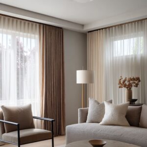
D. The soft filter
Warm tinted walls—apricot-peach, peachy beige, powdery lavender-gray, and warm off-white—behave like a gentle color grade. They soften daylight and reduce sharpness between cool and warm materials, helping mixed temperatures feel blended rather than accidental.
Key visual effect: gray upholstery, white trim, blue glass, and warm accents can coexist without clashing.

E. The containment field
A blue-gray wall treated like a centered panel inside darker built-in borders, or a warm off-white shell edited by a narrow dark niche, creates a powerful containment effect. The main color is held inside a boundary, so it reads crisp and intentional—like artwork that gains strength from a frame.
Key visual effect: quiet colors look richer when they have a clear edge.

The value ladder: how stylish designs avoid flatness
Many polished interior designs feel composed because they manage a value ladder (light-to-dark spacing) instead of relying on one dramatic element. A common structure:
- Dark anchor (charcoal wall, navy built-in, deep olive media wall)
- Mid bridge (warm wood band, caramel leather, dusty textiles)
- Light mass (cream sectional, pale rug, warm neutral curtains)
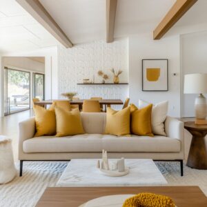
This is why the pairing of a deep media wall with a cream sofa and warm wood often looks balanced: the mid layer prevents the room from reading as simple black and white, and it creates a smoother visual rhythm.
Lesser-noticed point: designs often feel harsh when only two values dominate.
Many refined palettes quietly insert a mid bridge through wood and leather because both add warmth and readable texture.

Temperature choreography: warm and cool placed like a conversation
Stylish spaces rarely mix warm and cool randomly. They place temperatures in specific positions so the room reads stable from quick glances and long views.
Pattern 1: Cool background, warm comforts, neutral air
Cool-leaning walls—lavender-gray, slate-gray, blue-gray—paired with warm accents like terracotta bands, rust textiles, and caramel leather create a controlled push–pull. Warm tones look softer and more velvety against cool walls than they do against crisp white.

Pattern 2: Warm background, cool sharpeners
Warm walls such as peachy beige and warm off-white gain a modern edge through cool clean elements: glossy blue glass décor, deep blue lamp bases, cool gray drapery, and restrained black accents. These cooler notes keep the warmth from turning sweet or dated.

Pattern 3: Daylight balance through intentional echoes
Large windows can make a design feel visually cooler. Some palettes answer that by grounding coolness with a large blue surface on the floor, so the coolness looks intentional.
Other palettes intensify daylight by framing it with a dark wall, making brightness feel dramatic rather than washed out.

The mass rule: accents read designed only with enough support
A popular principle is that strong color looks intentional only when it has either:
- Mass (a full sofa, a large rug, a full wall), or
- Support (repetition through art, textiles, and one secondary object)
That is why bold pairings—like a saturated blue sofa against bright walls with red accents—feel curated when the red appears in artwork and the rug carries warm undertones that quietly connect the scene. The design stops reading as scattered pops and starts reading as planned color blocks.
Lesser-noticed effect: small accents without a larger permission system often feel like decoration added after the fact.

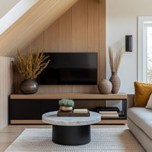
Why dark built-ins feel calmer than dark paint alone
Dark wall color feels more refined when darkness is unified with shape. When shelving, cabinetry, and the media wall share one deep tone, the eye reads a single continuous silhouette rather than separate parts.

This is also why TVs visually disappear on deep walls: the screen stops acting like a harsh black rectangle and becomes part of the larger composition.
Lesser-noticed effect: a darker wall can make a design feel calmer because it simplifies what the eye has to separate and count.

Negative space as luxury: how shelving stays styled, not busy
In polished interior designs, wall color often carries the visual weight, so shelf styling can remain minimal and controlled. Dark shelf backgrounds make light ceramics look crisp, while generous gaps between objects help built-ins read as architecture rather than storage.
Lesser-noticed effect: restraint creates rhythm. Empty space functions like punctuation, making the overall composition feel quieter and more premium.

Edge control: outlines replace contrast in soft palettes
In designs with warm off-white, greige, sage-gray, and other low-contrast wall colors, the finished look often comes from disciplined outlines:
- black window frames
- thin metal furniture lines
- narrow dark niches within cabinetry
- small ceiling notes that echo darker details elsewhere
This creates crisp clarity without loud wall color moves.
Lesser-noticed effect: one controlled dark insert can make a pale wall feel intentional because it gives the eye a boundary line.

Finish and texture: wall color changes what people notice in fabric
A deeper effect of dark or muted wall colors is that they increase legibility of soft materials. Cream upholstery can look plain against bright white, but against deep olive or charcoal it becomes more dimensional—seams, edges, cushion geometry, and weave texture read more clearly.
Lesser-noticed effect: wall color can lift the perceived quality of furniture by making tailoring and texture easier to see.

Color zoning: layout clarity without partitions
Open-plan layouts can feel visually undecided unless an organizing cue appears. Wall color can create zoning without physical separation by forming one dominant plane (a terracotta feature wall, a deep navy built-in) or a focused ceiling frame (a terracotta canopy above dining).
Lesser-noticed effect: a single strong plane changes perceived distance and assigns purpose, so the layout reads intentional even when the plan is continuous.

Eight distinct visual looks created by wall color strategy
These are recurring outcomes in stylish living room design, each produced by a specific wall color role and supporting palette logic:
- Calm, grown-up softness
Middle-value walls paired with thin dark edges and warm neutrals create quiet structure. - Gallery backdrop with livable warmth
Deep charcoal walls feel refined when softened by warm taupe drapery, creamy seating, and muted greens. - Architectural built-in statement
A full deep navy built-in gains balance through warm wood bands and restrained object styling. - Daylight framing and outdoor emphasis
Charcoal near windows and black framing can make daylight brighter and greenery read more vivid. - Soft luxury with gentle tension
Lavender-gray walls paired with terracotta overhead framing and plum/rust accents create a modern, softened richness. - Cozy wrap, grounded modern
Deep olive walls feel welcoming when bridged by rust/clay textiles and large cream upholstery. - Bright stage with controlled color blocks
Crisp white walls feel curated when a single saturated sofa carries the palette and warm undertones appear below. - Energetic contrast that stays ordered
Teal-blue walls can hold an orange statement piece when symmetry and a multi-tone rug provide visual glue.

A framework behind these effects
A. Role assignment
Wall color typically takes one primary role: anchor, backdrop, frame, filter, or contained panel.

B. Value ladder structure
Dark anchor + mid bridge + light mass keeps the palette dimensional.
C. Color placement logic
Color tends to live as a large field (wall), a large block (sofa/rug), a compact cluster (grouped accents), or a supported accent (repeated through art and textiles).
D. Edge discipline
Crisp outlines and narrow dark insertions often replace big contrast in softer palettes.
E. Controlled object language
Repeated neutrals, limited finishes, and negative space keep the wall color as the main story.
The central idea: wall color is a perception tool
The strongest lesson in stylish living wall color ideas is that wall color operates as a perception tool rather than a simple preference:
- It can make furniture appear more sculpted by improving silhouette clarity.
- It can calm visual noise by absorbing clutter and merging shapes.
- It can intensify daylight and make outdoor greenery read like curated art.
- It can make warm accents look velvety rather than loud.
- It can make cream seating and textured fabrics feel more premium.
That is why a design can look expensive with simple furniture: the wall is doing heavy visual organizing, and the palette is arranged to support that single, clear optical job.
Related Posts
Harmony Home Design brings 10+ years of residential interior design experience to the ideas shared here. We publish design concepts, layout thinking, and practical styling notes.