
Neutral interiors can turn blurry faster than people expect. When walls, upholstery, and rugs sit in the same pale family, the eye stops getting clear depth cues.
Everything starts to read as one soft field, especially in rooms with tall glazing, light drapery, and high ceilings. That is exactly why the ceiling becomes a depth tool.
It can add shadow lines, proportion, and a clear lighting order without asking you to introduce bold paint, heavy patterns, or busy wall decor.

A quick before and after helps explain the effect:
- Flat ceiling: The room can feel visually weightless. In tall spaces, the upper zone becomes a big blank sheet. In the evening, light can turn harsh because the room depends on scattered downlights or one central fixture.
- Built ceiling (tray, coffer, cove): The room gains scale cues. You start reading the space in measurable “units” overhead. The ceiling also sets a center of gravity, so the furniture group feels grounded and intentional.
Here is the key design rule that shows up again and again in successful pale interiors:
- A stepped tray ceiling can aim the eye toward the anchor wall (often fireplace, built-ins, or a TV wall treated like architecture).
- A coffered grid can make bright rooms feel complete even when walls stay minimal.
- A layered lighting plan (glow + downlights + sparkle) can make evenings soft instead of stark.
Mini takeaway
In neutral interiors, the ceiling can replace bold paint and heavy wall décor by combining three things in one clear hierarchy:
- Geometry for shadow and proportion
- Glow for evening softness
- Sparkle for micro-contrast and life

Four layers that keep neutral interiors from flattening
Think of a ceiling as a system, not a single feature. The most convincing neutral rooms rarely rely on one move.
They stack four layers, and each layer has a job.
1) Form layer (coffers, trays, stepped planes)
- It gives the room measurement. Instead of one big overhead plane, the eye reads multiple planes, edges, and recesses.
- It helps tall rooms feel designed on purpose. Height stops feeling accidental.
- It supports furniture scale. Low, wide seating looks grounded because the ceiling provides the counterweight.
A strong form layer can be quiet in color (often white), yet still feel rich because it creates shadow rhythm.

2) Frame layer (trim bands, crown, ceiling fields)
This is what makes a chandelier or pendant feel placed rather than floating.
- A trim band or ceiling “field” creates a target zone for a fixture.
- It improves long sightlines, especially dining-led views where you see the ceiling first.
- It helps open plans feel zoned without changing flooring.
A useful rule: if a fixture is meant to be the focal point, give it a frame. If the ceiling is flat, the fixture has to work too hard.

3) Glow layer (cove lighting + perimeter washes)
This is the evening upgrade that makes pale rooms look richer.
- Glow softens the ceiling-to-wall edge, which is where pale interiors often feel sharp at night.
- It turns the ceiling into a gentle border, so furniture and decor feel held in the room instead of floating.
- It prevents tall ceilings from reading as a blank bright sheet under downlights.
Glow is also the best friend of drapery. When curtains hang full height, a soft perimeter wash makes the fabric look deeper and more tailored after sunset.
4) Sparkle layer (chandeliers, pendants, glass clusters)
Sparkle adds tiny points of highlight without adding new colors.
- Glass and crystal create micro-contrast: small reflections that keep neutrals lively.
- Sparkle can soften the severity of a black TV rectangle because reflections break up that flat dark panel.
- Transparent fixtures add presence without blocking views in open layouts.
The biggest rule with sparkle: it needs discipline. If every zone tries to shine, the ceiling becomes clutter.

Coffered ceilings
What coffers actually solve in neutral interiors
Coffers succeed because they fix three common neutral-room problems at once.

- Scale control
A large bright ceiling can feel endless. Coffers break it into readable sections, so the room feels designed rather than empty. - Shadow rhythm
Even with white paint, beams and recesses create alternating light and shadow bands. In daylight, the ceiling gains depth without any added color. At night, the pattern can stay legible if lighting supports it. - Visual pairing with other grids
A coffer grid can echo window muntins, shelving grids, or panel rhythms. That repetition is powerful: the room feels cohesive because the same geometry appears at multiple heights.
A practical way to use this: if a window wall has divided panes, a ceiling grid in a similar proportion can make tall glazing feel intentional instead of overpowering.

Where coffers work best
Bright living rooms with strong window grids
When windows already create a repeated pattern, coffers feel natural overhead. The ceiling becomes the partner that gives the window wall scale.
TV or fireplace walls that already act as the main axis
When one wall is the anchor, coffers add interest without forcing you to add competing wall focal points. You get depth overhead while the anchor wall stays clean.
Double-height volumes
Very tall rooms are where coffers earn their keep. They break height into readable units, helping the upper zone avoid emptiness.
They also give the eye something to read above the window line, so the room does not feel top-heavy.

Lighting placement inside coffers (practical, not technical)
A coffer ceiling can look expensive or messy depending on one simple thing: whether the lighting respects the grid.
- Align recessed lights to the pattern. If lights drift off-center or ignore the beam rhythm, the grid loses clarity at night.
- Repeat the same placement in each bay. A coffer system is a rhythm. Random dots break the rhythm.
- Let the coffers do most of the visual work. Use light to support the geometry, not fight it.
One strong guideline: you should be able to look up at night and still read the ceiling pattern clearly. If you cannot, the lighting strategy is overpowering the form.

Common coffer mistakes and how to fix them
Mistake: Too many downlights competing with the coffer pattern
The ceiling turns into a bright polka-dot field. The beams stop mattering.
Fix: Reduce the number of visible light points and keep them aligned. Use the coffer shadow lines as the main feature; lighting should be supportive.

Mistake: Coffers plus a busy chandelier plus a busy niche grid all in one view
Now there are three competing patterns: overhead, central, and wall. The room feels restless.
Fix: Choose one hero pattern per main sightline. If the coffers are strong, keep the chandelier simpler.
If the chandelier is the hero, keep the coffer pattern quieter or larger-scale.

Mistake: Coffers scaled too small for the room
Tiny bays in a large room can feel fussy. Fix: Use fewer, larger coffers so the ceiling reads at the same scale as the furniture group and the window wall.

Tray ceilings
Tray ceilings as directional lanes
Trays do something coffers do not: they point. In long rooms and open layouts, direction is often the missing ingredient.
A tray ceiling can:
- steer the eye toward the anchor wall (often fireplace, built-ins, or a media wall treated like architecture),
- organize a long room so it does not feel endless,
- match the furniture axis, so the seating plan and the ceiling feel designed as one composition.
Think of the tray as a ceiling route. The long edges create a corridor of attention, even when the room itself is wide.

Stepped trays for living rooms
A stepped tray works well in living rooms with tall windows and low, wrapped seating. The ceiling can supply structure while the furniture stays soft and low.
Strong rules that keep stepped trays clean:
- Crisp edges matter. A tray works because shadow lines look sharp. Soft, vague edges weaken the effect.
- Use a controlled downlight rhythm. Small, well-spaced lights can create precise pools of light at night without glare.
- Keep the ceiling field calm. When the tray is the architectural feature, avoid extra ceiling clutter.
A hidden benefit: a tray can help you keep ceiling elements visually tidy. When vents, trims, or access panels are placed within the tray logic, the ceiling reads intentional instead of interrupted.

Long trays for open-plan dining-to-living suites
In open plans, a tray that runs the length of the space can tie dining and living into one composed view. This approach works especially well when:
- the dining table is placed on a straight axis toward the living focal wall,
- the ceiling height is generous and needs a visual boundary at night,
- you want a clean, modern envelope but still need depth.
A warm perimeter glow line inside the tray can hold the ceiling at night so it does not feel empty. Then downlights and sparkle fixtures can sit inside that frame.

When trays beat coffers
Choose a tray when you want:
- Direction more than a grid.
- A long sightline to feel controlled.
- A ceiling system that supports one clear axis.
Trays also make sense when the room already has strong rectangular rhythms: built-ins, long fireplaces, slab walls, and long drapery runs. A grid overhead can sometimes add too many lines; a tray gives structure with fewer moves.

Tray ceiling pitfalls and fixes
Mistake: Tray direction does not match the room’s main axis
The ceiling points one way, while the dining table or fireplace points another. The room feels slightly off.
Fix: Align the tray’s long edges with the longest sightline. In many open plans, that is the table-to-focal-wall line.

Mistake: Tray depth exists, but lighting does not reinforce it
You see the tray in daylight, but at night it disappears. Fix: Pair tray edges with perimeter glow or a clean downlight rhythm.
The lighting should reveal the ceiling form after dark, not flatten it.
Mistake: Too many tray steps in a modest room
Multiple layers can feel heavy. Fix: Use fewer steps with stronger proportion.
One confident tray with a clear frame often looks richer than several small recesses.

Cove lighting
What cove glow changes
Cove lighting changes the emotional temperature of a neutral room. It reduces harsh contrast at the ceiling line, which is where pale interiors often feel stark after sunset.

Here is what it improves immediately:
- Softer wall-to-ceiling transitions. Walls look taller and smoother.
- Better fabric depth. Full-height drapes look richer because they catch gentle light from above.
- More flattering surface reading. Stone, wood, and matte textiles show subtle variation instead of looking flat under direct downlights.
Cove glow also supports the object-based styling approach that works so well in neutral rooms: branches, ceramics, bowls, and shelf displays. When the ambient light is soft, those items read as intentional forms rather than clutter.

Strong use cases
Layered ceilings in dining-led open plans
When the ceiling has multiple planes, cove glow can emphasize those layers without adding color contrast. The ceiling stays light, but it becomes dimensional.
Open plans with paired fixtures
When two matching fixtures are used to carry a long view, perimeter glow can support them so the fixtures do not have to supply all the ambient light. The sparkle can stay decorative, not functional-only.

Living rooms where the ceiling is part of the architecture
A full lighting plan often looks like this: perimeter glow for ambient softness, a few precise downlights for function, and one central sparkle layer for life. That combination keeps a neutral room warm in the evening without harsh hotspots.
Cove glow mistakes and fixes
Mistake: Cove glow is the only light layer
The room can feel pretty but flat, because you lack direction and highlight. Fix: Add a small number of precise downlights to give surfaces gentle modeling.
The goal is depth, not brightness.

Mistake: Cove glow fights other accent lighting in open plans
Shelf lighting, under-cabinet lighting, and ceiling glow can compete if they are all treated as equal. Fix: Set a hierarchy:
- ceiling glow = ambient
- shelves and cabinetry = accent
- pendants and chandeliers = focal
When each layer has a role, the room feels calm.
Mistake: Glow makes the ceiling feel detached from the room
If the glow is too dominant, the ceiling can seem like it is floating away. Fix: Balance glow with one mid-height light source in tall spaces (a floor lamp or table lamp) so the room has warmth at human level, not only overhead.

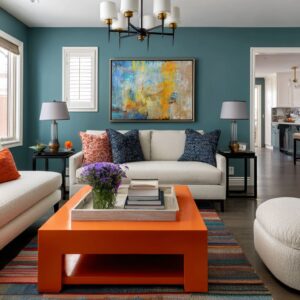
Chandeliers and pendants
Sparkle as micro-contrast in pale rooms
In pale palettes, micro-contrast matters. Glass and crystal give you tiny highlight points that keep the room lively without introducing bold colors.
This is why sparkle works so well when the rest of the room stays calm:
- the ceiling remains bright,
- you still get texture and life overhead,
- reflective points add depth even when walls are minimal.
A second benefit is especially useful in living rooms with a TV: reflections can soften the severity of the black screen. A TV is a hard, flat rectangle.
When it picks up chandelier glow, it feels less like a dark hole.

Dining-led sparkle: how to make the chandelier belong
A chandelier feels intentional when two things happen:
- It is framed by the ceiling. A trim band, ceiling field, medallion, or tray center gives the fixture a target zone.
- It is aligned to the table axis. From multiple angles, the fixture still reads connected to the dining surface below.
In open layouts, this matters even more. If the chandelier is slightly off, the whole room feels less ordered because dining is often the first zone you see.
A helpful rule: size the chandelier to the table and the ceiling field, not to personal comfort with how big it looks in a showroom.

Pairing fixtures in open plans: the rhythm strategy
In long open plans, one oversized fixture can make the dining zone feel like the only event. The living zone can end up visually quiet.
Two matching fixtures can solve that problem. They create a repeated beat along the main axis:
- one above dining,
- one closer to the living zone.
This approach works best when the ceiling form supports it (a long tray, a framed ceiling field, or a ceiling system that clearly defines the axis). It creates continuity without adding more furniture or wall décor.
Pendant clusters: sparkle without mass
Clusters succeed when you want movement and reflection but do not want a heavy object blocking the view. Why they work:
- Transparent globes add reflection while keeping sightlines open.
- Varied drop heights create vertical rhythm in front of pale walls and long drapery runs.
- A rectangular ceiling mount can echo the shape of an island or a long table, tying the cluster to the plan.
Clusters are especially helpful at kitchen islands in open plans, because the kitchen often sits between dining and living. You need a ceiling feature that marks the island zone without acting like a visual wall.

Oversized globes: the scale solution over wide islands
Small pendants can look lost above a large island. When the countertop is a bold slab or the island has strong mass, the ceiling lighting needs matching scale.
Oversized glass globes solve this in a clean way:
- they read at the right size from a distance,
- they add glow and reflection,
- they keep the room feeling open because glass stays visually light.
A good pairing is warm bulbs inside clear or lightly textured glass. It softens cool stone and balances darker cabinetry.
Sculptural pendants as a soft counterpoint to linear rooms
When a room is highly rectilinear—long shelves, straight table edges, strong ceiling recess lines—one organic fixture can add shape variety overhead. This works best in spaces that already have strong linear architecture.
The fixture becomes the soft form note, while the rest of the room stays disciplined.

Sparkle mistakes and fixes
Mistake: Dining chandelier, island pendants, and kitchen fixture all compete
The ceiling becomes busy. Every zone tries to be the focal point.
Fix: Assign roles:
- dining = main sparkle
- kitchen island = lighter transparency
- hallway and circulation = simpler supporting lighting
Mistake: Fixture scale is too small for room width
The ceiling feels empty, and the fixture looks like an afterthought. Fix: Scale the fixture to the table and the ceiling field.
If the ceiling has a framed zone, the fixture should feel like it belongs inside that frame.
Mistake: Too many different fixture styles in one open plan
Even in a neutral palette, the room can feel disjointed. Fix: Repeat one idea:
- either repeat similar forms (glass globes and glass drums),
- or repeat one metal tone,
- or repeat one silhouette family (cylinders, globes, or drums).

Dining axis, kitchen island lighting, hallway sconces, and double-height rooms
Dining axis: ceilings that pull the eye straight to the anchor wall
Many polished open plans rely on one clear sightline: dining table leading to a focal wall. Ceiling design can reinforce that sightline in three ways:
- Geometry: Use a long tray or ceiling field that runs parallel to the table.
- Fixture alignment: Place the main dining fixture centered on the table, then keep any secondary fixtures aligned on the same line if the plan is long.
- Lighting rhythm: Keep downlights steady and organized so the axis reads cleanly.
A subtle detail that makes this feel complete: tabletop styling that echoes ceiling shape language. A round tray under a chandelier with a round presence creates a visual link between ceiling and table.
Tall branches or stems can bridge the vertical gap, connecting human-height styling to overhead sparkle.

Kitchen island lighting: transparency, rhythm, and scale
Kitchen islands in open plans need ceiling lighting that marks the zone without blocking the room. Three reliable approaches:
- Row of globes: A clean rhythm that stays visually light, especially over long islands.
- Cluster pendants: Movement and reflection with open sightlines.
- Oversized globes: Scale support when the island is large and heavy in stone or veining.
If you want to define the kitchen zone without changing floors, a ceiling detail above the island can help: a framed plane, a recessed insert, or a contrasting ceiling field. It creates a boundary without adding new wall décor.

Hallways: ceiling daylight plus sconces for a gallery lead-in
A hallway can preview the main rooms. When it does, the whole home feels more composed.
Two ceiling-led ideas work especially well:
- Skylight as the hero: Daylight becomes the corridor’s feature, and the hallway feels alive through the day.
- End-zone framing: Wall sconces near a console can frame artwork and create a destination at the end of the corridor.
Art and console styling in the hallway can repeat the main rooms’ material language: branches, pale ceramics, and simple frames. That continuity makes the transition feel intentional.

Double-height rooms
Double-height spaces often fail for one reason: the upper zone feels empty. A strong approach combines:
- Coffers for scale: The ceiling becomes readable, and height feels designed.
- Quiet recessed rhythm: Light supports the pattern instead of overpowering it.
- Mid-height lighting: Floor lamps or table lamps prevent the evening mood from relying only on overhead light.
- View-first thinking: Treat the window grid and outdoor greenery as the primary visual feature. The ceiling becomes the partner that gives proportion.

Ceilings that support TV and fireplace walls
Ceiling patterns that echo built-ins and paneling
A living focal wall often carries a lot: TV, fireplace, shelving, panel rhythm, niche grids. If the wall already has strong geometry, the ceiling should support it, not compete.
Two strong pairings:
- Coffers that mirror wall rhythm: When wall paneling or built-in grids exist, a ceiling grid can reinforce the same language so the room feels unified.
- Tray edges that echo long horizontals: A long fireplace slot, a long dining table, and a long tray ceiling can share one family of lines. That repetition is calming.
When wall art is minimal, the ceiling becomes part of the art plan
In many media-centered rooms, large wall art is intentionally limited because the TV already acts like a dominant graphic element. In that situation, atmosphere often comes from:
- ceiling geometry,
- layered light,
- shelving depth with restrained object styling,
- one strong tabletop centerpiece (branches, florals, or sculptural bowls) that introduces organic shape.
If you do want wall art, it tends to work best on a secondary wall, not on the media wall. Keep it low-contrast and textural so it adds mood without creating a second competing focal point.

A ceiling decision checklist (room by room)
Living room
- Do you need scale control (coffers) or direction (tray lanes)?
- Is the TV or fireplace wall the main axis? If yes, keep ceiling sparkle disciplined and avoid multiple competing ceiling moments.
- In tall rooms, add at least one mid-height evening light source so the room feels warm at human level.
Dining
- Align the main fixture to the table and the main sightline.
- If the space is long, consider paired fixtures to carry the view from dining toward living.
- Use ceiling detailing to place the chandelier: a ceiling field, trim band, tray center, or medallion.
Kitchen island
- Choose visually light forms when the island already has strong veining or heavy mass.
- Use larger pendants over wider islands so the lighting reads at the right scale.
- Keep the island lighting rhythm distinct from the dining chandelier so each zone has its own role.
Hallway
- If there is a skylight, let it lead. Support it with end-zone sconces and a styled console so the corridor has a destination.
- Use art and console styling that previews the main rooms’ material rhythm.

6 ceiling recipes
1) Bright coffered living room recipe
- Coffered grid scaled large enough to read from the sofa.
- Recessed lights aligned to the grid so the ceiling pattern stays legible at night.
- One simple center pendant, kept calm so the coffers remain the main feature.
- Window grids or shelving grids echoed by the coffer rhythm for cohesion.
2) Directional tray living room recipe
- Stepped tray lanes aimed at the anchor wall.
- Small, well-spaced downlights creating precise pools of light without glare.
- One pendant cluster adding vertical rhythm in front of a pale wall.
- Table centerpiece with branches to introduce organic linework that balances all the rectangles.
3) Open-plan axis recipe with paired chandeliers
- Long tray running through dining toward living.
- Perimeter glow line holding the ceiling at night.
- Two matched drum fixtures aligned on the main centerline to carry the long view.
- Supporting recessed rhythm around the perimeter so the fixtures stay decorative.
4) Kitchen-to-living light-but-luxe recipe
- Row of transparent globe pendants over the island for a clean rhythm.
- Minimal ceiling plane in the kitchen zone so the pendants read crisp.
- A media wall treated as material art (wood + stone or slab-like surfaces) instead of relying on framed art.
- Built-in niche lighting for depth, styled with restrained ceramics and negative space.
5) Long dining corridor recipe with display shelves
- Layered ceiling recesses that extend the length of the room.
- One sculptural organic fixture overhead as the soft counterpoint to rectilinear shelves.
- Warm backlit display shelving on both sides, styled with breathing room so the lighting feels high-end.
- A clear end-point artwork or focal wall moment so the long view ends with purpose.
6) Double-height volume recipe
- Coffered ceiling grid to break height into readable units.
- Quiet recessed rhythm aligned to the coffers.
- Mid-height lamp layer near seating so evenings feel livable.
- Tall drapery framing glazing so the window wall reads intentional and soft.

Conclusion
Neutral interiors stay rich when the ceiling provides structure in daylight and layered light at night.
- Coffers give scale and proportion.
- Trays give direction and organize long sightlines.
- Cove glow gives evening softness and makes pale finishes look deeper.
- Sparkle fixtures add micro-contrast and life, as long as they stay in a clear hierarchy.
If you want a neutral room to feel finished without relying on bold paint or busy wall decor, start overhead. The ceiling can carry the depth story quietly, all day, and especially after sunset.
Related Posts
Harmony Home Design brings 10+ years of residential interior design experience to the ideas shared here. We publish design concepts, layout thinking, and practical styling notes.