
The entryway holds a special place in home design, setting the tone for everything that follows. In spaces inspired by mid-century modern ideas, these areas are carefully shaped through a refined balance of proportion, texture, and quiet visual rhythm.
Rather than relying on heavy decoration, the style draws its strength from subtle design decisions that work together to create depth and character. At its core, this approach favors clean lines, floating forms, and thoughtfully composed negative space.
Furniture often appears to hover, mirrors stretch vertical proportions, and lighting becomes a sculptural feature that shapes how the space feels from every angle. The use of materials like walnut, brass, and natural stone is paired with carefully chosen color palettes that allow each surface to support the next.

What makes these designs stand out is their quiet control over balance — mass and lightness, symmetry and asymmetry, reflection and absorption. Every surface, from polished floors to matte ceramics, plays its role in a layered composition that feels open yet highly refined.
Through these principles, mid-century inspired entryways offer more than just a first impression. They become carefully arranged visual compositions where every detail, no matter how small, contributes to a calm and highly structured atmosphere that remains timeless and visually engaging.

Verticality as Visual Calm Control
In mid-century modern entryway ideas, one of the most skillful visual decisions lies in how height is handled. These spaces often rely on a quiet but strong commitment to vertical proportion.
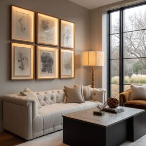
Tall mirrors — whether they are soft-edged rectangles, elongated ovals, or gentle arches — serve far more than reflective duties. They visually stretch the height of the room, allowing even compact spaces to feel open and composed.
Without adding physical volume, the vertical lines act like silent reinforcements, pulling the eye upward and giving the sense of more space. The relationship between these tall mirrors and the floating consoles beneath them is carefully measured.
The mirrors counterbalance the dominant horizontal spread of the consoles, creating a sense of steady equilibrium. Rather than simply stacking objects, this vertical layering shapes how the entire composition breathes.

Even in examples where several mirrors appear together, like the softly aligned trio against a green feature wall, the rhythm remains controlled rather than becoming busy. Each vertical form carries its role in balancing the composition, preventing any visual clutter from forming.
Rounded corners frequently soften the strictness of these vertical elements. Without the sharp edges, the eye glides naturally over the surfaces, which keeps the space from feeling cold or stiff.
The verticality works almost like invisible interior columns — quiet supports that allow the space to feel confident and balanced, even in its smallest versions.

Negative Space as Active Design Tool
One of the less obvious yet highly sophisticated techniques in a mid-century modern entryway is how the absence of objects becomes part of the design language. Rather than filling every surface, these entries control space through what they leave open.
Negative space operates as a fully active ingredient, shaping the visual weight and allowing each element to stand on its own. Console surfaces, for instance, are rarely crowded.
Instead of spreading multiple decorative objects, they often feature tight groupings—perhaps two vases and a small stack of books—carefully arranged to leave open space around them. This breathing room gives depth and clarity, making each item appear intentional without becoming overwhelming.

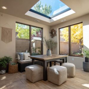
Underneath the consoles, ottomans fill their spaces with precision. Their shapes—usually rounded or perfectly cubic—occupy the gaps without visually competing.
The proportions are carefully chosen so they provide presence without disrupting the openness above them. Benches follow a similar principle.
Many feature slim black or dark legs that appear to recede visually, making the bench itself seem to float lightly above the floor. This controlled hovering effect keeps the lower part of the composition light and avoids introducing any heavy visual anchors.
The empty zones between objects carry as much visual importance as the objects themselves. In many ways, this discipline reflects the core values of mid-century aesthetics, where clarity, balance, and visual breathing space create rooms that feel complete without feeling full.

Sculptural Rhythm in Lighting
Lighting inside a mid-century modern entry serves a far more dynamic purpose than simple illumination. Every fixture becomes part of a visual composition, adding movement and rhythm that shapes how the space feels — even before a single bulb is turned on.
The fixtures act almost like small sculptures suspended in the air, guiding the eye across the room in carefully choreographed steps.

Pendant lights often hang at different heights, arranged asymmetrically to create a sense of floating motion. Even when off, this staggered positioning gives each pendant its own sense of quiet movement, adding layers of visual rhythm that activate the space.
These groupings break up any flatness and prevent the ceiling plane from feeling static or empty. Glass globes take on a special role in many of these designs.
With exposed filaments glowing inside clear or semi-frosted glass, they become tiny orbs of soft radiance. These glowing spheres interrupt flat surfaces and bring gentle highlights that feel almost like punctuation marks within the room’s visual structure.

Wall sconces, often placed at vertical centerlines beside mirrors, act less like light sources and more like visual anchors. Their slim forms help organize the vertical geometry, adding sharp lines that balance the surrounding curves and horizontal stretches.
Throughout these mid-century modern entryways, lighting also quietly pays respect to its design roots. Multi-arm brass chandeliers, offset rods, and branching fixtures reference atomic-era inspirations without falling into nostalgic imitation.
Each piece holds its place in the visual rhythm, guiding where attention settles and how it travels from one feature to another.

Hidden Dialogue of Surface Sheens
There’s a quiet visual dialogue happening across surfaces in a mid-century modern entryway, one that many observers may overlook at first glance. The mood of these spaces relies not only on color or form but on how surfaces catch or suppress light.
This balance between reflection and absorption creates an atmosphere that shifts gently throughout the day. Take, for example, a wall finished in burnt ochre with a marbled or cloudy texture.
Its softly diffused surface reacts to changing light conditions, producing a gentle cloud effect that brings depth without overwhelming the eye. This kind of treatment gives the wall a subtle sense of life, making the backdrop feel richer and more dimensional.

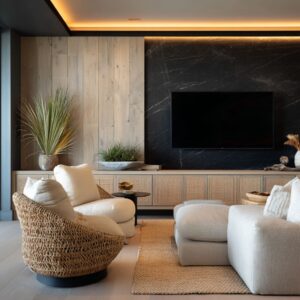
In contrast, many consoles feature matte black finishes. Rather than bouncing light, these darker surfaces absorb it, allowing nearby elements like warm wood grains and brass frames to take on a soft, inviting glow.
The dark matte creates areas of visual rest where the eye can settle briefly before moving on. The flooring often participates in this interplay too.
Polished concrete or smooth stone floors reflect light in a low, controlled sheen. They extend the visual depth of the space without drawing attention to themselves, acting like quiet mirrors spread horizontally across the room.
Even small decor objects contribute to this layered dialogue. Textured matte ceramics placed on console surfaces absorb light far differently than glossy vases would.
Their soft finishes keep highlights muted, preserving the room’s calm mood while still offering tactile richness. The coordination between gloss, matte, and soft reflection creates a carefully balanced dance of surfaces.
This subtle orchestration shapes how light moves across the space, producing a refined visual softness that often escapes casual notice.

Visual Weight Balancing via Proportional Play
Inside mid-century modern entries, one of the most refined techniques involves managing how different elements carry visual weight. This balance is rarely uniform.
Instead, designers carefully shift between heavy and light, solid and floating, creating compositions that feel controlled yet never stiff. The arrangement of mass is a constant dialogue between grounding and lifting.
Consoles often carry significant visual mass due to their thick slabs or wide profiles. Yet, rather than letting this heaviness dominate the room, many are floated off the wall using shadow gaps that create the impression of lightness.
This subtle separation allows the eye to perceive the console as both solid and suspended at once.

Beneath these consoles, ottomans or benches are frequently placed with care. Their volume helps visually anchor the hovering console above, providing counterweight without overwhelming the space.
Whether rounded boucle forms or structured cubic shapes, these seating elements reinforce balance while adding texture. Thickness in the consoles is often contrasted by the surrounding details.
Delicate brass mirror frames or slim tabletop objects provide a fine counterpoint, ensuring that the larger elements never feel clunky or overpowering. This contrast between scale and fineness keeps the overall composition feeling graceful.
Lighting follows this same principle. Oversized globes hanging above or nearby may feel larger than necessary, but they serve to establish a clear hierarchy of scale.
Their round forms add volume above while balancing the proportions of the room’s lower, more grounded elements. The result is a constant play between mass and lightness.
Some elements seem to hover, while others firmly root the space, producing a composition that feels stable yet full of quiet energy.

Echoed Geometries Without Repetition
What gives mid-century entries their layered visual richness is how shapes repeat without falling into strict duplication. Rather than simple copying, the geometric elements in these spaces form a kind of dialogue — repeating themes while keeping each version slightly unique.
This gives the space rhythm without slipping into predictable patterns. Mirrors often introduce curves that echo forms found elsewhere.
Rounded mirrors may reflect the soft lines seen in ottomans or the spherical shapes of pendant lights, but each curve carries its own proportions and presence. This shared language of shape builds unity while keeping visual interest alive.

Consoles may carry edges that nod to the groove patterns found on adjacent wall paneling. The edges and surfaces connect visually, but exact matches are avoided, allowing each layer to maintain its own identity while still speaking to the others.
This subtle echo keeps the space rich without feeling repetitive. Smaller geometric touches bring even more complexity.
Triangles often sneak into the composition through angled wall sconces, tapered furniture legs, or hairpin bench supports. These sharp angles introduce a slight tension into the otherwise rounded and rectangular shapes, preventing the design from feeling too soft or overly controlled.
The entire visual structure operates as a geometric conversation, where repetition is always softened by variation. This approach keeps the space feeling relaxed, natural, and free of mechanical uniformity, while still honoring the timeless design codes of the period.

Micro-Layering of Nature Referencing
Even within the highly controlled look of mid-century modern design, nature quietly plays a role beneath the surface. Organic references are never overwhelming, but they are carefully positioned to bring warmth, softness, and a living rhythm to the spaces.
This subtle interaction with nature keeps the visual composition from feeling cold or too rigid. Rather than filling these spaces with abundant greenery, plant elements are introduced with great restraint.
Dry branches, slim palms, or single cacti often appear as vertical or slightly arched forms, perfectly aligned with the vertical language already present in mirrors, wall panels, and lighting. These delicate natural structures echo the architectural lines while gently breaking any sense of stiffness.

Beyond the obvious plant materials, organic texture is layered into the design through surfaces and fabrics. Cane doors introduce a woven, breathable feel; boucle upholstery adds depth through its soft, tactile looped surface; and ribbed ceramics provide fine undulating lines that mimic natural formations.
These elements contribute to a sensory richness without demanding attention. Light itself becomes part of this nature-inspired layering.
Sunlight filtering through side windows introduces moving shadows that shift throughout the day, bringing a slow, living texture to the surfaces. The dance of light and shadow adds yet another dimension to the design, allowing nature to participate quietly.
This controlled infusion of organic elements gives these precise compositions breath and energy, preventing them from falling into a sterile or mechanical appearance. Nature remains present, but always within the carefully measured balance that defines the aesthetic.

Advanced Tonal Synchronization
One of the most refined and often unnoticed aspects of entryway ideas inspired by this design period is how carefully tones are balanced across surfaces. This is not simply a matter of matching colors but of tuning undertones so that materials quietly harmonize across the entire space.
Walls finished in burnt ochre, for example, do more than provide color. Their earthy warmth extends into the soft golden glow of brass hardware, creating a seamless transition from surface to detail.
The tones speak to one another without directly copying. In other entries, sage green walls are paired with walnut or smoked oak finishes.
The cool undertone of the green allows the rich warmth of the wood to stand out without conflict, creating a layered effect that feels natural and calm. Even stronger contrasts find balance through this tonal conversation.
Charcoal stone walls become perfect backdrops for brass and walnut elements, making their richness glow softly instead of clashing. The dark base supports the warmth, enhancing depth.

Lighter schemes follow the same principle. Light gray walls paired with warm oak floors allow the wood’s natural tones to shine while cooling the overall atmosphere slightly, preventing visual heaviness.
The skill lies in how these tones are synchronized across materials, surfaces, and accents, allowing every piece to visually connect across the room. This fine-tuned balance helps achieve the effortless harmony often felt in these interiors, even if its complexity stays hidden to most observers.

Invisible Repetition of Mid-Century Codes
Even as these spaces feel updated, the language of mid-century remains deeply present, but never through imitation or clichés. Instead, it appears through a collection of design codes quietly guiding the compositions.
This is where the true refinement reveals itself. One of the strongest codes is the consistent use of floating forms.
Furniture elements often hover off the floor or wall, using shadow gaps or slim supports that create a sense of weightlessness. This floating effect allows mass to feel lighter, contributing to the balanced calm that defines the style.
Cabinetry goes beyond storage. Built-ins are shaped almost like sculptures, becoming part of the room’s architecture rather than sitting as detached furniture pieces.
Their integrated presence strengthens the visual flow and creates seamless transitions between functional and decorative elements. Asymmetry plays a key role as well.
Lighting fixtures, tabletop accessories, and even plant placements are rarely perfectly centered or mirrored. This deliberate off-balancing introduces visual movement, avoiding stiffness while adding a natural rhythm across the space.

Material choice remains faithful to mid-century origins. Walnut dominates as the signature wood species, appearing in various treatments — fluted, smoked, ebonized — each offering a different tone while staying rooted in the period’s material vocabulary.
Furniture details also continue this conversation. Tapered legs and hairpin bases return repeatedly on benches and consoles, referencing their historical roots while blending effortlessly into these modernized interiors.
These modern interpretations absorb the principles of mid-century design rather than copying its furniture pieces. The codes stay alive, but their expression evolves into compositions that feel current, sophisticated, and deeply intentional.
Closing Insight
At first glance, modern mid-century entryway designs can appear simple, even effortless. But beneath that calm surface lies an elaborate choreography of small visual decisions.
Every area — from the negative space between objects to the way surfaces reflect light, from the proportion of materials to the balance of tones — is the result of highly controlled coordination. This invisible complexity allows the designs to feel open, natural, and timeless, while holding together a tightly composed structure underneath.
Related Posts
Harmony Home Design brings 10+ years of residential interior design experience to the ideas shared here. We publish design concepts, layout thinking, and practical styling notes.