
This article takes a deep look into blue and gray kitchen ideas that go far beyond what most people notice at a glance. What sets these kitchens apart isn’t simply the contrast between light and dark, or even warm and cool—it’s how those differences are handled with precision.
The blend of cabinetry colors, material textures, and finishes creates an atmosphere that feels intentional without being forced. By observing how top designers use undertones, finishes, and architectural details, it becomes clear how subtle decisions shape the overall mood of a space.

Balancing Color Temperature Through Undertones
One of the most important and easily overlooked design tools in these kitchens is color temperature—especially how gray and blue shift depending on light, nearby materials, and even sheen. Cool or Warm GrayGray cabinetry isn’t one-size-fits-all.
Some of the soft, dove-like grays carry a warm, almost beige-like base, while others lean into cooler tones that echo brushed steel or shadow. These small variations are what let a space feel either cozy or crisp—often both, depending on the time of day.
A warm gray perimeter paired with a cooler blue island softens the contrast and helps the two-tone palette flow naturally. In daylight, warm gray might seem sunlit and soft, but under cooler lighting, it becomes sleeker and more modern.
These shifts are subtle, but they’re what give depth to blue gray kitchen cabinets and prevent them from feeling flat or overly uniform.

Blue Spectrum
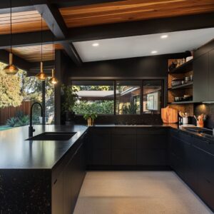
The blue shades used in these kitchens range from bright and energetic to soft and chalky. Some kitchens lean into rich cobalt or royal blue finishes—especially on the island—which instantly draws the eye and adds energy to the layout.
These saturated tones pair well with neutral mid-tone grays that won’t compete for attention. On the other end, muted powder blues or periwinkle add calmness without fading into the background.
One standout trend is using dusty blues with visible brushstrokes or low-sheen finishes. These surfaces create a handcrafted feeling and bring subtle texture into play, even before you notice any hardware or lighting details.

Throughout many of these spaces, designers show a careful hand in balancing strong color contrast with visual softness. This control over hue and shade is what makes these blue and gray kitchen cabinets feel timeless, rather than tied to a trend.
From modern homes in coastal cities to classic suburban layouts, the mix of blue and gray continues to evolve in fresh, quietly impactful ways.

Nuanced Cabinet Finishes and Techniques
Beyond choosing colors, the texture and surface treatment of cabinetry can completely change how a kitchen feels. This is where the craft behind two tone blue and gray kitchen cabinets starts to show through.
While many might focus only on the shades, what gives these kitchens depth is how light interacts with paint finishes, wood grain, and glass.

Hand-Brushed Lacquer or Visible Grain
In several kitchens, especially those with darker navy islands, brushwork is intentionally left visible. This technique adds subtle movement across large flat surfaces, breaking up the bold tone without using patterns or hardware.
It feels more hands-on than a sprayed finish and lends a natural softness to the space. By contrast, a high-sheen lacquered blue on cabinet doors reflects the room like a polished piano surface.
This creates a more contemporary vibe, often used in urban spaces where clean lines and a bit of shine are preferred. The choice between these two approaches—hand-brushed vs.
gloss—is less about color and more about mood.

Fluted or Reeded Glass
Instead of basic clear panels, some upper cabinets are fitted with vertical fluted glass. These softly distort what’s behind them, giving just a hint of contents without the hard look of transparency.
The vertical lines work as a repeating detail, helping to visually stretch cabinets upward—great for kitchens with lower ceilings or narrow proportions. This is also a way to layer texture into a space that otherwise uses smooth quartz, polished metals, and flat paint.

Cerused or Wash Effects
A few kitchens in this style lean on washed or cerused finishes that let the wood grain peek through. Instead of hiding the material, this treatment highlights the natural variation of the surface.
Especially on blue cabinetry, it adds a coastal or slightly rustic edge, even in a modern plan. These finishes are often paired with matte brass or black hardware that isn’t too shiny—again, emphasizing tactility over flash.
It’s a subtle nod to handcrafted furniture, without stepping too far into farmhouse territory.

Creative Contrast and Placement
Not every layout sticks to the standard formula of dark base cabinets and light uppers. Designers experimenting with blue gray kitchen ideas are increasingly flipping that idea on its head, or breaking it apart entirely to let color play a more fluid role.
Upper Cabinets in Bold Blue
Using strong blues up high is less common but brings an unexpected energy. It shifts the focus upward and can make a small kitchen feel more open by keeping the base palette soft.
This approach works well when the ceiling is white or softly arched, letting the bold tone sit neatly in the middle visual band. Instead of feeling heavy, the blue draws the eye toward light fixtures, ceiling trim, or upper shelving details.

Accent Zones, Not Even Splits
In some of the most successful kitchens, color doesn’t follow a strict rule. Blue might only appear on a single element—a vent hood, the back of an island, or even a drawer front facing the living area.
This placement allows the blue to act like an anchor, while the rest of the cabinetry stays neutral. It’s especially useful in open-plan homes where the kitchen is visible from multiple angles but doesn’t need to dominate.

Adding a Third Material for Warmth
One common thread in high-end two-tone kitchens is the quiet use of a third contrast—usually natural wood. Whether it’s a floating oak shelf, a sliver of walnut along the hood, or wood-framed glass doors, this helps avoid the stiffness that can come from sticking too tightly to only two tones.
The result is a layered palette that feels collected rather than calculated. Together, these layout tricks make two-tone kitchens feel balanced without being too matchy.
Whether it’s a city loft or a coastal retreat, the way blue and gray are placed—combined with thoughtful texture and finishing—makes a lasting impact on how the kitchen works and feels.

Architectural Details and Millwork
Some of the most memorable kitchens owe their visual appeal not to the color palette alone, but to how cabinetry interacts with the room’s structure. These touches can completely change how blue grey painted kitchen cabinets feel in a space.
Hood Shapes and Surrounds
In many kitchens, the range hood is more than a functional element—it becomes a feature in its own right. Hoods finished in muted, powdery blue stand out without shouting.
Whether trimmed with colonial-style corbels or left in a curved plaster form, they quietly anchor the kitchen’s focal wall. In contrast, sleek metal hoods in warm bronze or cool brushed steel create bold edges, especially when framed by pale gray cabinets.
In layouts with both traditional and modern elements, these hoods play a central role in blending the two.

Crown Molding and Built-Ins
Crown molding isn’t just for the top edge anymore. In well-planned kitchens, trim is used to wrap corners, frame built-in nooks, and even transition between wall and ceiling treatments.
Matching the hood’s trim to the molding or upper cabinetry adds continuity. Designers sometimes change cabinet colors precisely where the molding breaks, which helps divide space without using walls.
In smaller kitchens, this technique keeps the room from feeling chopped up while still defining zones.

Embedded or Flush Doors
Two tone kitchens with a more modern lean often use push-to-open doors or recessed pulls. Without knobs or protruding hardware, the surfaces feel sleek and almost architectural.
On the opposite end, some kitchens go heavier on the millwork—using wide stile-and-rail doors with bold insets and visible frames. These are often finished in rich blues or smoky grays, grounding the space and adding weight to lower cabinetry.
This contrast between minimal and detailed approaches gives designers a wide spectrum to work within, depending on how classic or contemporary the rest of the house feels.

Hardware and Lighting Choices
If cabinetry is the bones of the kitchen, hardware and lighting are what bring the expression to life. Small pieces, but huge influence.
Contrasting Metals
The right metal choice does more than coordinate—it shapes the kitchen’s character. Brass pulls on a royal blue island feel more refined, while matte black hardware adds edge.
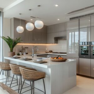
Some kitchens pair deep cobalt cabinets with aged bronze knobs, leaning into contrast instead of harmony. On softer grays, polished nickel or brushed stainless often works best.
One common thread: the hardware never overwhelms the design. It frames it, catches light, and adds rhythm without noise.

Pendant Statement
Pendant lights are used thoughtfully, not just to brighten the island but to mark it as the heart of the room. Whether they’re smoked glass domes, hammered gold bells, or ribbed glass lanterns, pendants often mirror the tone of the cabinet hardware, forming a visual bridge.
Their size and spacing are precise—close enough for impact, but not so low or bulky that they dominate. Kitchens with vaulted ceilings or open layouts benefit most, letting the pendants guide the eye across the space.

Integrated LED Strips
A subtle upgrade seen in several kitchens is toe-kick or under-cabinet lighting. When placed correctly, these lights add a glow that lifts base cabinets off the floor—especially effective in kitchens using darker grays.
In glass-front cabinets, soft interior LEDs highlight dishware and make the upper walls feel lighter. Some use cool-toned lighting under gray bases or soft warm LEDs behind reeded glass to play with visibility and glow.
It’s not just about visibility—it’s about creating quiet contrast where you wouldn’t expect it. Together, these details don’t just support the color story—they define how a kitchen feels when you’re standing in it, moving through it, or catching it out of the corner of your eye.
That’s where the subtle design work really shows.

Backsplash Interplay
One of the most important yet often under-analyzed parts of any two-tone kitchen is how the backsplash plays referee between the upper and lower cabinets. It’s more than filler—it can shift how the whole palette feels.
Blue Tile in Gradations
In many gray and blue kitchen ideas, the backsplash acts as a tone bridge. Some spaces use gentle sky-blue tiles behind gray cabinetry to reflect more light, creating a soft visual lift.
Others place charcoal or deep blue tile behind navy cabinetry to deepen the richness and give more visual weight. This isn’t about matchy-matchy color coordination—it’s about tuning contrast.
Lighter blue tile can brighten up muted gray cabinets, while deeper tile tones bring bold cabinetry into focus without needing extra decor.

Textures and Patterns
What makes these kitchens feel layered isn’t always the color—it’s the texture. Herringbone patterns in matte finishes, subtle mosaics in gloss, or small-format stacked tiles add rhythm to walls.
Even a fish-scale tile with mixed blue and gray strokes can tie both tones together in an artful way. The shape of the tile matters too.
Larger tiles in a clean grid feel more modern, while small, textured tiles lean more handcrafted or boho. In kitchens where cabinetry is slab-front and minimal, this is where detail can really live—on the walls, in patterns that break the symmetry.

Full-Slab Stone
For a completely different mood, some kitchens skip tile altogether and use one continuous slab as backsplash. This works well in kitchens using muted color palettes where veining can quietly echo both cabinet colors.
A slab of white marble with soft gray streaks and blue undertones doesn’t compete—it simply connects. It’s also a way to introduce scale, since slabs give the illusion of uninterrupted surfaces.
That kind of clean backdrop lets blue and gray tones speak clearly without distraction.

Flooring and Other Surface Coordination
What’s underfoot matters as much as what’s on the walls. Flooring decisions can either ground the design or make the contrast between blue and gray cabinetry feel too sharp.
Designers who get it right know how to use surface tone and texture to keep everything balanced.
Natural Wood Tones
In kitchens where deep blues dominate—navy islands, cobalt uppers—a warm wood floor keeps things from becoming too cold. Pale oak, honey ash, or light walnut planks bring comfort and make cooler cabinets feel more relaxed.
You’ll often see this mix in suburban or coastal-style homes, where warmth is a priority. The grain pattern also adds movement, which complements the structured lines of shaker or slab cabinetry.

Concrete or Porcelain
For kitchens leaning more urban or industrial, you’ll often find polished concrete or matte porcelain tile underfoot. These materials align with a sleeker design—especially in lofts or modern builds.
When paired with charcoal cabinetry and matte blue fronts, concrete flooring keeps the palette grounded. It’s also practical: low maintenance and resistant to scratches or stains, which makes it a favorite in busy households.

Diagonal or Herringbone Install
Even if the flooring material is simple, how it’s laid can shift the room’s feel. Herringbone and diagonal plank layouts introduce subtle movement that breaks up the otherwise linear flow of cabinet rows and countertops.
In kitchens where everything is angular and flat, these floor patterns keep the space from feeling too boxy. It’s a quiet detail, but it makes the whole composition feel more considered.
From wood tones to grout lines, these surface choices are doing more work than most people give them credit for. They tie the palette together, soften contrast, and shape how the kitchen feels under both natural and artificial light.
The best kitchens in this category aren’t afraid to let the flooring and backsplash share the spotlight.

Compact vs. Large-Scale Layouts
The way blue grey kitchen cabinets are used shifts dramatically depending on the size and shape of the room. A smart layout takes full advantage of proportions, using tone and finish to balance space rather than overwhelm it.
Compact Kitchens
In smaller kitchens, designers tend to limit where bold color appears. A popular move is to apply saturated blue only to the island back panel or a select section—just enough to give character without taking over.
The rest of the cabinetry might lean on a soft, light gray, keeping the room visually open. Glossy finishes on cabinet doors or mirrored inserts in uppers are often used to reflect light and visually expand tight layouts.
In homes where natural light is limited, this tactic adds brightness without needing to paint everything white.

Expansive Kitchens
Larger kitchens, especially those with open floor plans and generous ceiling height, handle deeper colors more comfortably. That’s where full-height navy pantry walls or wide stretches of charcoal blue cabinetry really shine.
These kitchens often incorporate natural light from oversized windows or skylights, which softens the bold tones and prevents them from becoming too heavy. It’s not unusual to see entire appliance walls flanked by dark columns or island cabinetry finished in deep hues.
These features help anchor the space and create structure across a wide visual field.

Layering Accessories and Decor
Even the strongest cabinetry layout benefits from thoughtful styling. While the core structure may be built on tone and proportion, it’s the accents that often make the space feel cohesive and personal.
Open Shelves and Styling
Floating shelves—whether in oak, walnut, or painted finish—offer a chance to tie everything together without clutter. Vases, pitchers, cookbooks, and ceramic bowls in soft neutrals or complementary tones echo the cabinet palette.
Greens and terracotta tones, in particular, sit well with blue and gray cabinetry, creating quiet contrast without competing.

Upholstery and Seating
Bar stools are more than a place to sit—they shape the overall texture of the space. Linen-upholstered cushions or leather seats in saddle brown or charcoal can echo the mood set by the cabinetry.
Nailhead trim or button tufting gives a slightly more classic or farmhouse lean, while slim metal or matte black bases feel more contemporary. These are the kinds of details that bridge the gap between function and mood.

Pendants and Vases
Pendants over the island often carry the visual weight of jewelry in the kitchen. They can repeat the finish of cabinet hardware—brass, black, or brushed nickel—or introduce something more playful like smoked glass or hammered texture.
A matte vase in a soft off-white or pale clay tone, filled with a branch of citrus or an oversized green stem, adds contrast without pushing the design off balance. Even a single pop of red—like range knobs or a bowl of tomatoes—can bring life into a space that might otherwise feel too uniform.
In both compact and larger kitchens, these layers complete the look. They don’t distract from the cabinetry—they work quietly in the background to reinforce the tone, scale, and texture of the design.

Emerging Concepts and Less-Obvious Observations
Below are some finer points that go beyond standard design checklists:
Shifting the Usual Order
A noticeable trend is placing the stronger color on the island or focal wall, while perimeter cabinets remain a subdued gray. However, a few designs flip this, using bright blues up high or applying vibrant color only to the backs of islands.
This partial coverage often feels more dynamic than a simple top-and-bottom color split.
Harmony Through Repeated Lines
Vertical fluting in glass doors is echoed in reeded backsplashes or wire-brushed floors. Even metal hoods with horizontal welding can mirror the direction of tile patterns.
These repeated lines unify the composition and make the two-tone scheme feel intentional rather than arbitrary.

Softening with Texture
Cerused finishes, brushed paint, or minor distressing keep bold color from appearing too flat. Subtle textures allow the eye to settle on something besides the color block itself, injecting a sense of crafted detail.
Three-Tone or Four-Tone
In many kitchens, it’s not just two colors of paint but also metal elements, wood shelving, or stone counters. By balancing each finish in distinct “zones” or surfaces, the design remains cohesive instead of chaotic.

Lighting as a Design Equal
LED toe-kick illumination, under-cabinet strips, and interior cabinet lights provide a second palette of color—most obvious when cool LEDs highlight blues or grays. In transitional kitchens, such high-tech lighting can appear surprising, but it’s an effective way to add depth without introducing extra materials.
Mindful Color Placement for Appliances
Built-in refrigerators and integrated panels help maintain the color block approach. Bold or exposed appliances (like ranges with colored knobs) can serve as a small but impactful accent—especially in a controlled color scheme of just blue, gray, and white.
Concluding Thoughts
These fresh two-tone kitchens in blue and gray showcase the wide possibility of this pairing—ranging from stately and subdued to bright and striking. Uncommon details (such as fluted glass, custom hood shapes, carefully selected grains, and strategic lighting) are often what lift a design from merely functional to memorably styled.
Paying attention to undertones in both paint and materials is essential for achieving a balanced overall look. By combining subtle finishing techniques, mindful hardware choices, and thoughtful distribution of each color, designers create kitchens that feel richly composed and visually intriguing—rather than simply following a trend.
Whether focusing on a hand-painted island in deep navy, a series of upper glass cabinets in vivid azure, or a barely-there powder blue base set against warm gray walls, these kitchens demonstrate that carefully combined tones can bring personality and visual balance to one of the home’s most important spaces.
Related Posts
Harmony Home Design brings 10+ years of residential interior design experience to the ideas shared here. We publish design concepts, layout thinking, and practical styling notes.