Accent walls in dining spaces have shifted from ornament to quiet structure. They no longer serve as just a spot for color or print.
Instead, they frame behavior, balance layouts, and give dining areas their mood. Through carefully chosen wallpaper, a wall can soften daylight, link zones together, or introduce depth without building out.
The current approach isn’t about loud gestures. It’s built on tone layering, shape echo, subtle contrast, and visual rhythm.
From soft-focus murals that widen a room, to micro-motifs that act like woven panels, the wallpapered dining wall has become an anchor that steadies everything around it. Some designs mimic natural fibers without texture.
Others organize the space through quiet geometry. Some fade into airiness; others carry a story with just a few hints of form.
In this article, we take a close look at the quiet techniques that make modern dining wallpaper accent walls feel structured, composed, and connected—without ever needing to shout.
Murals That Behave Like Windows, Not Paintings
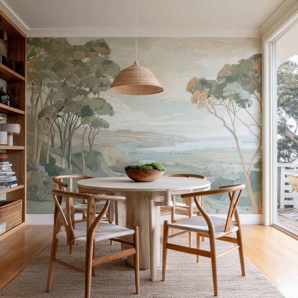
There’s a quiet shift happening in how murals are used within dining interiors. Instead of performing as static illustrations, scenic wallpapers are acting more like visual extensions of space.
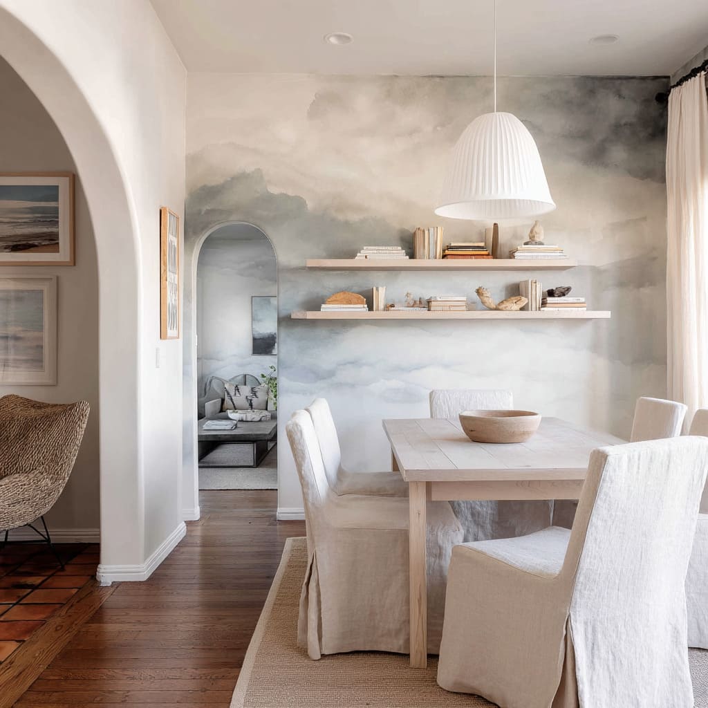
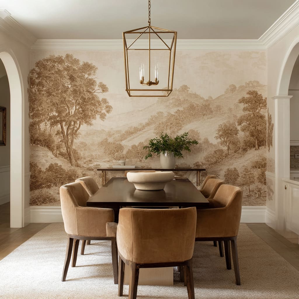
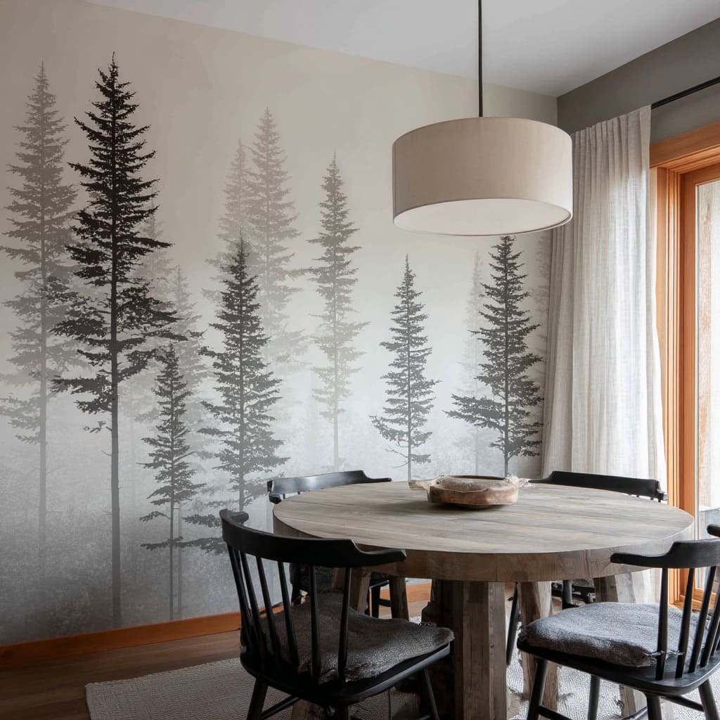
In particular, coastal horizons, fog-filtered forests, and vintage sepia hills no longer sit on the surface—they reach beyond it. What defines these mural wallpapers isn’t their subject, but how they dissolve the sense of boundary.
Full-wall, edge-to-edge applications prevent the eye from hitting a visual stop. Instead, the wall softens and stretches.
The viewer’s gaze drifts outward, pulled by a landscape that appears to continue past the confines of the room.
Color is kept quiet. These murals use soft gradients, faded washes, and foggy layers—tones like misty blue, sage, charcoal, or dusted taupe.
They don’t demand attention. They let the wall recede, letting space feel larger without needing mirrors or glass.
Furniture responds in kind. A walnut table under a sepia forest mural.
A pale oak chair reflecting coastal sand. The most effective rooms echo the mural’s palette not through imitation, but through deepened tones of its key colors.
The result is an interior that feels woven into the backdrop, like furniture set inside a landscape rather than in front of it. What’s happening here is quiet but powerful: the accent wall stops being a background and starts functioning as depth.
Especially in open layouts or compact dining nooks, this technique visually enlarges the footprint without shifting a wall. In rooms using a wallpaper for a dining room feature wall, scenic murals are making a strong case—not as art, but as spatial tool.
The best examples avoid crisp outlines or bold hues. They stretch space by softening it.
The wall becomes a horizon, and the wallpaper reads less as design, more as a borrowed view.
Tone-on-Tone Immersion Replacing High Contrast
Another path modern dining rooms are following involves the quiet layering of similar tones—not competing colors, but variations of the same hue. This approach doesn’t rely on bold pattern or flashy detail to hold interest.
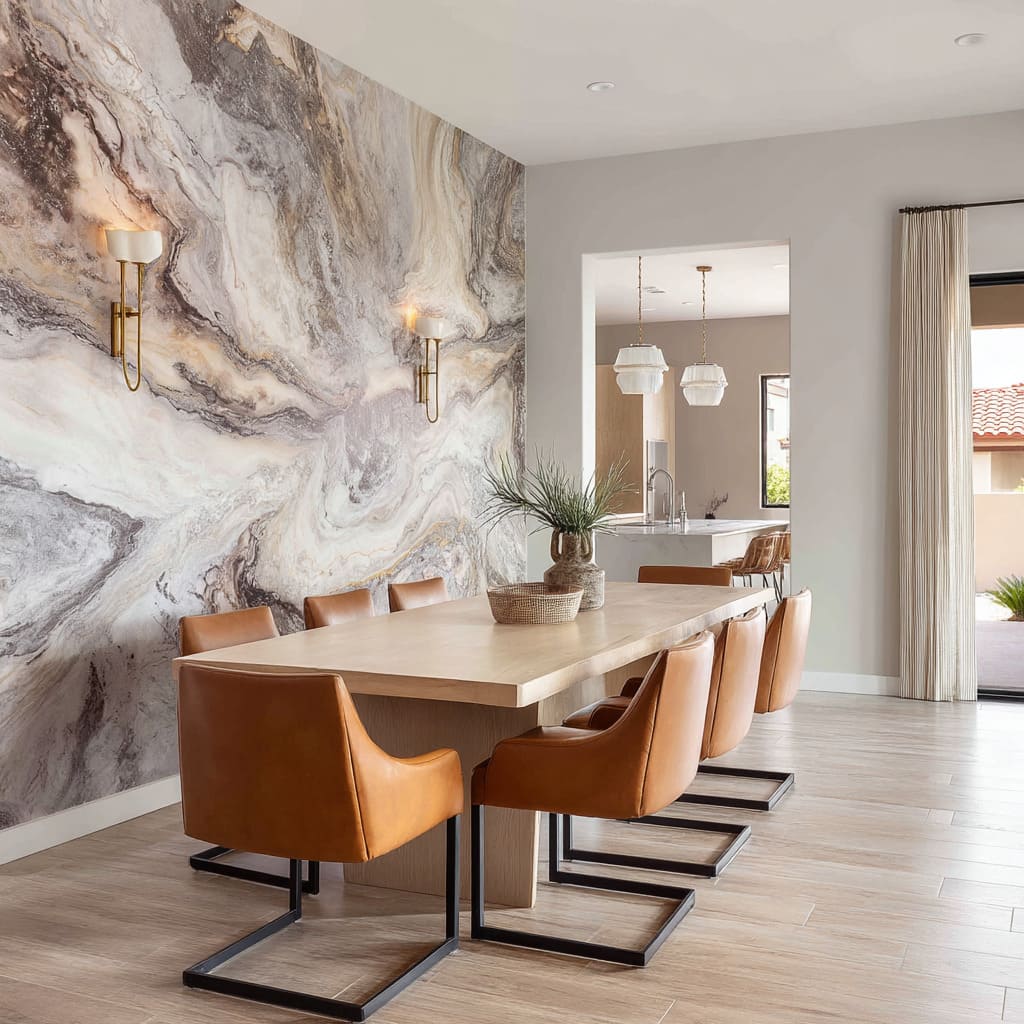
It builds character through depth, value, and texture within a single range. Imagine tan marbling wallpaper behind soft caramel leather seating.
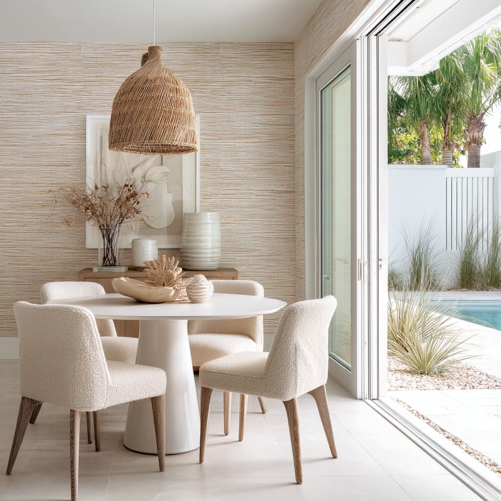
Or a wall of faux raffia, where horizontal straw-like threads play gently against ivory boucle dining chairs. In these spaces, tone is the lead player.
The dining room wallpaper accent wall is no longer a loud statement; it’s a quiet coordinator, pulling wall, floor, and furniture into tight alignment. What allows this to work is restraint.
The difference between the wall color and the upholstery may be only a few degrees of warmth or lightness, but that’s enough. Even highly patterned wallpapers—like micro-motifs or watercolor fields—can feel calm if they remain inside this narrow tonal window.
Lighting supports the mood. Soft brass sconces, ivory canvas pendants, or frosted domes spread warmth without shine.
The light doesn’t bounce; it settles. It shapes shadow across textured surfaces like linen, seagrass, or soft-grain wood, bringing out their depth without breaking the calm.
What separates this approach from minimalism is how dense it can be—patterned walls, thick rugs, layered finishes—but all whispering in the same key. Contrast isn’t erased; it’s narrowed, refined to the difference between matte and satin, between a bleached wood and a warm beige weave.
The visual clarity in these rooms doesn’t come from separation, but from alignment in tone and softness in form. It’s a subtle, immersive effect that reshapes how pattern and color interact.
Where traditional feature walls wanted to shout, these dining rooms prefer to hum—and they do it through a controlled drift of tone.
Soft-Focus Edges for “Moving Stillness”
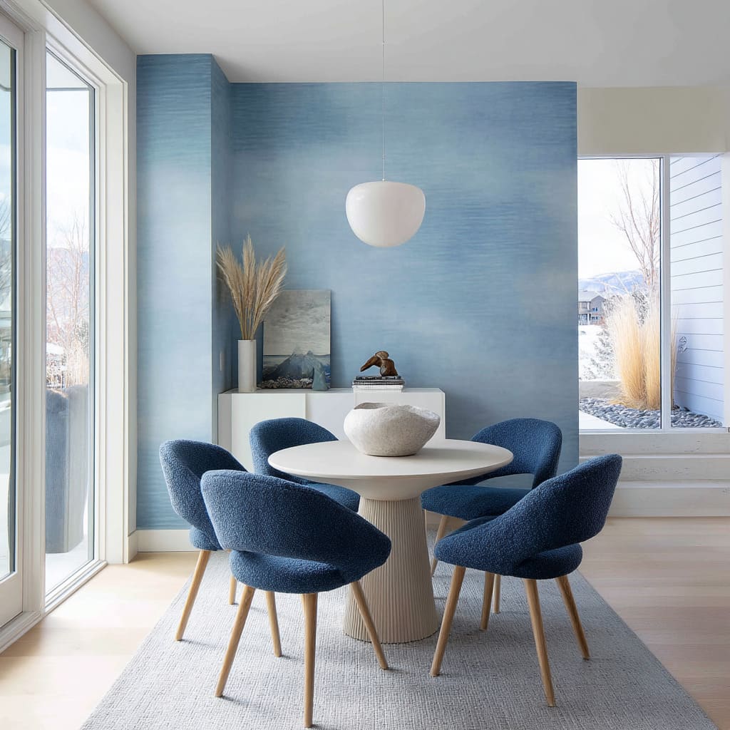
Some of the most visually calming dining room accent wallpaper designs aren’t defined by clear shapes or structured motifs. Instead, they rely on something quieter—blurred transitions that suggest form but don’t lock it in place.
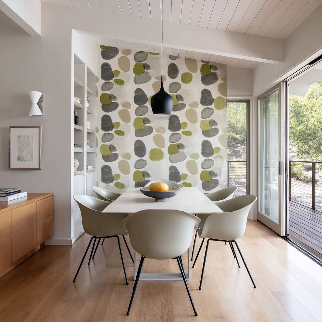
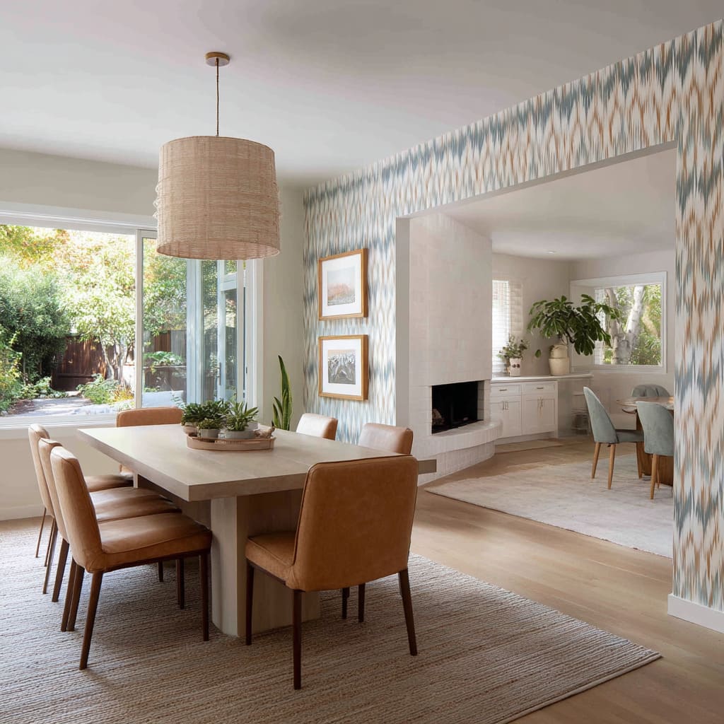
These are the walls that seem to hover between stillness and motion. Watercolor-style cloudscapes, vertical ombré fades, hand-painted brushstroke dots, and ikat-inspired bands all share one thing: edges that dissolve.
They don’t demand attention with sharp contrast. Instead, they invite a slower read, where the eyes move softly across the surface, never forced to settle.
It’s this lack of hard stops that makes the room feel less confined. What makes these wallpapers even more effective is how they respond to changing daylight.
As the sun moves through the space, the hues shift subtly—a smoky gray may appear almost blue in the morning, then warm into olive by dusk. The surface doesn’t rely on repeat patterns to stay interesting.
Instead, it becomes a canvas that changes in real time.
Other elements in the room quietly echo this rhythm. Pendant lights with soft, ribbed ceramics or frosted glass, artwork with bleached edges or smudged brushwork—these details reinforce the sense of slow, natural variation.
The dining space becomes less about symmetry and more about tone and flow. Importantly, this kind of wallpaper dining room accent wall doesn’t try to compete with what’s in front of it.
It acts like air with color—never overwhelming, always responsive. The blur isn’t a loss of structure, but a tool that brings softness to vertical planes, making them feel more like atmosphere than surface.
Graphic Linework as Spatial Organizer
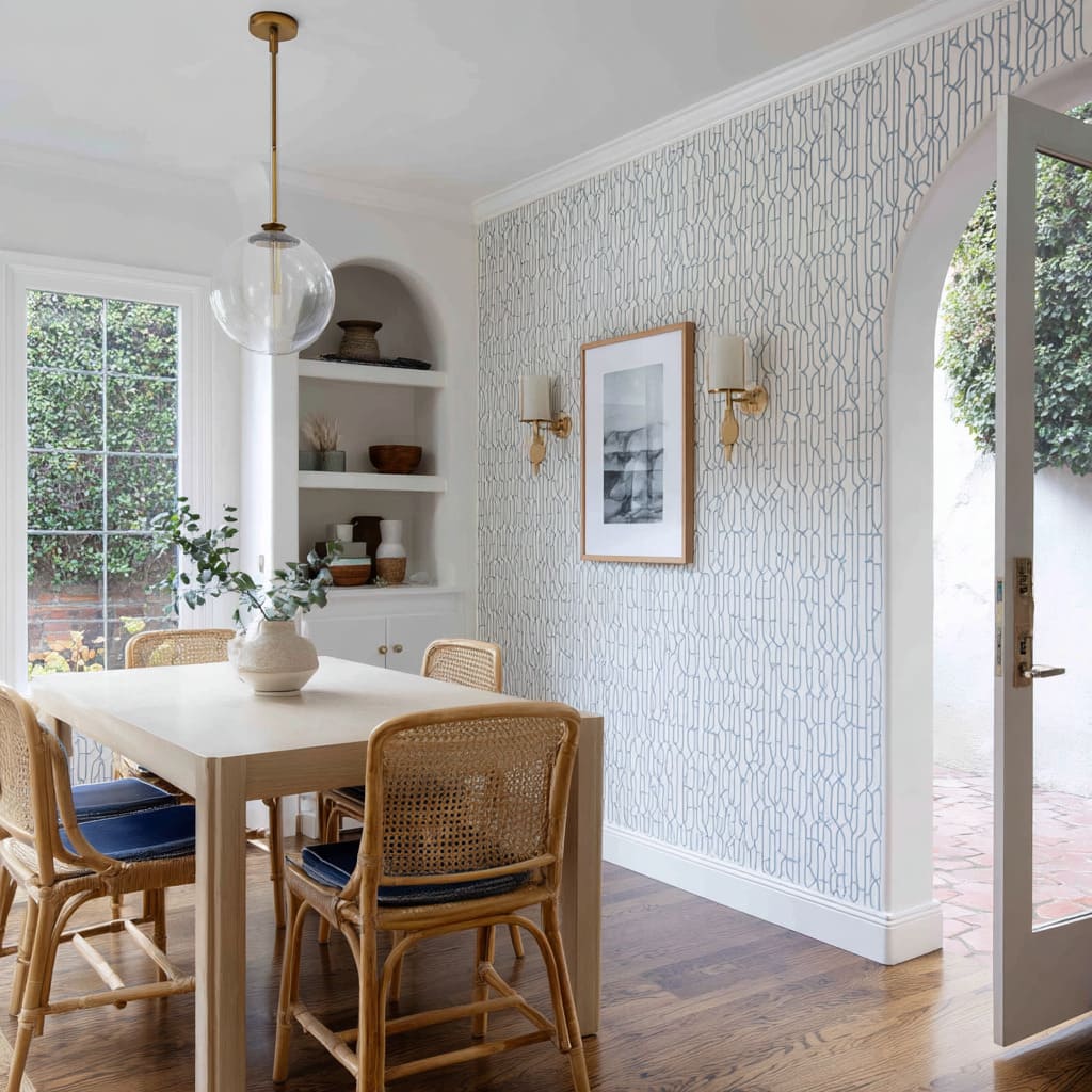
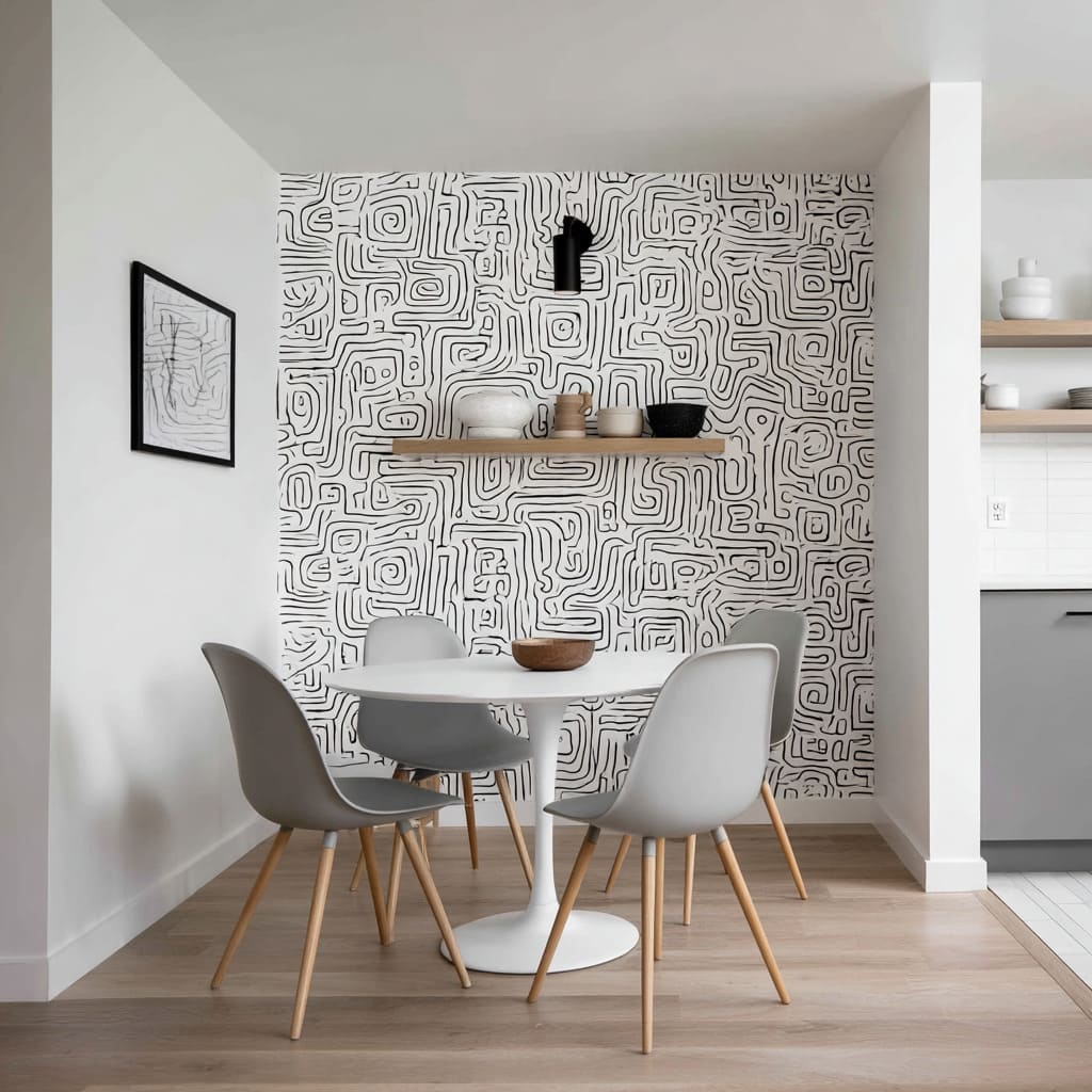
Not all high-impact dining spaces need large patterns or strong color fields. In many recent layouts, graphic linework takes on a unique task: bringing rhythm and organization to compact or open spaces without shouting for attention.
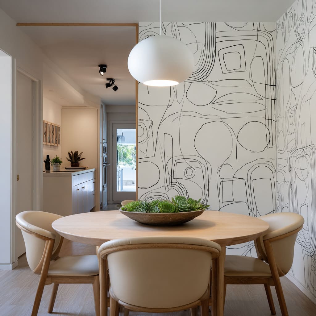
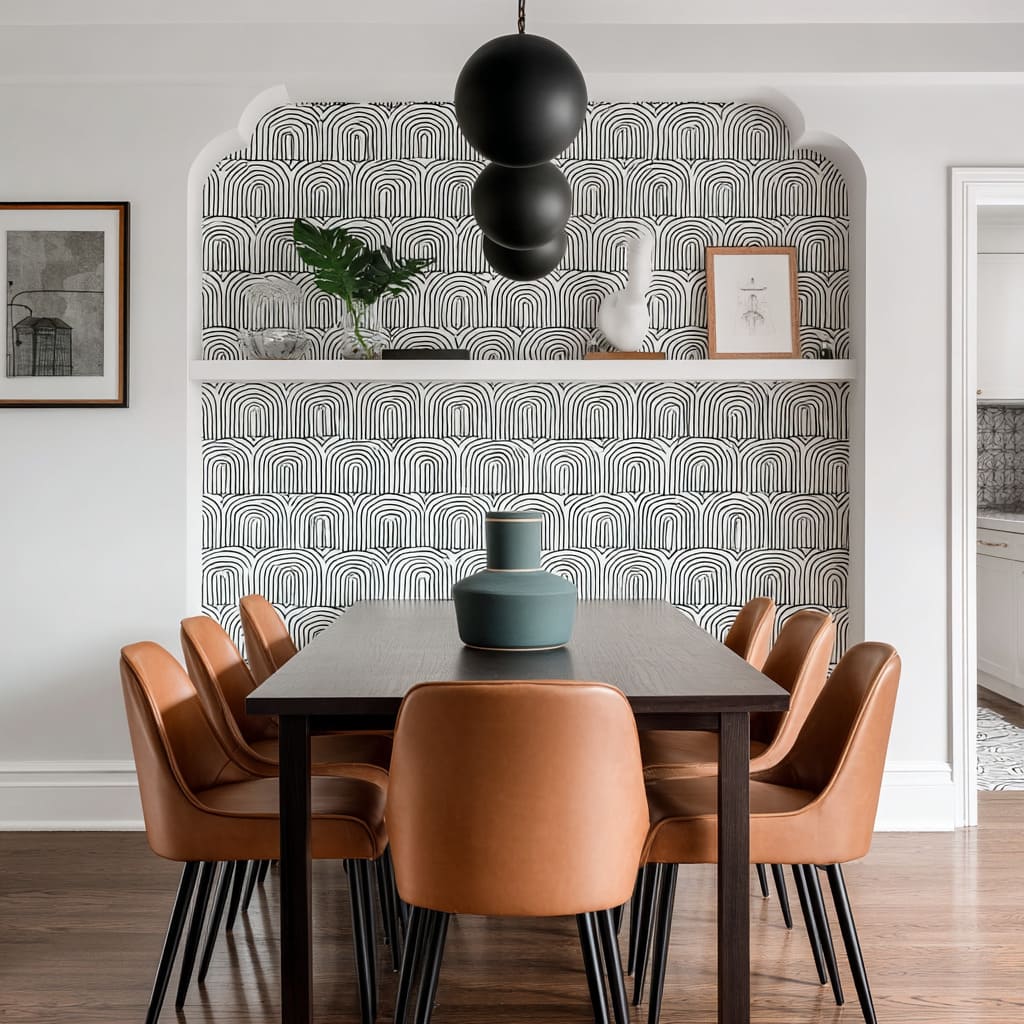
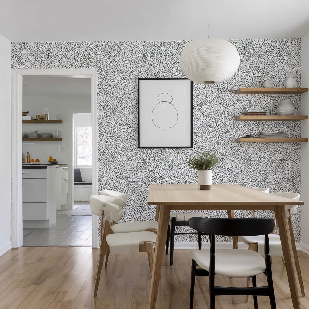
Fine black lines on white grounds—curved, straight, or abstract—carry a visual energy that’s more about structure than style. These wallpapers might reference fingerprints, rainbows, labyrinths, or even loose sketches.
But what sets them apart is how carefully they’re placed and echoed throughout the room.
For instance, when applied within a niche or recessed wall, the linear motif feels grounded. The boldness is limited to a framed zone, giving the wallpaper a sense of containment.
It acts like an internal skeleton—giving form to floating shelves, aligning with the edges of light fixtures, or neatly sitting behind slim framed artwork. The power of this style grows when curves repeat elsewhere.
Rounded chair backs, spherical pendants, arched cutouts, or even a curved kitchen backsplash visible beyond the dining area—they all answer the rhythm set by the wallpaper. This is how a wall pattern becomes part of the room’s architecture rather than its decoration.
Even without color contrast, the repetition of arcs, loops, or measured lines can bind a space together. Dining room accent wallpaper like this adds hierarchy to open layouts and defines corners without physical dividers.
It’s visual structure through geometry. Done thoughtfully, the wall starts to function like a measured beat in a quiet song—steady, predictable, but never boring.
It’s about placing energy exactly where it’s needed, and letting the rest of the room relax around it.
Pattern Contained by Architecture
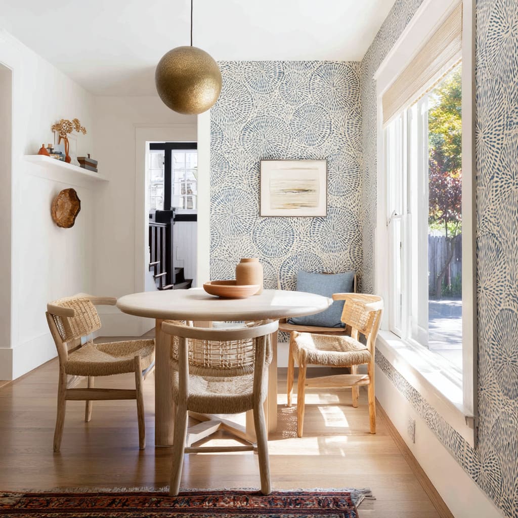
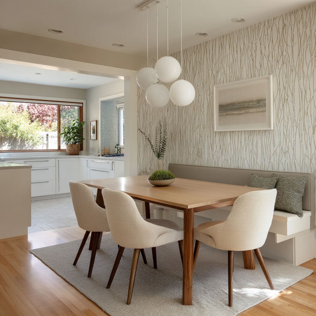
There’s a distinct way bold pattern becomes manageable in dining areas: by tucking it into architectural pockets. Whether it’s a bench alcove, a recessed wall bay, or a panel framed by shelving, this approach lets the wallpaper do its job without overtaking the entire room.
Why it works has to do with balance. A highly graphic or oversized motif can be overwhelming if it spills across every surface.
But when placed inside a physical boundary—say, behind a built-in bench or between vertical shelves—it holds its energy. It performs like a backdrop inside a frame, rather than shouting across open space.
This approach invites experimentation. Stripes, geometrics, or saturated colors feel less risky when they sit inside clearly defined architectural zones.
The eye can enjoy the contrast, knowing that there’s an edge where the visual activity stops. What might go unnoticed at first is that the plain walls surrounding these patterned areas are doing just as much work.
They provide quiet. Their flat, color-consistent surfaces amplify the energy of the patterned space by contrast.
It’s a restraint technique that gives the dining area a rhythm of tension and release. Framed wallpaper can also reinforce symmetry and zoning—especially helpful in open layouts or narrow nooks.
It becomes a grounded visual pause that anchors lighting, artwork, or shelving arrangements without needing additional layers. Some of the most effective wallpaper ideas for dining room accent walls use this principle: limit the area, but increase the boldness.
The structure of the room handles the boundaries, and the pattern brings in the texture, color, or narrative that completes the space.
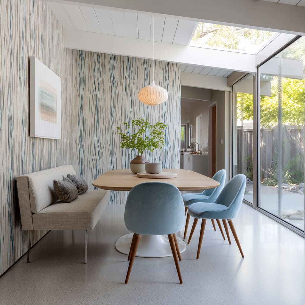
Vertical Rhythm That Lifts Ceiling Perception
In many dining spaces, vertical wallpaper isn’t just decorative—it shapes how height is perceived. Stripes that stretch, brushstrokes that pull, or elongated latticework patterns all contribute to what feels like a taller room, even when dimensions are modest.
What’s especially effective is how these verticals echo the actual architecture. If there’s a clerestory window, a tall arched opening, or floor-to-ceiling drapery nearby, the wallpaper doesn’t compete—it syncs.
The visual lines continue upward, helping the eye move without pause. Lighting completes the rhythm.
A pendant with multiple drops or staggered bulbs mirrors the upward motion, extending the climb from wall to ceiling. It gives the room a rise-and-fall tempo: the pattern pulls the gaze up, and the light fixture settles it down.
This kind of composition relies less on color and more on motion through shape. Pale blues, soft grays, or neutrals don’t need to shout when arranged in vertical brushstrokes or woven reed effects.
They still guide the gaze and give the wall a measured beat that shapes the room. Furniture in these rooms tends to echo the vertical rhythm in quiet ways—tapered legs, fluted wood bases, slim backs on chairs.
Every element plays along with the wall’s upward direction, even if it doesn’t repeat the pattern. What stands out in a strong modern dining room wallpaper accent wall using vertical motifs is the feeling of breath it brings to the space.
It expands the eye’s movement and makes compact corners feel taller. The effect is subtle, but consistent.
One detail rises, another descends—and together, they create a balanced sense of lift.
Natural Texture Illusions Without Literal Material
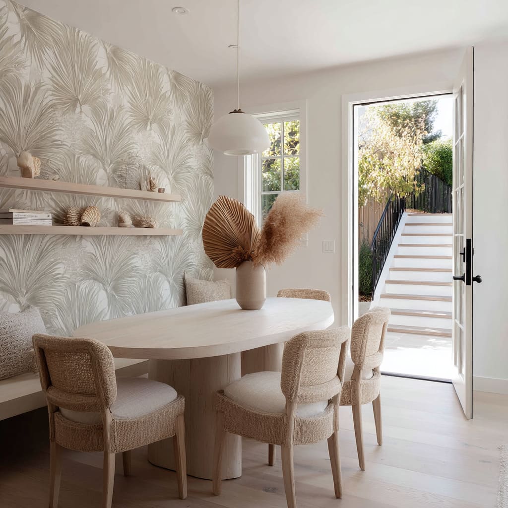
Some of the most convincing wallpapers for dining spaces don’t rely on actual depth—they suggest texture instead of building it. These surfaces stay completely flat but borrow from the visual language of woven fibers, stone veining, or organic layering to imply touch.
Faux-raffia textures, for instance, read like horizontal threads pulled taut across the wall. Their grain is shallow but detailed, catching light in subtle shifts.
Similarly, marble-printed surfaces don’t try to mimic the polish of real stone—instead, they work through soft, matte finishes that absorb daylight gently. It’s this restraint in reflectivity that protects the illusion.
A glossy surface would expose the flatness too quickly.
The trick lies in how these wallpapers are paired with actual tactile materials. A boucle-upholstered chair or a sideboard topped with rattan trays adds physical texture that complements the printed illusion.
The eye sees the wallpaper and believes it belongs to the same world as the real weave or grain nearby. What makes this move so effective is how small variations in tone and direction inside the wallpaper mimic irregularities found in handmade materials.
Even without physical texture, these variations add depth. The pattern might fade gently at the edges or shift from cool to warm hues, creating the suggestion of fiber or stone layers.
This kind of visual play is quiet but powerful. The wall appears to hold weight and tactility without ever interfering with spatial openness.
In rooms where actual woven panels might feel too bulky or costly, the printed equivalent—backed by the right mix of materials—gives a similar richness. The room doesn’t feel flat, even if the wall does.
Instead, it reads as layered—a surface that holds more than color.
Tone Echo: Furniture Shapes Mirroring Wall Motifs
A subtle but effective way to reinforce cohesion in a dining space is through shape alignment—specifically, by letting the forms of furniture quietly echo the patterns on the walls. This isn’t about matching curves perfectly or duplicating motifs.
It’s about letting one form quietly respond to another. Consider a wallpaper filled with arched graphics or soft vertical waves.
When paired with chairs that curve at the back or rounded tabletops, the room gains a kind of internal agreement. The shapes talk to each other—not loudly, but clearly.
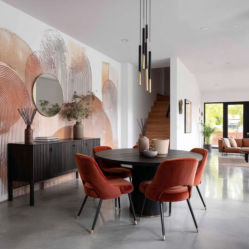
A velvet seat may have nothing to do with the print’s color, but if both share a soft arc, they feel connected.
This technique is especially helpful when colors are intentionally varied. Rust tones beside a terracotta-based mural, or olive upholstery next to a forest-toned gradient—these don’t clash because their shapes support each other.
The wall might swirl in wide brushstrokes; the pendant above echoes it with a wide, shallow dome. It’s all part of the same movement.
What’s important here is that form does the unifying, not saturation. Color takes a back seat.
This lets the overall palette stay broader—allowing pale woods, bold metals, or cool neutrals to coexist with warmer tones—because shape is holding the visual story together. This move is most visible in rooms with murals, arches, or sculptural wallpaper graphics—spaces where bold visual gestures on the wall need grounding from furniture.
Rather than overwhelming or competing, the chairs and lighting quietly fold themselves into the same rhythm. Over time, the viewer may not consciously notice the repetitions.
But the space will feel resolved. This instinctive alignment between wall and object form is one of the reasons certain dining rooms feel calm even with bold pattern—it’s not the palette that carries the mood; it’s the echo.
Storytelling Prints Setting Emotional Temperature
Some wallpaper styles carry more than pattern—they carry tone, memory, or atmosphere. These are not simply visual tools, but thematic cues that shape how a dining room feels before a single word is spoken.
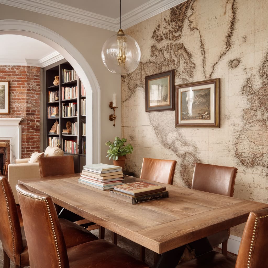
A sepia-toned map can set a scene that leans intellectual. The implied history, cartographic detail, and faded ink lines evoke something closer to a study or a tucked-away library.
Just a few supporting pieces—a worn oak table, a cluster of bound books, or a globe-shaped pendant—are enough to confirm the mood. The room leans into suggestion rather than imitation.
A fog-layered forest mural, on the other hand, doesn’t just create depth; it hints at quiet landscape, early light, and stillness. The shapes are loose, but the intent is strong—this isn’t an outdoor view, it’s a mood pressed into a surface.
Timber seating, charcoal drapery, and diffused lighting complete the thought without overexplaining it. Then there’s the hand-stamped look of indigo block prints, which introduce informality without losing clarity.
This kind of surface reads lighthearted but structured—like an artisan touch on the wall that doesn’t feel rehearsed. What keeps rooms from slipping into costume is control of palette and restraint in accessories.
Once the wallpaper sets the tone, it doesn’t take much more. A few physical accents—if chosen with care—are enough.
Going beyond that tips the balance, making the space feel over-themed. The strength lies in letting the print initiate the story, and the furnishings simply finish the sentence.
In this context, wallpaper becomes emotional shorthand. It shapes perception—intellectual, rugged, crafted—without naming it outright.
Micro-Scale Motifs Creating “Static Texture”
There’s a different kind of visual weight that comes from fine-patterned surfaces—walls where the motif is so dense and small, it almost reads as texture. These aren’t loud designs.
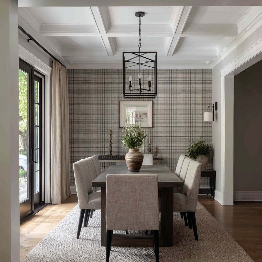
They build character through repetition so tight, it borders on visual vibration. Pebble-like dot clusters, miniature plaid grids, or tiny leaf mosaics fall into this category.
Up close, the detail is crisp. From across the room, it fades into a soft visual buzz.
These surfaces don’t draw attention through shape—they do it through density. This approach works especially well in dining rooms that lean formal but don’t want to feel stiff.
The tight motif creates structure without heaviness. It lends the wall weight, but keeps the atmosphere breathable.
The overall feel is grounded, without ever becoming visually closed in.
The real beauty of these surfaces is how they allow for minimal contrast elsewhere. A single accent—a black-framed chair, a graphite pendant light, or a pale wood buffet—becomes enough to stand out.
In fact, too many bold pieces would compete. The power of this design is in the restraint.
These patterns don’t need color variation to feel dimensional. The motif creates a woven illusion—like looking at fabric under light.
This illusion gives the wall a tactile presence even though it’s entirely smooth. That’s why these micro-patterns often read as part of the architecture rather than added décor.
They hold everything else in place, visually anchoring the room while letting furniture and art breathe. This is the kind of surface that doesn’t call attention to itself until you sit down—and then you notice its quiet persistence.
Texture without texture. Pattern without mass.
Movement without noise. These are the walls that make an impression slowly, but last longer than flashier ones.
Light as Co-Designer
Light doesn’t only illuminate the room—it shapes how the wallpaper is read across time. This is especially true for surfaces with soft matte finishes and tactile-inspired visuals.
These wallpapers don’t reflect; they absorb and redirect light in delicate shifts. The goal isn’t brightness.
It’s quiet reveal. Wallpapers printed with matte inks or fiber-imitating textures behave differently under daylight.
Instead of bouncing glare, they allow sunlight to skim their surface. Patterns unfold slowly—morning light shows one part of the motif; afternoon brings out another.
This movement makes the wallpaper feel active without ever being loud.
A key placement trick is to put these wallpapers directly across from large windows. That alignment ensures natural light has the room to travel, tracing across brushstrokes, weaves, or gradients.
In these moments, the print isn’t static—it refreshes throughout the day, matching the rhythm of shadow and tone in the space. In the evening, the lighting takes over.
Wall-mounted sconces with diffused shades or ribbed pendants with wide glow patterns keep light soft and even. Instead of spotlighting one area, they wash across the wallpaper, helping it remain legible and warm even after the sun sets.
One of the lesser-noticed details in these layouts is how functional elements disappear into pattern. For instance, air vents or discreet speakers are often set into darker parts of the wallpaper.
By placing hardware inside low-contrast zones, the visual field stays clean. Your eye lands on the motif, not the mechanics.
This approach shows how light isn’t just an afterthought—it’s part of the wallpaper’s effect. The best pairings are the ones where light becomes the animator, letting surfaces shift and unfold without ever needing to move.
Boundaries Blur, Zones Connect
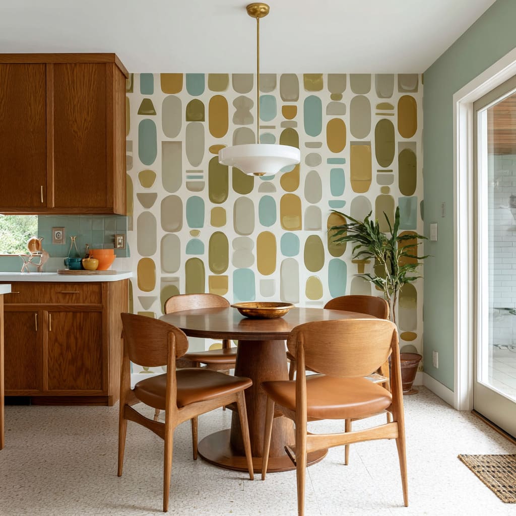
In homes with shared layouts, wallpapers often act like soft bridges between adjoining areas, helping connect materials, tones, and uses without needing structural dividers. A common approach is to choose a print that draws color from two adjacent spaces.
A dining wallpaper might share the walnut tone of nearby kitchen cabinetry and echo the neutral warmth of dining upholstery. In doing so, it becomes a chromatic mediator—quietly unifying both areas without favoring either.
Transitions are handled carefully. Wallpaper rarely stops with a harsh trim.
Instead, edges often fade at natural junctions—around a fireplace surround or at the edge of a hallway corridor. These fade-outs might follow an architectural curve or simply align with a change in floor material.
There’s no fanfare. Just a soft release of the pattern into calm wall color.
In some homes, wallpaper continues around a corner or fills a small recessed zone that connects dining to an entry or lounge. This extension isn’t decorative.
It’s directional. The wallpaper acts as a visual cue, suggesting movement or purpose, like a guide without signage.
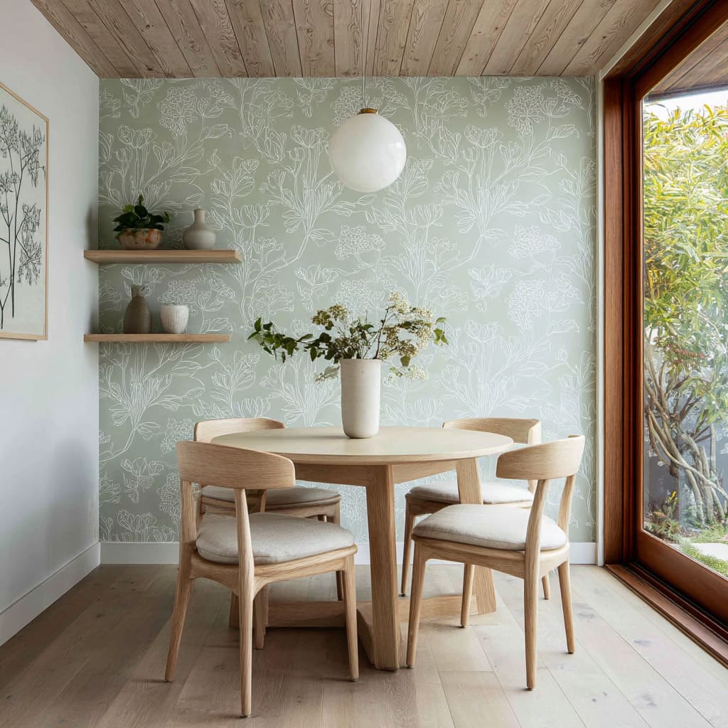
This idea works because color and form are doing the signaling. A brushed blue wallpaper might continue around the pantry arch, or a sage-toned print might flank a built-in bar nook beside the table.
These changes are subtle, but they guide the eye, helping residents and guests understand flow without needing explanation. It’s less about marking territory and more about linking experiences.
The wallpaper steps into the role of connector, not separator. By extending gently, aligning with furniture tones, and fading when needed, it shapes the space without dividing it.
Conclusion
There’s no one-size-fits-all rule for using wallpaper in a dining area—but there is a shared thread: control, clarity, and restraint. Whether the wall carries a soft mural, a bold print, or a barely-there texture, the strongest results come from understanding how the surface will behave over time, under changing light, and in relationship to what’s around it.
Some patterns reach across a wall like a horizon. Others stay tucked inside a framed alcove.
Some walls do the heavy lifting by linking color stories between rooms; others hold the room in place through subtle shape repetition. Even the smallest decisions—like echoing a wallpaper curve in a chair back, or fading a motif around a doorway—can be the difference between visual noise and quiet strength.
A dining wallpaper accent wall doesn’t need to be the loudest feature in the room. Often, it’s the calmest.
But it’s that calmness that makes the space feel settled, clear, and intentional.
Related Posts
Harmony Home Design brings 10+ years of residential interior design experience to the ideas shared here. We publish design concepts, layout thinking, and practical styling notes.
