
A blue and white interior can be almost architectural when the palette is treated as structure instead of decoration. White is not a blank; it is a frame with edges, shadows, and repeatable geometry.
Blue is not a wash; it behaves like punctuation—placed where the eye already pauses: the coffee table corner, the console behind the sofa, the lamp base that sits at shoulder height, the single ceramic piece that gives a dining table its center.


That design pattern works through bright trim, paneled walls, and a fireplace wall treated as a clean volume. The firebox becomes a dark rectangle that steadies an otherwise pale wall, and suddenly blue can stay small without feeling timid.
Even daylight plays a role: large glazing pulls in green outdoors as a living backdrop, so the palette feels fresh without adding extra colored objects inside.


What makes such blue white interior designs persuasive is not the color itself, but the way color is carried by scale, finish, and repetition.


White as an envelope with real edges
In many high-end transitional interior designs, the white shell is built to look intentional in daylight and at night. Ceilings are often smooth and bright, then lit with many small recessed downlights.


That choice matters: an even constellation of light keeps fabrics looking matte and calm, rather than creating one dramatic beam that turns every weave shiny. It also helps wall paneling read as depth rather than decoration, because the panel lines hold gentle shadow instead of hard contrast.

Wall trim and panel molding do something similar. When the rectangles are large and crisply cut, the wall reads tailored, not fussy.
It becomes a quiet grid that can hold patterned ceramics in front of it without competing.

In stair halls and long entries, that grid pairs naturally with a darker railing line or thin black balusters—one continuous dark stroke that sharpens the whole composition. The result is that the eye can accept blue as a small repeating note, because the architecture is already doing the heavy lifting.

Fireplace walls in this palette often follow the same logic: a clean white surround, a simple mantel shelf, and a black opening. The black opening is not there to be dramatic; it’s there to give the wall a base and a graphic center.
In interiors with pale upholstery and pale rugs, that single rectangle can keep everything from drifting into one soft blur.

How blue appears: weight, height, and where the rests
In blue and white interior design, blue tends to land in a few predictable places—not because designers lack imagination, but because those locations match how a room is read.

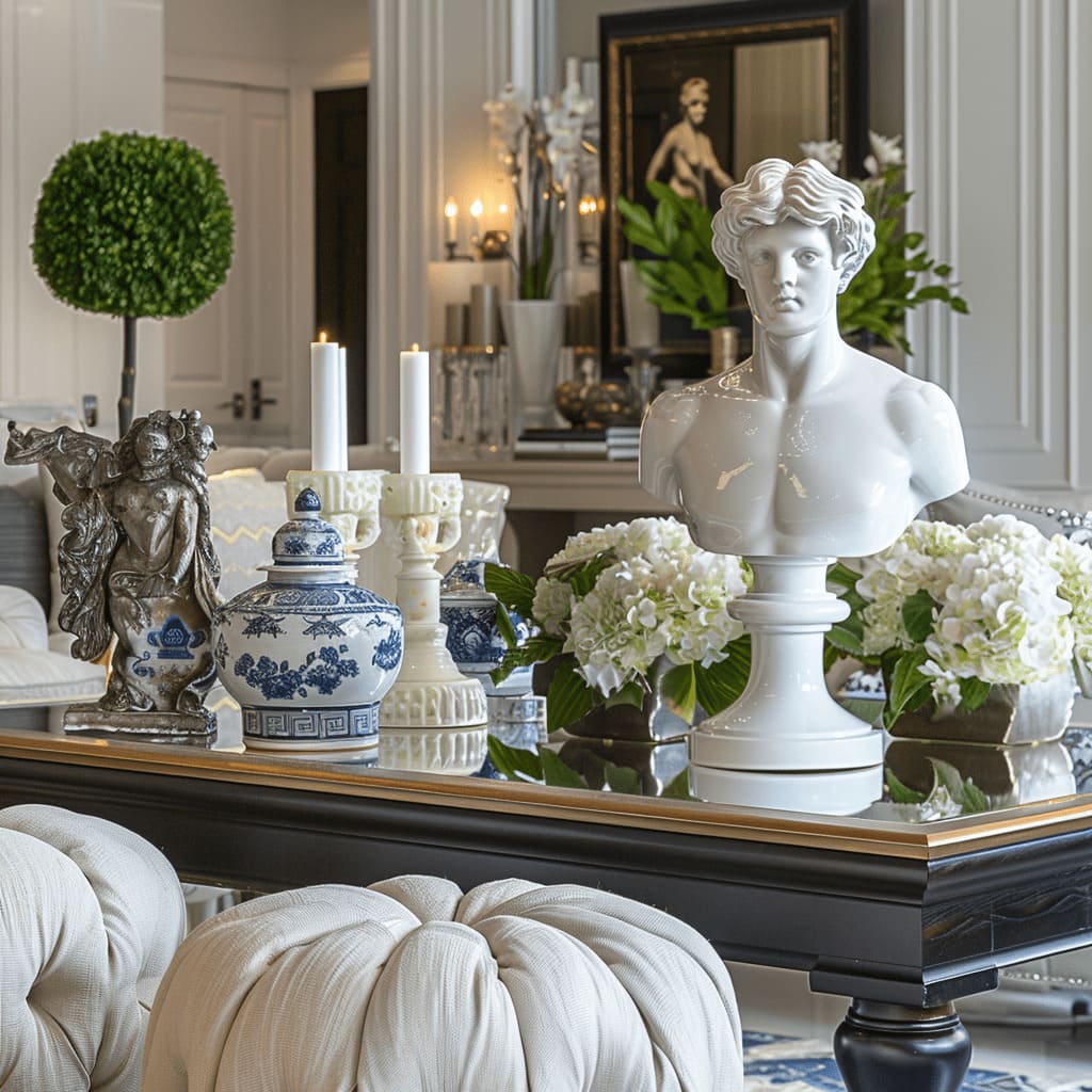
1) At the hand level: coffee tables and dining tables.
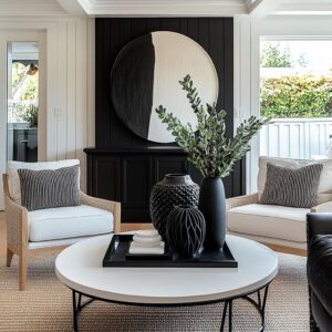
A pale, oversized coffee table (lacquer, light stone, very light wood) is often treated like a stage. One large porcelain jar at a corner can act as the anchor.
The scale is the key: a single oversized piece reads steadier than a scatter of small accessories.

White flowers on top—hydrangea-like clouds, orchids with clean stems—create contrast without introducing another color family. The books underneath are not filler; they turn a formal object into something that feels lived-in, because porcelain sitting on books reads less museum and more home.

That same idea gets translated to dining: a porcelain bowl used as a centerpiece, filled with orchids, or a grouped cluster of jars arranged as sculpture. When the table is glass-topped, the effect becomes lighter and more luminous; reflections let the centerpiece feel present without visual bulk.
When the table is marble-look or polished stone, the veining adds movement so the blue does not have to work as hard.

2) At the eye level: consoles and lamps.
A console behind a sofa often becomes a gallery plinth. Two ginger jars placed in symmetry create rhythm that mirrors the wall panel grid.
Sometimes the display uses hierarchy instead: one tall floor vase with branches, then medium jars, then small pieces. The point is the same—blue reads intentional when it has a size order.

Lamp bases are a second eye-level move that works because they occupy a stable, repeated height. A pair of porcelain lamp bases with simple white drum shades can feel traditional in material but current in silhouette.
In large rooms, that pair does real spatial work: it marks the boundary between living and dining without a wall, and it gives the open plan a readable midpoint.

3) As a tonal echo: art and textiles.
The most beautiful interior designs avoid literal matching. Instead of bright cobalt paintings, artwork often carries foggy blue-gray washes—misty enough to support the ceramics without turning the space nautical.
Pillows take the same approach: deep navy or charcoal-blue may appear, but it sits in the center of the sofa arrangement so it functions like visual ballast. Lighter pillows frame the ends, keeping the seating airy while still grounded.

This is why the palette feels layered even when it is narrow: blue shows up in several intensities—deep in a pillow, saturated in a glazed vessel, softened in art—so the room has depth without extra colors.

Finish is the secret: matte surfaces, then a few places that catch light
A trick is the separation of sheen. Most large surfaces stay matte: upholstery, rugs, wall paint, even many tabletops when they are wood or stone with a softer finish.
Then reflective materials are saved for a few controlled points—porcelain glaze, crystal, clear glass, polished metal.

For example, a crystal chandelier hangs over a pale living area, but the rest of the ceiling is supported by recessed lights. The chandelier gets to be jewelry rather than the only light source.
The same strategy can appear in dining rooms with crystal chandeliers paired with glass tabletops: sparkle repeats at ceiling and table, so the room doesn’t feel top-heavy.

Elsewhere, clear globe pendants do a similar job with a different mood. Transparent globes give volume without blocking sightlines, which matters in open plans.
The warm metal inside the globes—often brass-toned arms—keeps a white room from feeling sterile.

And when brass shows up again on a coffee table base, on candle holders, or in small decorative spheres near glass hurricanes, the room gains warmth through repetition rather than through added color.

There’s also a practical side to this finish logic. A glossy white coffee table top can bring lift to a seating group full of textured fabric, but it needs a dark outline to keep it from dissolving into the rug.
That’s why thin black metal frames show up so often under pale tops. It’s not a trend so much as an optical fix: dark edges define light planes.

Symmetry gives the room its backbone, then softness keeps it human
Many blue-and-white transitional designs lean on symmetry because it makes patterned accents feel calm instead of busy. Two lamps flanking a sofa, two artworks hung as a pair, matching sconces around a fireplace—these moves create order so the eye can accept porcelain pattern without feeling overwhelmed.

But the best design ideas rarely leave symmetry untouched. They add one element that loosens the grip: an orchid spray that arcs outward, a branchy green arrangement in a tall vase, a pair of tufted round ottomans placed in front of a rectangular table.
Those rounded forms matter. In rooms full of panel rectangles and straight trim, tufted circles soften the geometry and make the seating feel usable, not staged.

The same principle can be used in entries and stair halls. Paneled walls and crisp trim can read formal, but a slim console with two chunky knitted poufs underneath changes the temperature immediately.
The wall remains structured; the base becomes touchable. Add a round mirror nearby and the geometry starts to alternate—rectangle, rectangle, circle—so the space feels designed rather than rigid.

Open plans succeed when blue travels in small, repeated notes
Large homes with connected living–dining–kitchen zones often rely on a thread approach: a material or accent appears in multiple zones so the house reads as one story.

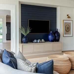
In such concepts, blue-and-white ceramics do that work. A tall vessel near black-framed doors repeats the accent seen on the living coffee table.
A porcelain bowl centerpiece in the dining area echoes the lamp bases behind the sofa. Sometimes the kitchen reinforces the idea quietly through glass-front cabinetry where pale dishware and a few blue pieces are visible, so the color feels embedded rather than applied.

The layout strategies help too. Wide cased openings and aligned sightlines turn the open plan into a sequence: a foreground surface, a seating group, then a dining axis beyond.
Mirrors placed at the end of that axis double light and repeat chandeliers, making the palette feel richer without adding items.

A useful detail in such open plans is how anchors are spaced. The living zone often has a table that reads substantial (stone slab, glossy white block, large rectangle), because open rooms can make furniture feel like it’s drifting.
Dining anchors itself differently—usually through centered lighting and a strong centerpiece spine built from candles, trays, and one porcelain piece set on a reflective base.

Where the look can slip into coastal, and how it usually gets corrected
Most blue and white decorating ideas stumble in one of two ways.

The first is distribution: blue gets sprinkled evenly everywhere—pillows, throws, art, vases, rugs—until nothing feels like the main note. In such concepts that work, blue is concentrated.
One large porcelain piece on the coffee table, a paired set on the console, and perhaps one or two pillows: the room reads collected because the blue comes in legible chapters, not as confetti.

The second is tone: the wrong blue can pull the room toward nautical, especially when paired with stark whites and high-contrast stripes. The interior designs avoid that by letting art carry softened blue-gray, by keeping textiles mostly neutral, and by bringing in warm metals plus natural greens.
Green is not an accent color in the same way; it behaves like a natural ingredient. A branch arrangement or an olive tree gives life and breaks geometry without turning the scheme into a two-color costume.

A small shift in materials often solves it too. When blue is mostly on glazed ceramics rather than on large fabric areas, it reads classic and collected.
When the surrounding furniture stays tailored—clean arms, simple legs, minimal fuss—the palette lands in transitional rather than theme.

A quick check before calling it finished
Blue should show up in at least two heights—one down at table level (coffee table or dining centerpiece) and one up where the eye rests (lamps or a console). Aim for one piece that carries real weight (an oversized jar, a paired set of lamps, a substantial bowl) and let everything else be small and secondary.
Keep the big fields quiet and low-sheen—walls, upholstery, rug—then allow shine to live in a few precise spots like porcelain glaze, clear glass, crystal, or polished metal.

Make sure there’s at least one dark edge somewhere (a firebox opening, black-framed doors, a thin table frame, a railing line) so the pale surfaces don’t blur together. Finish with one irregular, living shape—branches, orchids, an olive tree—so all the panel rectangles and straight trim don’t make the room feel stiff.

Quick scan
- Blue repeats at two heights (table + lamp/console).
- One main blue piece leads; the rest supports.
- Large surfaces stay low-sheen; dark edging + one natural green element keeps the structure clear.

The through-line: blue behaves best as an object, not a paint job
Taken together, beautiful blue and white interior design ideas use a consistent pattern. The palette works when the architecture provides structure—panel grids, crisp trim, framed openings, a fireplace rectangle—while blue is carried by objects that already have cultural weight: porcelain jars, lamp bases, a bowl used as a centerpiece.

The design stays modern because silhouettes are simplified: straight-lined sofas, slim consoles, thin metal frames, clean shades. It stays welcoming because soft pieces do their job: tufted ottomans, textured rugs, layered bedding, chunky knit poufs in the hall.

And the lighting ties it all together. Even illumination from recessed points keeps whites flattering.
Clear glass and crystal add movement without extra color. Warm metal keeps the palette from turning icy.
Blue then has permission to remain concentrated and meaningful—appearing where the room naturally asks for emphasis, then echoed softly so the home feels whole.
Related Posts
Harmony Home Design brings 10+ years of residential interior design experience to the ideas shared here. We publish design concepts, layout thinking, and practical styling notes.