
From mountain foothills to desert flats and wooded suburbs—interior designers are rethinking what Scandinavian style looks like in local contexts. Instead of replicating northern European interiors room-for-room, they’re working with light, climate, and regional materials to shape spaces that feel connected, restrained, and quietly modern.
What’s emerging is a broad interpretation of Scandinavian aesthetics that feels more adapted than copied. These rooms lean into layered textures, low-set furnishings, and soft geometries, all while responding directly to their surroundings—whether that’s dry air, coastal moisture, or filtered forest light.

It’s not about keeping spaces empty. It’s about giving each surface and object room to hold meaning.
In many cases, walls are chosen to reflect light rather than stand out, while fabrics focus more on touch than pattern. Even the most sculptural pieces are often kept visually quiet, allowing volume and shadow to do the work.
This approach brings fresh perspective to Scandinavian living room ideas, showing how principles of calm, tactility, and honest material use can work across different home types—especially when reinterpreted through regional context, architectural scale, and a sharp awareness of how comfort looks and feels in an American setting. This way, Scandinavian influence becomes less about visual mimicry and more about thoughtful interpretation.

Palette Logic: Quiet Families of Neutrals
In many Scandinavian living room designs, muted tones are doing far more work than they appear to at first glance. What might seem like a plain wall color is actually a finely balanced tint meant to react with sunlight, shadow, and nearby natural tones.
Cool greens with a gray lean, and barely-there blue shades are often placed intentionally to reflect the foliage or the wide sky outside the window. These aren’t colors that shout—they whisper just enough to pull the outdoors in without visual noise.

In warmer regions or dry climates, tones shift closer to sand, pale limestone, and wheat. These soft neutrals often echo the natural stone or soil of the landscape itself, letting light from the window tint the surface rather than relying on heavy paint.
It’s a color logic that feels more linked to environment than trend—walls behave like filters rather than focal points.

To keep things from feeling flat, many designers add a single saturated detail somewhere in the room. A deep burgundy chair, an olive-painted wall section, or a rust-colored pillow might appear just once.
These darker tones often match something already grounded in the space: a piece of metal hardware, a ceiling beam, or even the clay in a nearby decorative vase. It’s not repetition that defines the mood, but restraint.
The strength of the composition comes from the limited use of intensity.

These palettes are quietly confident. A successful setup often starts by picking a neutral range that belongs naturally in that setting—something that seems at home in the region’s weather and views.
Then, instead of layering more shades, designers add weight only where it makes sense visually—usually in places where mass or shadows already fall.

Texture Before Color
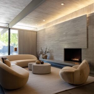
Before the color choices even begin to register, it’s usually the surfaces that speak first in a nordic style living room. The finishes carry much of the design’s depth—some even shape how the daylight behaves inside the space.
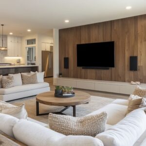
Surfaces such as matte microcement, sand-coated plaster, or lime-finished walls subtly soften light and slow its movement across a room. These materials don’t just reflect; they absorb and diffuse, which is why even a pale wall can feel layered and atmospheric.

Soft textures do a lot of heavy lifting without creating any visual noise. Boucle fabric, ribbed wool upholstery, and looped rugs quietly scatter reflected light.
Their role isn’t decorative in the usual sense—they add softness in both appearance and sound, offsetting the sharper lines of architectural elements like window frames or open shelving. These materials stay close to the human scale and encourage quiet physical comfort.

Natural woods appear almost untreated in many of these spaces. Whether it’s a coffee table with lightly sanded plank ends or ceiling beams that still show saw marks, wood is chosen for its grain, not just its tone.
Sometimes those details are left intentionally rough, but only where they don’t get touched—mantels, beam soffits, or table sides. These rough areas catch light in uneven ways, adding visual rhythm without feeling unsafe or unfinished.
It’s a style that uses texture as its main storytelling tool. In rooms where color takes a step back, surface plays the lead role.
The sense of depth comes not from contrast but from how light reacts to the room’s finishes throughout the day.

Geometry & Volume Management
One of the most effective visual strategies in a scandinavian interior design living room is how geometry is used to shape both movement and stillness. While the furniture might seem simple at first, its placement and form often respond to the size and proportions of the space more subtly than expected.
In American homes—where living rooms often have wider footprints or lower ceilings—designers have leaned into two key geometry moves to keep rooms feeling visually balanced without adding clutter.

The first is the introduction of soft curves to break up long horizontal lines. Crescent-shaped sofas, oval coffee tables, and gently curved sectionals help steer the eye away from walls or window grids.
These softer forms pull attention inward, making a sitting area feel more connected and less like it’s floating in a large, echoing box. Curved furniture also tends to echo existing shapes in the room: arches in doorways, rounded corners in built-ins, or even the shape of a window frame.
This mirroring effect connects furniture to architecture in a way that feels natural, even if the room itself is brand new.

The second move is horizontal stacking. Floating shelves, long low benches, and thick slab tables work together to draw the eye from side to side rather than floor to ceiling.
In homes where the ceiling height doesn’t stretch much above standard, or where fireplaces span an entire wall, this technique is key. By layering mass at the midline, the design pulls the space outward and calms vertical tension.
These volume decisions aren’t accidental. In many cases, the radius of a chair back or table edge quietly repeats the curvature of some nearby architectural detail, even down to the soft curve of a built-in nook or archway fillet.
It’s these small, almost unnoticed repetitions that make a room feel consistent even without symmetry.

Lighting Approaches
Lighting in these interiors is rarely about the fixture. It’s about what the light hits, and how it moves.
A common thread in both large homes and smaller layouts—especially those drawing from scandinavian small living room ideas—is the decision to keep artificial lighting tucked away or softened by material and shape. In many rooms, the glow comes from indirect LEDs hidden behind shelves or inside architectural coves.
This approach shifts the focus to how textures react to light, rather than letting fixtures dominate the view.

In taller spaces, oversized paper lanterns or pleated pendants step in as gentle vertical markers. These add softness above eye level, especially where ceilings might otherwise feel too empty.
The scale of these fixtures is rarely an accident—they’re large enough to fill volume without creating visual weight. Their glow is even and subdued, often casting light sideways instead of downward.

Natural light, though, is often the true centerpiece. In various interiors inspired by Portland, Los Angeles, or hillside homes further inland, the fabric on the windows does more than block glare—it edits the quality of daylight.
Linen sheers, gauze curtains, or finely woven Roman shades allow sunlight to enter at a softened angle, diffusing brightness without stripping away the view. These treatments often respond to the angle of the sun through the day, rather than being left to hang as afterthoughts.
What ties these lighting choices together is a shared belief in lighting as a backdrop. It shapes how colors appear, how textures register, and how depth plays out across a space.
Even the smallest glow tucked into a shelf can add volume and structure to a wall. Light is treated as a quiet part of the architecture, not an accessory.

Furniture Scale & Comfort Fusion
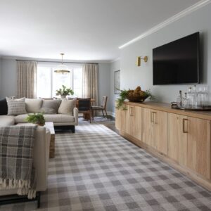
There’s a clear balancing act happening across many scandi living rooms in American homes — comfort is prioritized, but without losing the clarity that defines Nordic spaces. One of the most noticeable patterns is how low the main pieces sit.
Sofas and sectionals are almost always kept close to the ground, rarely rising above standard coffee table height. Their structure leans toward boxy silhouettes, but they avoid looking heavy by using light or recessed legs, keeping the footprint soft and grounded.

Sectionals are often modular, made with deep seats that invite lounging but without leaning into overstuffed shapes. The upholstery sticks to textured neutrals — boucle, cotton-linen blends, or subtle ribbed weaves — giving enough volume for comfort while remaining visually clean.
Even large sectionals avoid bulk by staying under 18 inches in seat height and minimizing ornamentation. That low visual mass helps maintain open space in rooms where the architecture needs to breathe.

Sculptural chairs play an important supporting role. In most layouts, you’ll only find one or two — a sling chair in raw leather, a Safari-style frame, or a blocky boucle seat with exposed wood arms.
They don’t match the sofa; they challenge it a little. Their angles, textures, and materials bring in variety and often turn to face windows or create conversational arcs across the room.
Coffee tables in these spaces are heavy in appearance but softened in surface. A block of travertine, a raw plank slab, or a poured concrete cube might take center stage — but none of them reflect light.
Finishes stay matte, helping the table visually recede despite its size. And their height?
Always kept below the knee, keeping focus on what’s around, not what’s between.

Styling & Object Economy
Across many nordic living room ideas, the finishing details don’t feel like decoration — they feel like structure. The way books, vessels, and natural materials are placed tells you that styling here is about rhythm, not layering.
Every object has a purpose in the visual order, and that shows most clearly in how height, spacing, and surface finish interact. On open shelves and built-ins, you’ll often see groupings of ceramic pieces in neutral tones — bone-white, terracotta, stoneware in unglazed textures.
These are arranged in sets of odd numbers and in height progressions that either draw the eye toward the top of the wall or gently slope toward a window or landscape view. The logic is quiet but intentional — nothing feels crowded or purely decorative.

Plants are used sparingly but meaningfully. A tall vase of dried stems, a bonsai in a low ceramic pot, or a moss garden tucked into a recessed tabletop space introduces movement without relying on bright color.
These are living or once-living elements that connect back to the landscape — but in a muted, shape-forward way. Books show up too, but never in long vertical rows.
More often, they’re stacked flat, used to create height layers beneath objects — acting like small pedestals rather than visual noise. Covers are usually removed, or color-coordinated to fit the space.

One subtle but important theme is how materials are grouped by temperature. Clay and oak tend to sit near each other, while concrete, pale stone, or cool-toned ceramics appear elsewhere — rarely do they share the same shelf.
This creates clarity without calling attention to itself. It helps the eye read the scene in one pass, without internal conflict.
This approach to styling isn’t about minimalism in the pure sense — it’s about alignment. Every item speaks to the room’s structure, and every surface has space to breathe.

Integration with Architecture & Site
One of the most compelling traits of a Scandi inspired living room, especially in American homes, is how naturally it blends into its surroundings rather than sitting apart from them. The materials chosen for the walls, the way windows are framed, even the texture of a bench or a ceiling beam — all of it responds to the local climate and architectural rhythm.

In dry, sun-heavy regions, finishes like microcement make sense — they resist cracking and absorb light without reflecting it harshly. In humid, breezy coastal areas, you’ll often see limewash coatings that let the surface breathe and age with the air.
In colder climates, plaster isn’t just decorative; it carries thermal mass, helping the space hold warmth long after the sun sets. These material decisions stretch beyond the walls.
Where the window meets the landscape, there’s often a deliberate decision to frame, not hide. A black metal mullion might slice through a large pane of glass, drawing out the horizontal line of a mountain range or echoing the angle of a nearby rooftop.
In timber-rich areas, natural wood frames do the same — pulling interior geometry into the landscape instead of separating it.

The continuity also appears in the structural materials. In homes around Texas, limestone often finds its way indoors, tying foundation and façade together.
In desert climates, you’ll spot travertine used across thresholds and living spaces without change in finish. Coastal regions, especially in the Northeast, lean into details like driftwood-inspired ceiling beams — weathered, tactile, and clearly tied to the environment.
This isn’t about matching. It’s about response.
The strongest examples don’t look like imports; they reflect their site as clearly as they reflect the influence of Nordic homes. And the results feel grounded in both place and principle.

Strategies for Different Home Types
| Home Type | Key Moves |
|---|---|
| Compact Cottage / Urban Bungalow | Use arched niches and window benches for storage + seating. Opt for single sculptural chair plus floor cushions to free up volume. Let daylight be primary light source |
| Desert Modern | Wrap walls in color-matched microcement; blend sofa base into built-in platform for seamless look. Use dried flora to echo outdoor silhouettes |
| Mountain / Forest Retreat | Lean on boucle sectionals, knotty plank tables, and jute rugs. Permit fireplaces and stone planks to stay rough; let windows act as artwork |
| Mid-Century Renovation | Paint exposed beams white, keep tongue-and-groove ceilings intact. Combine low boucle seating with matte black cube tables for updated contrast |
| Large Suburban New-Build | Introduce mass with limestone or concrete feature walls, then soften using pleated paper globes and linen drapes. Oversized sectionals should curve or tuft to avoid bulkiness |

Final Thoughts
There’s a quiet power to the scandinavian interior living room spaces, and it rarely comes from ornament or trend. What makes them work so effectively is how closely they follow a kind of internal logic.
Color doesn’t float—it relates to the local light. Texture isn’t applied for flair—it becomes part of the architecture.
Furniture doesn’t just fill a space—it shapes how the room is used, seen, and moved through.
Whether set against a backdrop of canyon hills, coastal fog, dense forest, or suburban sprawl, the same approach consistently appears. Start with a pared-down palette that mirrors its setting.
Layer in texture that diffuses light and softens echo. Let furniture be both form and comfort. Let lighting come from above, below, or behind—but never center stage. Style only what adds rhythm. Then pause. The empty spaces are just as much a part of the design as the filled ones.
This isn’t replication of Nordic homes—it’s translation. A visual language built from climate, comfort, and calm visual order.
And that’s exactly why it feels lasting.
Related Posts
Harmony Home Design brings 10+ years of residential interior design experience to the ideas shared here. We publish design concepts, layout thinking, and practical styling notes.