
Luxury in contemporary interior design often arrives through restraint. The palette may be deep and moody or bright and airy, but the logic tends to repeat: large surfaces stay disciplined, the best materials sit where the eye lingers, and contrast is placed with intention so the interior design looks structured instead of styled.
That’s the core of luxury contemporary interior design—not a single look, but a set of habits that make modern spaces feel finished, expensive, and livable at the same time.

Modern vs Contemporary vs Transitional in Luxury Interior Design
Modern is a specific family tree: think mid-century roots, clean planes, long horizontals, and details that feel engineered rather than ornamental. It is often in moves like a low linear fireplace cut into a dark slab, flat-front cabinetry with minimal hardware, and big simple volumes that rely on proportion and shadow to look sharp.

Contemporary is the current design language, so it shifts with what designers are doing right now; it can borrow modern geometry, but it also folds in newer signals like smoked-glass or crackle-glass globes, black-framed glazing grids, and layered lighting that makes neutral rooms feel richer at night.

Transitional sits between the two: classic structure (symmetry, panel grids, porcelain references, chandelier presence) paired with today’s restraint—simplified furniture shapes, fewer patterns, and bolder material planes (stone bands, dark frames, thick tables) so the result feels current without dropping the familiar architecture.

Thickness, scale, and the furniture-like use of stone
A high-end design move is to treat stone and wood as furniture volumes rather than finishes. It is often on waterfall islands that read like monoliths, in wide fireplace bands that stretch horizontally like a shelf of stone, and on dining tables with tops thick enough to hold their own under a dramatic pendant cluster.

When stone is the star, the surrounding planes often become deliberately plain. A full-height veined slab can behave like artwork—branching grey lines on a light field, or white veining sweeping through black—so cabinetry steps back into flat, handle-minimal fronts.
The luxury signal comes from the hierarchy: one dramatic surface, then a supporting cast of calm planes that make the stone feel intentional instead of busy.

Even in kitchens that lean bright, the same idea shows up as a long marble island and a matching slab backsplash, with warm wood and creamy cabinets acting as the buffer that keeps the veining from feeling loud.

Scale matters here in a quiet way. A large island with thick edges looks permanent; a thin, delicate top can look temporary, even with an expensive material.
Likewise, a coffee table that is oversized and low tends to stitch a seating group together, so the room reads composed rather than scattered. This is why round, substantial tables show up again and again in high-end living rooms: they anchor circulation, soften sharp architecture, and give styling a stable base.

Contrast that frames the interior design
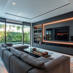
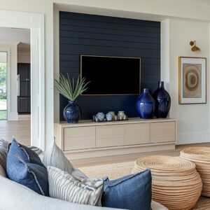
In luxury contemporary interior design, contrast is treated as a frame. Dark window grids, black-framed sliders, charcoal cabinetry volumes, and deep firebox openings act like outlines that keep pale upholstery and light walls from blurring together.
Notice how often the darkest notes sit at the perimeter (side cabinets, tall cabinetry masses, window frames) and at the center (a fireplace void, a black faucet on a white island, the TV/firebox axis). That placement creates structure without needing lots of pattern.

A useful detail: a single dark punctuation on an otherwise white surface can do more than several small accents sprinkled around. A black gooseneck faucet centered on a bright island gives the stone a focal mark, so the countertop doesn’t feel endless.
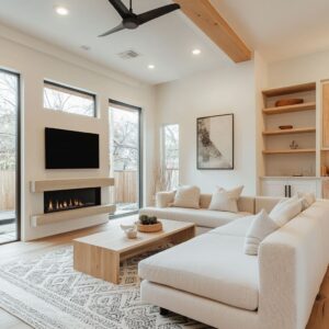
In living rooms, a deep rectangular firebox opening performs the same job—one clear void that gives the eye somewhere to land, making the surrounding stone or plaster feel deliberate rather than flat.

Lighting that behaves like finish
High-end contemporary designs often build a layered lighting story: ceiling fill for evenness, then a few decorative moments that add sparkle, warmth, or softness at the heights where the eye naturally rests.

Globe pendants are a recurring tool because they can be dramatic without being visually heavy. Amber glass brings warmth to dark rooms and makes wood feel richer; clear glass keeps the ceiling airy and lets the bulbs read like small points of glow.
Textured glass—dimpled, hammered, crackled—does something subtle but important: it breaks up the light so it feels refined rather than glaring, especially around stone surfaces that like to reflect.

There’s also a pattern in how the best rooms handle shine. Sparkle is usually concentrated, not everywhere.
A crystal core inside a globe pendant filters glitter into a contained zone over an island. A bubble or tube-glass chandelier adds shimmer overhead, then that same light is echoed at table height with one reflective tray, one warm-metal bowl, or a polished coffee-table surface—just enough to link top and bottom without turning every object into a mirror.

Warmth needs calibration. In moody charcoal interiors, warm bulbs prevent skin tones and wood from going cold.
In bright white kitchens and pale bedrooms, warm-neutral light keeps the space inviting without pushing whites into a yellow cast. The luxury feel often comes from getting that balance right so materials read true.

Shape families: the hidden organizer
A lot of expensive contemporary interior designs look effortless because they repeat a small set of shapes in different materials. Circles are the obvious example: round dining tables paired with globe pendants, a large round artwork near a fireplace, then a round coffee table that brings the same geometry down to seating height.
Rectilinear architecture can start to feel corridor-like; a round table or a cluster of spheres interrupts that and makes the space feel human.

Vertical rhythm is another quiet organizer. Fluted table bases, slatted consoles, ribbed cabinet fronts, and built-in niches with evenly spaced shelves all create fine-grain stripes that add detail without busy pattern.
In open-plan rooms, a long low console with vertical slats under a large artwork can turn a wall into a gallery moment: one big rectangular field anchored by a strong horizontal line, then softened by a few rounded ceramics.

Styling that reads like a still life, not clutter
Luxury interior designs tend to style low and weighty. Tabletop compositions stay under the pendant line so the sightline remains open into the lounge beyond.
Objects are grouped tightly rather than scattered: one matte vase, one bowl, one stack of books, maybe one tray. That grouping makes the table feel usable while still intentional.

A recurring high-end trick is pairing materials that behave differently under light. Matte black absorbs light and reads as pure shape; clear glass catches highlights and reads as sparkle.
Put them together on a console or coffee table and the vignette gains depth without adding color. The same pairing shows up at larger scale too: smoky cabinetry or charcoal walls beside a reflective glass pendant cluster, so the room has both depth and lift.

Color, when it appears, is usually concentrated. Deep burgundy florals show up as a single dark focal note because they read rich against neutrals and stone.
Blue often appears through porcelain or a stone fireplace band—glossy, patterned, and crisp—so it feels collected rather than like a fabric trend. The key is that the accent repeats at least once: a blue stone moment plus a single blue pillow, or porcelain in two niches rather than one lonely vase.

Open-plan depth: foreground, middle distance, background
Some of the strongest contemporary design concepts use the camera logic of cinema: a strong foreground anchor, a softer middle distance, and a clear background view. A dining table becomes the near platform, the lounge turns into the mid zone, and glazing to a garden reads as the far mural.
Black window grids sharpen that outdoor texture and link it back to interior black lines, so the view feels composed rather than accidental.

This is also where plants and branches do real work. In designs full of panels, grids, and long horizontal lines, irregular stems introduce a living counter-shape.
They connect inside to outside, but they also keep the interior from feeling too rigid. Often the best placement is where the room risks becoming overly rectilinear: beside the glazing, near a fireplace band, or on a console under large art.

Bedrooms: symmetry, depth pockets, and controlled ornament
In high-end contemporary bedroom concepts, the wall behind the bed is frequently treated as architecture. Panel grids, framed surrounds, and built-in wings act like a stage set that makes the bed feel anchored.
Symmetry shows up, but it’s rarely sterile: one side might carry a branch arrangement while the other holds more object styling, so the room feels balanced without looking cloned.

Built-in niches are a particular luxury move because they control where detail lives. The main wall panels stay smooth; the niches become the place for pattern and shine.
Warm backlighting in a walnut or smoky recess turns porcelain, ceramics, and sculptural objects into a small gallery, especially at night. This is the logic behind contemporary luxe interior design in bedrooms: quiet large planes, then a few concentrated zones where light, pattern, and reflection are allowed to be present.

Lighting stacks vertically in these rooms as well. Overhead sparkle (crystal strands, smoked globes, crackle glass) is paired with slim vertical brass stems or pendant sconces near the nightstands, then sometimes a lower reflective note at bench height.
That multi-height approach makes the room feel layered without adding more furniture.

Finishes and sheens
A polished interior usually has a sheen plan, even if nobody names it. The simplest rule is to keep the biggest surfaces low-luster so they hold light smoothly, then concentrate sparkle in a few intentional places—glass, crystal, and small metal notes—so shine feels like jewelry instead of a coating.
- Walls: In darker, moody rooms, matte or a plaster-like finish helps the charcoal/graphite range look deep instead of streaky under downlights. In brighter rooms, a soft sheen (think velvet/eggshell territory) can keep pale walls from looking chalky, but it should stay subtle—light should glide, not flash.
- Cabinetry and millwork: Satin is the sweet spot for most high-end cabinetry. Too flat can look dry and dusty under strong daylight; too glossy telegraphs every reflection and fingerprint and starts to feel laminate-like. If you have glass-front displays or deep niches with spotlights, keeping the surrounding cabinet faces satin prevents the whole wall from turning into competing highlights.
- Stone and large slabs: Decide where you want reflection to live. Honed/soft-matte stone works well on big, dramatic veined planes (backsplashes, fireplace surrounds, waterfall islands) because it keeps the veining graphic without turning the surface into a mirror. Polished stone is best used in tighter doses—tabletops, a single fireplace band, or a feature panel—where you actually want a controlled glint.
- How to avoid sparkly cheap-shiny: Put texture between the bulb and your eye. Dimpled amber globes, crackle glass, textured cylinders, and crystal cores inside clear globes all break reflections into smaller, finer highlights, which feels refined instead of glittery. Pair that with brushed metals (brass that looks warm, not mirror-bright), matte black frames, and matte ceramics on consoles and tables so the shiny elements stay special rather than everywhere at once.

A Final Step Back
Before the room gets signed off, it helps to step back and see whether the contrast is doing its work in a few intentional anchors. The darkest notes tend to land best where they can structure the whole view—at the perimeter (window grids, door frames, tall cabinetry) and at one clear center mark (a firebox opening, a faucet silhouette, the TV/fireplace axis).
Then look at how the strongest materials are being used: luxury shows up when the boldest stone, wood, or metal is allowed to hold a large plane—one slab, one monolithic island, one strong fireplace band—rather than being cut into small samples scattered around.

The same discipline applies to shine and shape. If every surface reflects, nothing feels special; the best rooms keep most backgrounds matte or satin and let gloss live in a few contained zones.
And even when the palette stays minimal, the space feels unified when a small family of forms repeats at different scales—circles echoing from table to pendant, or a steady vertical rhythm appearing in slats, fluting, or ribbed fronts. Styling usually lands better when it sits low and grouped, with one deep accent repeated once (or twice) instead of many tiny accents competing.
Finally, one organic note—branches, a plant, an irregular stem line—often makes the hard geometry feel lived-in, especially in rooms built from grids and long rectangles.

Taken together, these habits explain why the strongest luxury contemporary interiors feel both architectural and welcoming: restrained where the room needs to recede, and richly handled where the eye naturally wants to stay.

Conclusion
In the end, luxury contemporary interior design holds together less by decoration than by hierarchy. The room feels expensive because it has a clear order: one or two surfaces carry the main visual weight, the darkest notes land where they can outline the whole composition, and everything else supports that structure without trying to compete.
That is why the same spaces can swing between moody and airy and still feel coherent. The palette changes, but the discipline stays.

The strongest rooms also share a physical confidence. Stone and wood are treated as volumes with thickness, not thin layers applied to a backdrop.
A waterfall island has the presence of an object; a fireplace band stretches like a single, intentional stroke; an oversized table gathers the seating group the way a plinth gathers sculpture.

Those moves give the space permanence. They also make restraint feel like a choice rather than an absence, because there is enough mass in the right places to keep the room from drifting into softness.

Light and sheen finish the story. When the background surfaces stay mostly matte or satin, a few reflective moments can register as special: a textured glass pendant, a crystal note contained inside a globe, a controlled glint on a tabletop, a warm metal detail that catches evening light.
The goal is not to eliminate shine, but to give it boundaries so it feels intentional.

In that sense, lighting becomes a surface treatment. It decides whether stone looks crisp or harsh, whether dark walls look deep or streaky, whether pale rooms feel warm-neutral or slightly yellow.

What makes these interiors feel easy to live in is the hidden repetition: a small family of forms reappearing at different scales, and a rhythm that quietly ties one zone to the next. Circles often do it, especially in open plans where hard geometry can feel relentless; vertical lines do it too, in slats, fluting, ribbed fronts, and evenly spaced shelving.

Even the styling follows the same logic: grouped low, weighted, and limited, with one deep accent that returns once or twice rather than scattering into many small notes. Then a single organic element breaks the grid, so the room has breath and life rather than showroom stiffness.

So the real conclusion of luxury contemporary design is simple: it is the art of choosing where richness belongs, and letting everything else step back. Modern, contemporary, and transitional can all land in that territory when the room has strong anchors, material planes with scale, a deliberate contrast frame, and a sheen plan that protects the big surfaces while letting a few highlights do the sparkle.
When those habits line up, the space feels architectural without feeling cold, and polished without feeling precious.
It looks finished in a photo, but it also holds up when the lights change, when the room is used, and when the eye stops hunting for the next small detail because the big ones are already doing the work.
Related Posts
Harmony Home Design brings 10+ years of residential interior design experience to the ideas shared here. We publish design concepts, layout thinking, and practical styling notes.