
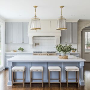
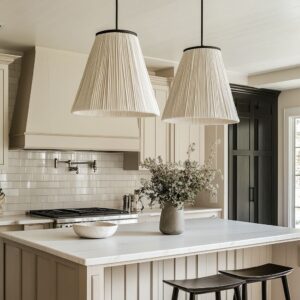
In kitchens where green cabinetry takes center stage—whether soft eucalyptus, muted sage, or deep forest—the backsplash quietly decides how the entire space holds together. It’s not an accent.
It’s a surface that guides the room’s pace, filters light, and sets the tone between bold and soft. The relationship between cabinet color and backsplash finish is rarely about contrast.
It’s more often a balance of texture, sheen, and direction. Glass panels spread brightness across flat planes.
Stone with visible grain softens strong color fields. Wood-look porcelain brings rhythm through repetition.
Each move shapes how the space feels without adding extra pigment.

A backsplash does more than fill a gap between counter and cabinet. It redirects the eye, balances weight, links one surface to the next, and—when chosen with care—lets the cabinetry stand tall without overpowering the room.
This article explores the quieter tools that bring dimension to kitchens built around green. Instead of louder color choices, it’s the play of light, shadow, and surface that carries the design.
Quiet depth. Clean transitions.
Subtle rhythm. That’s where the real structure hides.
Quiet takeaway: When cabinets already supply the dominant hue, depth must come from light-shadow play, not from more colors fighting for notice.

Subtle reflection vs. matte stillness
The effect of surface sheen in a kitchen is rarely about how shiny something is—it’s about where that light ends up. In kitchens with green cabinetry, glass or acrylic panels can work like soft mirrors.
Unlike high-glare materials that bounce light harshly, these panels send it sideways and upward in a calm diffusion, which helps deep greens stay lifted instead of feeling visually heavy. The impact is subtle but noticeable—especially under natural daylight or soft LED strip lighting.
Glossy mosaic tiles offer a different rhythm. Their tightly stacked textures split light into countless pinpoints, and even muted greens like sage or eucalyptus seem to come alive without introducing new colors.
These tiny tiles aren’t loud, but they animate the background enough to shift attention in gentle waves.

In contrast, backsplash surfaces like honed stone, textured Corian, or porcelain lean into absorption. Instead of reflecting light, they allow shadows to form naturally across their surface.
This turns the cabinetry into the most reflective surface in the room—green becomes the anchor, and the wall behind it holds the scene with a soft tactile quietness. It’s a kind of inverse glow, where visual gravity settles into the cabinetry rather than bouncing around the room.
The difference isn’t about gloss versus matte—it’s about light placement. Does the backsplash act as a soft lantern, a neutral background, or a subtle rhythm?
These choices affect how the green cabinetry feels: bold and grounded, or light and suspended. In many kitchen backsplash ideas with green cabinets, it’s this relationship—between finish and brightness—that creates atmosphere without changing the color story at all.

Tone-on-Tone Camouflage
Some of the most visually fluid kitchen designs rely on tone rather than contrast. One method that repeatedly stands out is matching cabinet paint to the backsplash, especially with glass or acrylic panels.
The wall and cabinetry share the same color and tone, forming a seamless envelope. This isn’t about tricks or gimmicks—it’s a deliberate way to strip away noise.
When done well, even the smallest kitchen feels more expansive. Visual breaks disappear.
The room moves as one unit. Shelving, hardware, and fixtures don’t become the stars.
Instead, they serve as accents, small metallic glints or wood inserts that give pause, but never interrupt. The cabinetry reads as clean and whole, and the backsplash melts into the layout instead of announcing itself.

Another move with a similar effect is taking the backsplash beyond the standard bounds. Extending the same material around a window return, across a side wall, or even up to the ceiling shifts it from mere surface treatment to spatial definition.
In these layouts, the backsplash isn’t decorative—it’s part of the architecture. And that can have a powerful effect on how a backsplash with green cabinets settles visually in a space.
Hue matching isn’t about achieving perfection in color—it’s about eliminating boundaries. When the difference between the wall and cabinetry fades, depth emerges from light falloff and shadow, not color changes.
The result is still, unified, and often surprisingly calming—green cabinetry becomes not a color block, but a field.

Texture as Movement, Not Ornament
The most visually compelling surfaces don’t need prints or high contrast—they move by how they catch light. In kitchens where green cabinetry leads the palette, that quiet movement often comes from materials that carry depth in their texture alone.
Sculpted Corian brings a flowing rhythm that changes across the day. These surfaces aren’t glossy or loud—instead, they shift gently under daylight, bending shadows into soft arcs.
Thin bands of travertine do something similar: their narrow profiles let even subtle sunlight draw lines that stretch across the wall like a tide. In both cases, the cabinet fronts beside them appear calmer, because the wall behind is doing the motion work.

There’s a slower story told in surfaces like tumbled pebbles or ashlar-cut limestone. These are uneven on purpose.
Light doesn’t bounce off them—it creeps, nestles, and retreats. The spaces between the stones act like tiny basins, catching dusk and early morning light in a way flat surfaces never could.
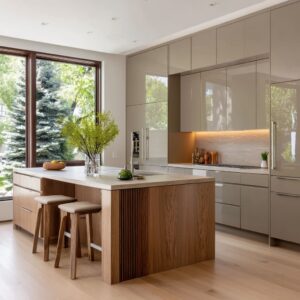
The irregularity builds a living surface, especially when paired with greens that don’t compete for attention. Wood-look porcelain tiles, particularly those with brushed or sanded finishes, introduce a different kind of softness.
Their faint wood grain nods to nearby oak floors or ceiling beams, but without demanding care or stealing light. They’re often installed as horizontal runs, letting the natural striation add whisper-thin lines behind flat-faced cabinetry.

The takeaway here is simple but rarely spoken aloud: you don’t need print or pattern for a wall to feel alive. Texture—especially when lit from an angle—creates its own motion.
This kind of visual flow works beautifully with rich, muted tones. In many backsplash ideas for green cabinets, the most memorable walls didn’t add color; they just added quiet rhythm, letting the eye travel without stopping.

How layout decisions reshape perception
It’s not always the size of a kitchen that shapes how it feels—it’s how the lines are drawn. And in kitchens that feature dark green or sage cabinetry, the orientation of wall materials often does more work than people think.
Horizontal layouts, especially using long wood-look planks or slender stacked tiles, give the room a visual stretch. This isn’t about tricking the eye—it’s about directing it.
That gentle, sideways pull makes the whole elevation feel longer, lighter, and more grounded. It’s especially useful with forest or seaweed tones, which can otherwise feel dense in a compact space.

Vertical surfaces offer the opposite effect. Shiplap paneling, tall ceramic tile layouts, or even glass panels with soft vertical ribbing pull the gaze upward.
Suddenly, a short ceiling gains height. Cabinets don’t feel blocky—they feel part of something taller.
This shift matters most in kitchens that need to lighten the upper field without removing storage. In homes where ceilings are already high, vertical lines create a rhythm that keeps tall surfaces from feeling blank.

Some of the most understated backsplash ideas for sage green cabinets play with this exact tension. The cabinetry provides the steady field of color, while the backsplash carves a visual path: either outward for balance, or upward for lightness.
Neither route is louder than the other—they’re simply different ways to let the structure guide how the space feels. Line direction in grout, plank, or pattern isn’t a detail to skip—it’s a spatial decision.
Especially in kitchens where color leans calm, the way the lines move is often what determines whether the room feels wide, tall, or thoughtfully shaped.

How stone, terrazzo, and dark accents keep green grounded
Green cabinetry—especially in deep olive or muted sage—can take over a kitchen visually if not paired carefully. That’s where wall and hardware choices begin to do more than fill space—they act as counterweights.
Busy stone slabs, particularly those with bold, branching veins, introduce visual tension. These lines often run through quartz or marble, echoing shapes found in brushed brass pulls or thin cabinet railings.
The result: the stone doesn’t compete with the green—it frames it. Instead of seeing one large block of color, the eye travels across diagonals or soft curves in the stone, finding rhythm.
Then there’s terrazzo, with its scattered flecks of warm neutrals like tan, soft rose, and honeyed brown. These specks don’t try to match the cabinetry—but they link it quietly to other pieces in the room.
A walnut shelf. A terracotta bowl.
A brass sconce. Each chip is a thread that connects without announcing its role.

In quieter designs, one strong vein or edge line can be all it takes. Think of a jet-black hardware finish that repeats a single dark stripe in the backsplash stone, or window frames that repeat the same depth of tone.
Suddenly, the cabinetry feels anchored—not just painted green, but rooted in something heavier. This type of visual grounding shows up often in refined backsplash ideas, where the surface is doing more than filling a wall.
It shapes how color feels—whether it needs breaking up, softening, or simply surrounding with contrast. The key move in all of these examples isn’t in bold contrast—but in calculated irregularity.
Veins, chips, and shadows give the eye somewhere to pause. Without it, deep color can turn flat.
With it, green takes on structure and presence.

Shelves as Backsplash Filters
Open shelves can do more than display. They often act as the pressure valve between bold surfaces and still ones.
Especially in kitchens where the backsplash carries texture, reflection, or heavy material movement, a well-placed wooden shelf calms the field without calling attention to itself. Oak and walnut planks, left natural or lightly stained, are often used to interrupt stone, tile, or glass.
That interruption isn’t accidental. It slows the eye.
It introduces a matte moment amid shine, or a warm horizontal break between dense verticals. Without the shelf, high-sheen walls could feel sharp.
With it, there’s breath between surfaces. In rooms where wood-look porcelain planks run behind the shelves, the boards often blend in so well they nearly disappear.
This creates the effect of decor floating, as if pinned directly to the wall. It’s subtle—but effective.
The wall remains dominant, but no longer overpowering.

Asymmetry helps, too. A single shelf off-center from the hood.
A pair on only one side. These placements chip away at the expected triangle of cabinet-hood-cabinet, replacing it with something softer and more lived-in.
It doesn’t feel casual—it feels thought-through, without relying on symmetry to feel orderly. The best shelf setups don’t just hold bowls or vases.
They edit the way the wall behind is seen. They turn shiny into matte, movement into pause, and help the backsplash tell a quieter story.
It’s a move that’s seen in many kitchens with sage green cabinets, where the balance between color, surface, and open display needs to feel light—but still connected. The shelf doesn’t shout.
It gently steps in between bold parts of the room, filtering how everything else is read.

Hidden Detailing = Visual Calm
In some kitchens, the details that carry the biggest visual weight are the ones that intentionally disappear. The decision to hide rather than highlight is what allows texture, color, and light to take the lead without interruption.
Outlets relocated under cabinets or tucked into drawer boxes free the backsplash surface to exist as a clean field. When a slab of glass or stone stretches across a wall without a single outlet cover breaking it up, the result feels uninterrupted—almost like a canvas.
It’s one of the simplest ways to protect visual flow, especially in smaller layouts where every square inch is part of the story. Matching hoods are another quiet move.
Instead of inserting a bulky metal centerpiece into the line of sight, these color-matched forms disappear into the background. The eye doesn’t stop at a metallic interruption—it continues, tracing the veining of stone or the movement of tile, letting the wall hold the space.

Tile returns around windows are another overlooked design decision. A backsplash that simply stops at the edge of a window can feel chopped, like an afterthought.
But when the material wraps around the recess, the window becomes part of the wall itself. It no longer breaks the backsplash—it joins it.
These aren’t bold features. They’re decisions of restraint.
And in a green kitchen, where cabinetry color often carries strong presence, it’s these invisible adjustments that let the walls support without clashing. The materials become connected, and the space gains rhythm without added noise.
In the end, it’s not silence that makes these kitchens feel calm—it’s subtraction. Every outlet moved, every hood concealed, every tile edge softened… all of it makes room for the color story to be fully read.

Micro-Shadow vs. Macro Contrast
There’s a lot of talk about contrast in kitchen design, but contrast isn’t always about black and white, or light against dark. Often, the most effective depth comes from shifts in shadow, not color.
Especially in kitchens where green already dominates the palette, subtle play between light and texture does more than added pigment ever could. Micro-shadow happens on the smallest scale.
It’s found in the dips between stacked slivers of tile, the grain lines of travertine, the undulating surface of sculpted Corian. These shallow grooves aren’t loud, but they bend light just enough to cast tiny ribbons of darkness.
The backsplash doesn’t change color—it changes depth. Macro motion, on the other hand, comes from bold surface features.
Large veins in quartz slabs. Flecks of color scattered across terrazzo.
These movements aren’t quiet—but they’re still part of the same tone family. They don’t compete with the green—they break it up just enough.
The eye follows those patterns, connecting the wall to the counter to the hardware, like a continuous visual sentence. Neither technique adds color.
But both add shape. In a room where cabinetry color is already strong, texture becomes the quiet architect of visual balance.
These shadows—large or small—offer contrast without conflict. So while paint might be the headline, light and texture write the subtext.
And that’s often where the design gets its depth.

The Backsplash as Mood Setter
In kitchens anchored by strong cabinet colors—especially greens that carry weight and personality—the backsplash acts like a quiet director behind the scenes. It rarely draws attention to itself outright, but its influence is everywhere.
The choice of material, finish, and scale becomes a toolset for adjusting how the entire space feels, not just how it looks.
- Light amplifier – Reflective surfaces like back-painted glass or polished tile push brightness into corners where overhead fixtures can’t always reach. Instead of spotlighting, they scatter light softly, lifting shadows near cooktops or underneath shelving.
- Saturation diluter – Some kitchens benefit from contrast, but many don’t need it. That’s where pale materials like honed limestone, softly veined travertine, or blush-toned acrylic come in. They quiet the intensity of bold green cabinets without dulling them. The color still stands, but it feels less compacted—more breathable.
- Texture giver – Smooth cabinetry, especially in slab styles, can risk looking too still. Backsplashes with pebble mosaics, sculpted surfaces, or subtle driftwood grain step in with dimension. They offer a break from flatness, pulling soft shadows and micro-movement into the room without changing the tone.
- Frame builder – When a backsplash runs from counter to ceiling, or wraps a window in full height, it does more than cover a wall. It gives the layout structure. Instead of the backsplash being an inserted panel, it becomes part of the room’s shape. The whole wall feels purposeful, not patched.
- Palette bridge – Small color elements—like warm flecks in terrazzo, gold flashes in stone veining, or soft streaks in porcelain wood grain—tie cabinetry to shelving, flooring, and fixtures. These barely-there tones act like links between surfaces, making the room feel coordinated without looking matching.

Final Thought
Today, backsplash design moves beyond function. It’s no longer just a way to block steam or stains—it’s a surface that manages mood.
It shifts how light falls, softens color weight, and guides the eye in the absence of ornament. In many designs anchored by green cabinetry, the backsplash doesn’t try to compete.
Instead, it redirects brightness, balances visual volume, and threads together materials that might otherwise feel disconnected. Sometimes, it adds reflection.
Other times, it adds roughness. But always, it adds a form of quiet structure.
The most effective kitchens aren’t always driven by contrast. Often, they succeed through careful coordination—lines that run in sync, colors that echo each other in tone, and surfaces that reflect or absorb light just enough to shape a room without making noise.
It’s these kinds of decisions—subtle, calculated, and often invisible at first glance—that give a space its full visual rhythm. Where green doesn’t overwhelm, and the wall behind it carries just enough texture, shadow, or shine to let everything breathe.
Related Posts
Harmony Home Design brings 10+ years of residential interior design experience to the ideas shared here. We publish design concepts, layout thinking, and practical styling notes.