
A modern sunroom no longer fits into a single category. These spaces move between lounge, work area, quiet retreat, and even display zone—depending on how they’re composed.
What sets apart the most visually thoughtful sunrooms today is not the amount of light or the size of the glazing, but how surface, spacing, and shape interact with one another across time.

Light is treated as form. Furniture blends into structure.
Outdoor views are curated with the same discipline as an interior shelf. Whether compact or open-plan, the current direction focuses less on furniture style and more on how materials and shapes guide the mood.
Texture replaces color. Glow replaces ornament.
Layouts are mapped for how they feel in motion, from morning light to dusk tones. In this layered approach, the boundary between inside and out stays deliberately thin—not erased, but blended, through vertical rhythm, repeated lines, and a restraint in contrast.
What follows is a close look at the visual logic behind today’s most composed sunroom interiors—not just how they function, but how they hold themselves together through detail, proportion, and silence.

Shadow is handled like moving décor
In thoughtfully crafted sunrooms, light isn’t static—it shifts deliberately across surfaces, creating a quiet animation throughout the day. Narrow-framed glass, linear clerestory windows, and overhead skylights are placed with precise spacing so that sunlight doesn’t just enter—it draws patterns.
As the sun moves, soft linear shadows travel across cushions, textured rugs, and tiled floors, forming bands of contrast that seem to paint the room in motion. This silent choreography becomes the decorative element itself, replacing framed prints or hanging objects with light-play that feels alive.
It’s one of those modern sunroom ideas that blends architecture with atmosphere, where even the simplest interior becomes dynamic through timed brightness and calculated shade. Whether the wall is limewashed, softly plastered, or clad in pale wood, these shadows give every surface a shifting role throughout the day.

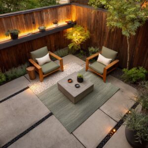
Furniture and architecture often fuse into one mass
In many of the most visually balanced sunrooms, you won’t always see a clear line between the furniture and the walls. Benches are poured or built right into the structure, softened only by tailored cushions, giving the impression that the room grew around the seating rather than accommodated it.
The effect is spatially calming—there’s no interruption to the sightline, no heavy object cutting the space in two.

Shelving niches, sideboards, and even small desks follow the same approach: the same finish, the same tone, sometimes the same material. This concept isn’t limited to utility—it also enhances the feeling of cohesion and makes compact layouts feel more generous.
Sunroom furniture ideas based on this blending method give the impression of carved-out forms rather than added-on pieces. It’s a technique often seen in reworked desert homes or updated mid-century layouts where integration matters more than decoration.

Objects are made to float through optical tricks
Rather than add drama with ornament, many sunrooms introduce visual lightness through construction tricks. Floating benches, for example, are underlit with subtle LED strips, giving them the appearance of hovering—especially after dusk.
Similarly, a thick concrete coffee table might look weightless when perched on a gloss-polished terrazzo floor, its edges reflecting just enough light to dissolve the boundary between solid and surface. These moments of suspension aren’t about gimmicks—they soften the visual weight of otherwise dense materials.
The room feels less filled, more composed. Some ceiling trays are outlined in the same way, casting a rim of light that pulls upward and flattens shadows overhead.
Such ideas appear often in sun room ideas that prioritize form without excess. What’s noticeable is how nothing seems anchored too tightly—each object sits in a kind of visual balance with the architecture around it.

Textural shifts replace overt color contrast
In many modern sunroom layouts, visual richness comes not from bold pigments but from how surfaces interact. A tightly curated palette—ivory, sand, oat, pale gray—can feel fully dimensional when textures do the talking.
Bouclé adds volume without shine. Terrazzo introduces a granular reflection that shifts with light.
Linen absorbs sunlight with a dry softness, while polished concrete quietly reflects it in broad matte fields. Leather brings in a grounded smoothness that contrasts with nubby weaves.

These material choices are lined up in adjacent or layered positions, creating subtle friction that energizes the scene without ever breaking the tonal calm. This approach is central to many sunroom designs where depth is built from grain and finish, not color.
The effect is especially noticeable at midday, when angled light hits the different textures and reveals their structure with more clarity than color ever could.

Single “earth accent” notes punctuate monochrome fields
Muted palettes are often broken—very intentionally—by a single moment of warmth. A camel leather chair placed off-center, or a rust-hued throw cushion, or even a ceramic in ochre or clay brown…
each stands alone, like punctuation in a sentence. The eye lands there first because everything else stays quiet.
But what’s key is restraint—these accents don’t repeat. They don’t become themes, and they’re never used in pairs.
This technique allows the overall palette to stay neutral while still offering a visual focal point. These subtle disruptions add rhythm without clutter, and keep the color scheme from falling into monotony.
The warmth stands out specifically because it’s not echoed. This kind of contrast shows up often in sunroom decorating ideas where balance matters more than saturation.

Negative space is treated as an active ingredient
Instead of filling every corner, some of the most compelling sunrooms leave visible gaps—between the sofa and glazing, around the center rug, or beneath floating furniture. These areas aren’t mistakes or oversights—they’re built-in pauses.
The absence of a central coffee table might allow more light to hit the floor or keep the view through glass fully open. The result is a sense of calm that’s shaped as much by what’s missing as by what’s included.
In layouts that border gardens or overlook distant mountain lines, this breathing room keeps the scenery in play and gives weight to the silence. Some of the most thoughtful sunroom design ideas use this method of subtraction—editing down to what the space can hold, but also what it can leave untouched.

Ceiling geometry is used to zone without partitions
One of the most efficient ways to divide a room without physically breaking it is to let the ceiling do the talking. In many multi-use sunrooms, changes in ceiling pattern signal the shift from one function to another.
A recessed tray above the lounge area might deepen the sense of comfort, while slatted wood overhead in the dining corner introduces warmth and subtle formality. Angled beams can stretch a tight footprint, drawing attention to transitions between seating and workspace or dining and lounging.
What’s critical is that all of this happens above the eyeline—the space beneath stays clear and uninterrupted. There’s no need for walls or heavy dividers.
Instead, the ceiling becomes the cue. For compact layouts, especially those following small sunroom ideas, this tactic offers rhythm and order without sacrificing flow.
The room stays open, but each function still feels grounded in its own area.

Curves are deployed sparingly to soften strict grids
Sunrooms often rely on sharp edges—rectangular glass panels, square tile layouts, linear seating setups. That crispness gives clarity, but too much of it can feel static.
This is where a curve can carry real weight. A single arc-back chair or rounded pouf shifts the visual rhythm, providing contrast without clutter.
These rounded elements usually appear once or twice in a space—a low tulip table, a smooth-edged bench, or a pillowy ottoman—so their presence feels intentional, not decorative.

By keeping the ratio of straight to curved lines high, the softness never overpowers. Instead, it breaks the repetition just enough.
This kind of sunroom interior design idea isn’t about decoration—it’s about balance. The curved form works like a pause between beats, helping structured layouts feel more natural and less rigid.

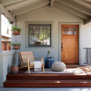
Vertical rhythm links interiors to planted views
Some of the strongest visual compositions in modern sunrooms come from aligning interior elements with the lines of the landscape outside. Mullions, ceiling beams, even floor seams often mirror the vertical trunks of palms or the tall spires of desert plants like ocotillo or yucca.
This repeating vertical rhythm builds a quiet bridge between inside and out, where manmade structure and natural form echo each other. The black metal window frames feel less like framing and more like a continuation of what’s beyond the glass.

This connection doesn’t need symmetry—it thrives on rhythm, where repetition of spacing, thickness, and height creates cohesion. In many homes following contemporary sunroom ideas, these alignments are so subtle they’re almost missed, yet they contribute to a strong sense of visual order and natural balance without using mirrors, trims, or pattern.

Landscape is staged as a living mural, not a backdrop
Greenery isn’t always placed “outside” in the traditional sense. In many refined layouts, plants are arranged with the same thoughtfulness as indoor décor—grouped, layered, and set at exact distances from the glass to shape the view.
Barrel cacti, tall grasses, and sculptural succulents are positioned to create depth, much like objects on a shelf. The result is that the outdoor space reads more like an intentional composition than a background scene.

Palm clusters might mirror the silhouette of a curved chair indoors, while agave rows outside follow the spacing of ceiling lights inside. This treatment allows the exterior to take on the same visual status as the interior—both are part of the overall scheme.
In fact, some of the most thoughtful ideas on decorating a sunroom treat the glazing as a display frame, where daylight highlights shapes, shadows, and textures that change with time but never lose their composure.

Asymmetry keeps orderly rooms from looking staged
Visual order doesn’t always mean symmetry. In fact, the most visually satisfying sunrooms often rely on small, deliberate imbalances that keep the room from feeling overly rehearsed.
A lounge chair pulled slightly off-center. Three pillows on one side of the sofa and five on the other.
Wall shelves that taper in density from bottom to top. These quiet adjustments introduce casual energy without losing structure.

Asymmetry invites the eye to move rather than settle. It builds rhythm without repetition.
In spaces built on calm tones and clean lines, these off-axis decisions stop the room from slipping into showroom stiffness. They work especially well in homes exploring more relaxed sun room design approaches, where subtle tension gives shape to restraint.

Lighting plans anticipate dusk as a second style moment
In these rooms, the way a space looks at night holds just as much weight as the way it photographs in daylight. Lighting is layered carefully—below benches, behind wall curves, inside ceiling troughs—not only to serve function, but to shape mood after the sun fades.
Ribbed sconces send shadows in soft arcs. Cove lights illuminate floating shelves from behind.
Even floor-level fixtures, barely visible by day, switch on to give base-level glow that hugs the edges of furniture.

This quiet glow reshapes textures and surfaces: a soft fabric sofa starts to float, a curved wall catches a golden gradient, wood beams overhead begin to read as light paths. The room enters a second visual phase, equally composed but warmer and more atmospheric.
Many sunroom room ideas take dusk into account from the start—choosing materials and configurations that respond just as well to artificial warmth as they do to natural light.

Conclusion
Across all of these sunroom compositions, the thread is clarity—not minimalism, but considered calm. Whether shaped through a rhythm of beams, an off-center pillow stack, or the subtle alignment of a cacti trunk with a black window frame, the decisions are quiet yet precise.
These are spaces that rely on less doing and more seeing, where light and material handle the expression.

Daylight plays the lead role, but every layer counts. A slight textural contrast, a carefully placed warm tone, or an unfilled void between two pieces of furniture—each adds meaning without noise.
There is no urgency to decorate every inch, only the intention to let proportion and finish carry the space.
This approach to sunroom interiors reflects a broader shift in design: an interest in how small moves can build atmosphere. Rather than focusing on what to add, the attention is on how to frame, soften, balance, and allow a room to carry its own weight.
The result is a space that feels still but not static—composed, yet always responsive to light, time, and use.
Related Posts
Harmony Home Design brings 10+ years of residential interior design experience to the ideas shared here. We publish design concepts, layout thinking, and practical styling notes.