
A neutral home can feel calm and still feel flat. The difference is rarely add color.
It’s usually a set of visual rules: how you plan contrast, where you allow shine, how you build depth through repetition, and how you prevent open-plan spaces from turning into one long beige blur. This guide takes the most useful, often-missed ideas and turns them into a repeatable way of designing rooms that feel composed, warm, and intentionally layered, without turning into a showroom or relying on loud accents.

Start with a contrast budget, not a color palette
Most neutral interior designs fail because everything sits in the same value range. When the light wall, the light sofa, and the light rug are all equally bright, the eye can’t “grab” the space.
It needs a planned contrast budget: a small amount of darkness placed in the right spots so the room gains shape.

A simple contrast budget that keeps the room calm:
- Light fill: walls, big upholstery pieces, large rugs
- Mid-tones: pillows, secondary seating, art interiors, wood tones
- Dark outline: frames, table bases, trays, chair legs, door/window frames
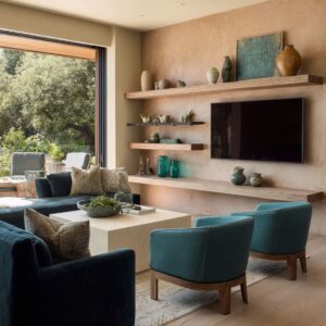
How such “dark outline / light fill” idea can be done: black-framed glazing, dark table silhouettes, dark trays, thin chair frames, and art frames. The dark is rarely a huge block; it’s usually an edge, a base, or a boundary.
That’s why it feels refined instead of heavy.

The key move people miss:
Put the darkest notes where the eye needs structure: at the floor plane (table bases, legs), at transitions (frames), and at “control points” (trays, bowls, vases). Avoid scattering dark accents randomly.
When dark accents appear as a system, the room feels designed.

Build depth by creating a “destination” in the distance
Open-plan rooms feel expensive when the eye has a clear path: a foreground anchor, a mid-zone spine, and a far destination. It can be done elegantly: living area in front, dining in the middle, kitchen beyond, often ending in daylight and greenery through glass doors.

To build that same depth, design in three layers:
Foreground anchor
A round coffee table, an oversized ottoman, or a glossy centerpiece table becomes the visual “start point. ”.
- Round tables soften the heavy rectangles in architecture and make movement feel easy.
- An oversized ottoman creates a calm center without blocking sightlines.
Middle spine
A dining table aligned on the central axis works like a visual runway. Even when the room is wide, alignment creates calm.
The most successful layouts keep dining centered behind the sofa so it reads intentional, not accidental.

Far destination
A chandelier, paired artworks, a lit niche, or a glowing kitchen wall gives the eye a reason to travel forward. A single warm feature light placed deeper in the plan is especially powerful: it creates a sense of occasion without warming the whole palette everywhere.
The benefit:
When the distant zone carries the hero moment (chandelier glow, tall branches, paired art), the living area can stay quieter and more restful. This is why these interior designs feel calm even with many items present.

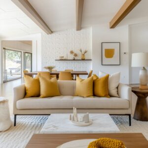
3) Use “soft walls” to keep the room plush without clutter
A popular tactic is the sofa back becoming a soft, layered backdrop: a dense pillow composition that reads like a continuous padded surface. This creates luxury without adding more furniture.
To make a soft wall look intentional (not messy), use a structure:
- Outer frame pillows: slightly darker, visually heavier, placed near the ends
- Inner light pillows: brighter, slightly larger, placed toward the center
- One horizontal “belt”: a lumbar pillow or long cushion that breaks the vertical pillow stack and stops the arrangement from looking like a pillow parade
This is why the sofa can face the room and look “finished” from a distance. The pillow mix becomes the detail layer that replaces color.

Extra subtle rule:
Avoid making everything the same fabric texture. Strong interior design concepts rely on micro-contrast: matte woven pillows beside a smoother, slightly reflective cushion.
That tiny shift is what makes a monochrome sofa feel deep.

Place shine like punctuation, not wallpaper
A calm interior design still needs highlights. But shine has to be rationed, or the space starts looking flashy or sterile.
The best designs do shine in small, planned moments:
- glossy coffee table surfaces that bounce light upward
- crystal or faceted lamp bases that add sparkle without adding color
- a warm metallic centerpiece on the dining table as the only “jewelry” moment
- glass pendants that add depth while staying visually light

Think of shine as punctuation marks in a sentence. Too many and it becomes noise.
One or two in the right places creates polish.

A practical shine ladder:
- Large surfaces stay matte: rugs, upholstery, most walls
- Medium surfaces can go soft-sheen: a coffee table top, a side table finish
- Small items can sparkle: glass lamps, crystal chandelier, metallic objects on a tray
This is why a glossy table can work beautifully in a neutral setting: it increases brightness and depth without adding new colors.

Map texture the way you would map lighting
Texture is the real color. But texture must be placed thoughtfully, or the room becomes busy while still somehow feeling empty.
A strong neutral room usually divides texture into zones:
Quiet fields
Large rugs with low-contrast cloudy patterns, plain walls, broad upholstered pieces. These areas calm the eye.
Detail islands
Trays, ceramic vessels, ribbed side table bases, tufted ottomans, orchid stems, branches, and patterned pillows. These areas give the eye something to study.
When texture is everywhere, nothing feels special. When texture is concentrated into readable clusters, the room feels curated.

A pattern insight:
The rugs rarely use sharp contrast. They use wide, soft patterns that hide life while keeping the room calm.
The rug becomes a “soft motion” under the furniture, not a competing focal point.

Control small objects with trays and “contained scenes”
One of the biggest reasons neutral interior designs look expensive is that small objects never feel scattered. Trays on round tables, trays on ottomans, stacked books as platforms, bowls and vases grouped into a single cluster.
This has nothing to do with minimalism. It’s about visual order.

A reliable tabletop composition uses:
- one vertical element (orchids, branches, stems)
- one low wide element (bowl, tray)
- one structured base (books or a rectangular box)
- one contrasting finish (matte ceramic against gloss, or a warm metallic accent)
That is why even a simple table can look styled without being crowded.

Make open-plan zoning feel natural without dividing the room
The strongest open plans use “soft zoning” instead of hard dividers. Three techniques could be used these ways:
The sofa as a boundary
The back of the sofa becomes the line between living and dining. It defines the lounge while keeping sightlines open.
One continuous rug strategy
Sometimes the rug extends under both living and dining, creating one cohesive field that still allows zone shifts through furniture shape (round vs rectangular) and lighting identity.

Lighting identity per zone
Living stays quietly lit (recessed lights, lamps, no hanging feature). Dining gets the signature fixture.
This creates a psychological boundary: entertaining happens there, relaxing happens here.
What people often miss:
If every zone has a dramatic fixture, the open plan becomes visually loud. If only one zone has the hero light, the whole plan becomes readable.

Symmetry as calm, asymmetry as life
Many neutral interiors use symmetry to create stability: paired artworks, centered dining alignments, matching lamps, balanced side tables. But the rooms don’t feel stiff because the symmetry is softened elsewhere:
- pillows are balanced by weight but not perfectly mirrored
- tabletop objects are grouped, not centered like a trophy
- one side might be slightly more “living” (a small plant, books) while the other stays cleaner
This is an advanced calm trick: symmetry gives rest, controlled variation gives character.

Use shape language so the room feels intentional
A quiet room still needs a visual theme. These interiors often use shape language to connect zones:
- circles repeated at different scales (round table, round tray, round bowl, round ottoman)
- rectangles kept crisp in dining and art (table, framed pieces, cabinetry lines)
- curves and softness reserved for lounge comfort (chaise, plush chairs, tufted ottomans)
This creates a subtle message: living is soft and welcoming, dining is structured and formal, kitchen is clean and quiet.

The point is not to match shapes perfectly. The point is repetition with variation so the eye feels continuity.

Keep one warm accent family, and keep it contained
The most successful neutral interior design concepts treat warmth like a signature rather than a scatter. You can see warm notes appear as:
- a gold chandelier in the dining zone
- a few warm metallic spheres on a coffee table
- warm bronze side table or lamp base
- warm glow from ceiling coves and under-cabinet lighting
Warmth is strongest when it’s repeated in a small family and placed in a few strategic moments, rather than appearing as random mixed metals everywhere.

A refined neutral scheme often works best when warm accents live in one or two “containers,” such as:
- dining centerpiece + chandelier
- coffee table bowl + one small metallic dish
That containment keeps the interior design calm, even when it includes sparkle.

Bedroom suites: make the lounge feel like it belongs
The bedroom lounge concepts work because the lounge isn’t treated as a separate style. It uses the same language as the bed wall:
- panel molding and oversized art create a calm, architectural backdrop
- a large round ottoman becomes the center of daytime use
- the chaise behaves like a daybed, so it feels natural in a bedroom setting
- symmetry is used at the bed (matching lamps), while the lounge stays softer and more relaxed

The best move here is scale: the lounge pieces are substantial enough that the room feels like a true suite, not a bedroom with a random chair.

A checklist to prevent “flat neutrals”
If the room is neutral but feels unfinished, the issue is usually one of these:
- No dark outline system (everything is mid-light)
- Too much sameness in texture (everything matte, everything smooth)
- No destination point (nothing pulls the eye deeper)
- Small objects scattered instead of grouped into scenes
- No shape theme (circles/rectangles/curves not repeated)
- Warmth not contained (random warm accents create visual mess)
Fixing even two of these can transform how “rich” the room feels.

Bringing it all together
The strongest neutral design ideas succeed because they treat calm as a form of structure. They don’t rely on color to create hierarchy; they use alignment, repetition, controlled contrast, and deliberate texture placement.
They keep surfaces large and quiet, then add interest through a few concentrated detail moments: the tray vignette, the coffee table centerpiece, the dining glow, the paired art.
That is why neutral interior design ideas can look warm and lived-in while still feeling edited. And that is also why modern neutral interior design works best when it has a contrast budget, a destination point, and a clear system for shine and texture.
The result is neutral interior design that feels intentional from every angle, not empty, and not noisy.
Related Posts
Harmony Home Design brings 10+ years of residential interior design experience to the ideas shared here. We publish design concepts, layout thinking, and practical styling notes.