
Warm palettes can feel instantly welcoming, but they can also slip into a soft blur if everything stays warm, mid-toned, and matte. The interior designs that feel sharp and finished usually treat warmth like a resource to place carefully, then keep a few steady structure materials repeating in predictable spots: black frames and dark bases for definition, pale stone for cool balance, and brass for small light-catching highlights.

The warm colors, such as peach, apricot, terracotta clay, caramel, olive, taupe, greige, can be used consistently, but they should not take over every surface. Instead, warmth tends to live where people pause and linger: the sofa pillows you lean into, the banquette corner where breakfast stretches into mid-morning, the bed wall that sits behind your head for hours.
Nearby, the harder-working elements hold a deeper or cooler register: charcoal kitchens, black-framed glazing, dark sideboards, dark fireboxes, darker credenzas. That split is what makes open-plan spaces feel organized without adding partitions.
What follows is a look at how this mix behaves with warm paint and textiles held in place by black outlines, mineral surfaces that keep the palette grown-up, and brass used as a quiet connector in lighting and small accents.

Warmth sits where people linger
A warm palette feels more believable when it follows how a home is used. Warmth can be like a comfort layer, placed at seating height and in the zones designed for staying put, while the work areas carry darker or cooler materials that tolerate daily activity and visual clutter.

A clear example appears in the terracotta dining nook design concept beside a dark kitchen. The clay-toned walls and cinnamon upholstery create a social pocket, and the built-in banquette makes the corner feel like a place designed for longer meals.
Right beside it, the kitchen stays near-black or charcoal, with crisp lines and glass-front uppers. The contrast isn’t random; it maps directly to function.
Dining is soft and warm. Cooking is structured and darker.
Even the banquette base picks up a deeper gray so the nook talks to the cabinetry instead of becoming a separate theme.

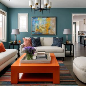
The same idea can be used in open living–dining room designs. The largest upholstery surfaces, such as long sofas in pale greige or cream, can stay quiet, then warmth concentrates in pillows and small tabletop pieces: caramel, cognac, cocoa, camel.
Behind the sofa, the dining zone often goes darker again (chairs in deeper charcoal or rich taupe), so the back area doesn’t fade into the light walls. In an open plan where you see multiple zones at once, that tonal hierarchy is what keeps the space from feeling like one continuous beige field.

Bedroom designs can follow the same logic, but with a softer hand. Instead of making every surface rosy, warm taupe or blush-peach becomes a wall color, while dark nightstands and a charcoal bench act as punctuation at the perimeter.
The warm tones stay closest to the bed—pillows, coverlets, and the headboard—where comfort is the main purpose. Storage pieces and nightstands stay darker, crisp, and rectangular, so the room keeps its edges.

Black outlines and dark anchors give warm palettes a clear shape
Warm paint and warm textiles can start to merge if there’s nothing crisp to separate one surface from the next. Dark outlines can act like a repeated framework: black window grids, matte-black fireboxes, dark table bases, dark sideboards, dark chair legs, dark frames around artwork.
The key is repetition. The dark outline shows up at the perimeter (glazing and doors) and again near the center (table bases and credenzas), so the room reads intentional from multiple viewpoints.

In open-plan layouts with tall black-grid windows, the grids create instant structure, like a built-in graphic pattern. That lets the interior stay restrained: creamy upholstery, quiet rugs, soft drapery.
When the sofa is long and pale, the black window lines prevent the whole view wall from dissolving into light-on-light. The interior design can stay calm without losing definition.

A long dark sideboard beneath framed landscapes or abstracts can become a steady horizontal base line of the interior. Without it, pale art on a pale wall can look like it floats.
With it, the wall looks as a complete composition: dark base, large-scale art above, then a slender brass sconce nearby to add a small highlight.

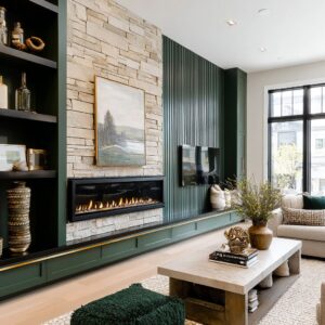
A fireplace wall makes this even clearer. The firebox is often trimmed in matte black so the flame looks sharper and more graphic.
That black center repeats the black window frames and the dark furniture bases, creating a consistent dark family even when the wall color changes from peach to olive to slate-blue. Even coffee tables follow the same discipline.
A pale marble slab on a thin black metal frame, or a pale stone top sitting on a darker base, becomes a dependable center anchor. In warm rooms, that dark base is especially useful because it stops the rug and sofa from feeling like they float.

Marble and pale stone keep peach and terracotta from turning sugary
Warm walls and caramel textiles can feel overly sweet if the supporting surfaces are also warm (wood tops, beige stone, warm metals everywhere). The interior designs that feel mature almost always introduce a cool mineral note: marble, pale stone, or stone-look surfaces with gray veining.
That veining does two jobs at once. It adds movement, and it adds coolness—tiny gray notes that cut through peach, terracotta, and taupe.

For example, it can be a coffee table with a white marble top with gray veining, held by a thin black frame. The marble keeps the table from blending into a light rug, but it also prevents the warm accents (caramel pillows, peach walls) from feeling dessert-like.
The gray veining introduces a cooler line-work that reads refined even when the palette stays soft.

Fireplace compositions use the same tempering effect. An olive paneled wall paired with a white-gray marble surround becomes rich instead of heavy because the marble breaks up the green with a cooler surface that still feels natural.
In charcoal-paneled rooms, black marble surrounds with white veining become the main texture—dramatic, but still controlled because the veining is contained inside clean slab geometry.

In kitchens and breakfast nooks, pale stone counters and backsplashes can act as a light band between dark cabinetry and warm wall color. When cabinetry goes near-black, the pale stone prevents the room from feeling closed-in.
When walls shift terracotta, the stone keeps the warmth from taking over the whole visual field. Even in bedroom designs, a marble-topped dresser or console adds that same cool counterweight.
It’s a small move, but it changes how blush and taupe read in evening light: less powdery, more polished.

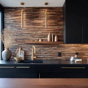
Brass shows up where light lives
Brass can quickly feel loud if it covers large surfaces. Warm metal can be used in a more focused way: sconces, chandeliers, pendants, and a few small tabletop pieces.
That placement matters because it puts brass where the eye naturally goes in low light—near faces, near art, near the dining table—so the metal becomes a connector rather than an extra color.

In dining nooks, brass often appears in the pendant hardware and chain, plus cabinet pulls in the nearby kitchen. It creates a thread that ties warm wall color to dark cabinetry without adding another paint color.
A frosted-glass bowl pendant with brass hardware softens the dining corner, while the brass pulls repeat the same warmth in small frequent touches.

In living rooms, brass can sit next to large pale forms—white shades on sconces, a brass arm near a black-framed artwork, or a brass detail on a coffee table edge. These are small highlights, but because they repeat, they feel planned.
A room might have only two or three brass moments, but they’re placed at consistent heights: mid-wall sconces, ceiling fixture over dining, then a small brass tray or vessel on the coffee table.

Amber, smoke, and tinted glass can act as a middle layer between brass and black. Smoke-glass pendants over breakfast tables add warmth without shouting.
Amber-toned vessels on a dark tray echo the warmth of the fire or terracotta pillows, but they do it through light and translucency rather than paint. The overall effect is that brass becomes a gentle bridge: warm walls and warm textiles on one side, black frames and charcoal furniture on the other, with the metal acting as a controlled highlight that helps both families coexist.

Symmetry and vertical punctuation
Warm wall colors can feel like a big paint field if there isn’t a clear layout logic. Many interior designs are based on symmetry, centered focal points, and repeated vertical elements so the warm paint reads intentional even with minimal decor.

Fireplace walls are treated like elevations. An olive paneled wall frames a centered fireplace, a centered black rectangle above, then a pair of sconces placed evenly to either side.
The wall feels finished because it has an underlying grid: panel rectangles, a central axis, and balanced side elements. In the apricot fireplace setting, the marble surround acts like a built-in anchor, and the mirror above repeats the firebox rectangle, stacking dark-on-light forms in a clear order.
Two sconces placed symmetrically add vertical light columns that give the wall a night-time identity without extra objects.

TV walls can follow a similar approach. A peach wall becomes more credible when the screen sits inside a thick built-up frame and is flanked by tall slim sconces.
The wall gains hierarchy: frame, center, flanking lights, then a long dark cabinet at the base to ground everything. The warmth stops feeling casual and starts feeling composed.

Window walls also contribute to this structure. Full-height drapes hung high and wide create repeated vertical stacks that mirror the window mullions.
Even when the wall color is soft peach, those vertical fabric columns keep the wall from reading flat.

Texture carries the room when color contrast stays gentle
When the palette stays tonal—taupe on taupe, peach beside cream—texture becomes the main source of variety. Such interiors often lean heavily on tactile differences: tufting, channeling, nubby weaves, velvet sheen, and subtle small-scale prints that behave like quiet background noise rather than bold pattern.

For example, in the soft greige paneled living room design concept, the sectional uses deep tufting along the back cushions to break up a large upholstery surface. That tufting adds shadow pockets, so the sofa looks plush without needing strong color contrast.
Pillows stay in the same cream-to-taupe family, but the mix of linen-like surfaces, nubby pieces, and a faint pattern keeps the styling from looking flat.

But velvet can play a different role. Velvet chairs catch light smoothly, while woven pillows break the light into a softer grain.
That contrast is especially effective next to marble, which has its own sheen and veining. The interior design becomes rich through surface behavior rather than through extra colors.

Breakfast nooks can use controlled pattern in a very specific way. Tiny geometric pillows in gray and cream add just enough movement to keep the banquette from looking like a blank slab of upholstery, while staying small enough that they don’t compete with a bold black window grid.

Bedrooms can take the same strategy and slow it down. A tall channel-tufted headboard adds rhythm through vertical channels, while bedding stays largely solid and tonal.
The depth comes from layered weaves, a folded throw, and pillow stacks that shift by sheen and weight rather than by print.

Curved shapes soften the design
Black window grids, paneled walls, rectangular credenzas, and framed artworks create a lot of straight geometry. Curves can be inserted as a deliberate relief point—often in the center of a seating group or in a nook where circulation is tight.
Round pedestal tables avoid sharp corners, and the pedestal keeps foot space clearer, which matters when seating wraps a corner. A dark pedestal base also brings the room’s black-outline language, while the round shape keeps the nook from feeling too rigid.

In living areas, round marble tables and round mirrors can act as soft counterpoints to rectilinear architecture. A round table placed near a sofa edge makes the corner feel easier to move around, and a round mirror above a fireplace breaks up a wall of panel rectangles while also bouncing light back into the room.
Curved lounge chairs also can do quiet work. For example, barrel chairs soften the room’s many hard edges, and their rounded backs echo the gentle shapes of vases and ceramics used on coffee tables.
The result is not a fully curved room, but a room with one or two circular moments that keep the geometry from feeling overly strict.

The outdoor view becomes the biggest artwork
A black-framed glazing turns the exterior into a series of framed panels. Autumn gold foliage, green lawns, and tree canopies become the most saturated color in the scene, so the interior stays controlled and supportive.
In living rooms with black-framed garden doors, the interior palette can sit in taupe, cream, and soft gray, with warmth appearing in pillows and small accessories. That restraint lets the outdoor color shift through seasons without clashing.
On a day when the view runs green, the room feels calm and fresh. When leaves turn gold, the same caramel pillows suddenly feel perfectly timed, even though nothing inside changed.
Curtains play an important role in making this work. Full-height drapes in warm ivory soften the black window grids and filter daylight so the room doesn’t turn harsh.
They also create a second frame around the view. The glazing provides crisp black lines; the curtains provide a softer vertical boundary.
Between those two, the exterior reads curated rather than accidental. This is why warm interiors paired with black grids can feel so complete: the exterior carries the louder color story, while the interior stays in a stable family—peach, terracotta, olive, taupe—supported by black, marble, and brass.
How the full palette holds together
- Warmth is placed at seating height: pillows, banquettes, bed walls, accent chairs.
- Black and charcoal is as outlines and bases: windows, table frames, fireboxes, sideboards, chair legs, art frames.
- Pale stone adds cool balance and movement: marble tops, surrounds, counters, and occasional stone-like slabs.
- Brass appears in the lighting layer and small highlights: sconces, pendants, chandeliers, hardware, trays, a few tabletop pieces.
- Symmetry, paneling, and centered compositions give warm walls structure.
- Texture takes the lead when pattern stays restrained.
- A few circles (tables, mirrors, curved chairs) soften grid-heavy rooms.
- The exterior view carries the biggest saturation, while the interior stays steady and adaptable.
That’s what makes peach, terracotta, olive, and taupe feel modern instead of theme-like. The warmth holds in place by outlines, minerals, and light-catching metal—so the interior design stays clear, composed, and comfortable in both daylight and evening glow.
Related Posts
Harmony Home Design brings 10+ years of residential interior design experience to the ideas shared here. We publish design concepts, layout thinking, and practical styling notes.