
Neutral rooms can feel complete with very little ornament, yet they still risk one quiet problem: if every surface sits in the same soft range, the space can read smooth—but slightly undecided. Green is one of the most reliable ways designers give that kind of interior a pulse without changing the whole palette.
The interesting part is how it lands best in neutral settings. In many stylish interior designs, green doesn’t arrive as dozens of small touches.
It arrives as a few deliberate, weighty decisions, then gets echoed lightly so the room feels coherent rather than decorated.

That’s the logic behind a few big moves approach: pick one or two green elements that carry real visual mass (a set of dining chairs, a grounded ottoman pair, a rug with a green field, cabinetry in a muted olive family), and then allow smaller repeats to behave like punctuation—placed where the eye already travels.

This is where green interior design tends to look strongest: the neutral background stays calm and continuous, while green behaves like a stabilizing mid-tone that gives the room depth, not “theme. ”

Why “a few big moves” often reads calmer than “many small touches”
When green appears everywhere in small pieces—tiny vases, little plants on every surface, assorted prints—it can start to look like a collection of separate decisions. The room becomes a series of accents instead of one story.

By contrast, consider how a muted olive kitchen can sit between black-framed doors and light stone. The cabinetry is not a shout; it’s a whole plane of color.
Because it’s large and steady, the eye accepts it as part of the architecture. Then the room can afford delicate supporting notes: clear glass pendants with warm metal stems, pale wood at the dining table, and a controlled centerpiece of white flowers that keeps the field bright.

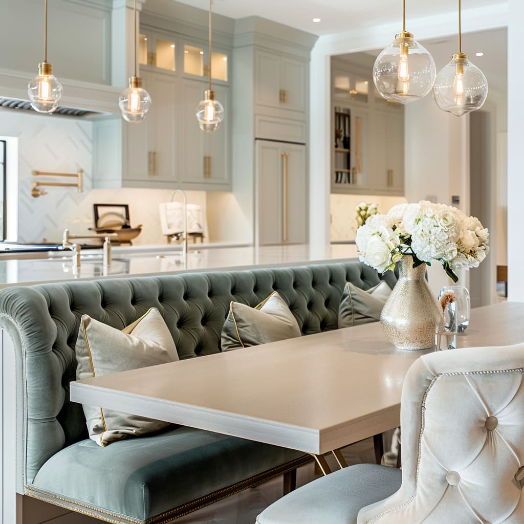
A similar thing happens in living room interior designs where green is carried by two oversized velvet ottomans. Those pieces behave like soft sculpture—large enough to define the center—so the rest of the room can stay cream, taupe, and warm white without feeling blank.
The green isn’t “added. ” It’s assigned a job.

What counts as a “big move” in a neutral room
A big move is less about price and more about surface area + placement. The most convincing green moments fall into a few repeatable categories:

A green plane
A rug is the clearest example. A green rug with a subtle grid or structured motif can act like floor architecture—quietly telling the eye where the seating belongs.
Because it’s under everything, it reads grounded instead of fussy.

A green mass at sitting height
Ottomans, a long bench, or a set of dining chairs upholstered in muted olive/khaki velvet create a block of color that feels intentional because it has weight and comfort built in.

A green “service zone” decision
Cabinetry in soft olive is a classic version: it’s functional, continuous, and repeated by nature (doors, drawers, tall pantry fronts). That repetition is built into the layout, so the color doesn’t need extra justification.

A concentrated textile moment
Deep green pillows can work when they’re treated as a single concentrated note rather than sprinkled in different patterns. One pillow on a sofa can read like a brushstroke; five different green prints can read like indecision.

A plant used as one dark silhouette
A tall indoor tree near a doorway or window becomes a counterweight to other dark elements (like a TV rectangle or black door frames). The key is that it’s one clear silhouette, not many small plants competing for attention.

The undertone decision that quietly controls everything
A lot of green problems in neutral rooms are not too much green. They’re the wrong temperature of green for the room’s neutrals and metals.
- Yellow-leaning olives and mossy greens tend to sit comfortably with warm whites, beige, pale oak, and brushed brass. They feel like part of the same family as wood and warm stone.
- Blue-leaning forest greens can look sharper and more formal, especially with crisp panel molding, symmetrical lighting, and pale marble floors. They often feel best when the room already has disciplined structure—clean wall panel rhythm, restrained decor spacing, and warm light that softens edges.

When that undertone aligns, green reads as depth. When it fights, it can look slightly “pasted on,” even if the amount is small.

Repetition without clutter: the “three-scale echo”
This interior design pattern is useful for neutral interiors with green accents: green appears in three sizes, not ten.
- Large anchor: cabinetry, rug, ottoman/bench, or dining chair set
- Medium echo: pillows, a bowl of moss-like greenery on a coffee table, a planter on a console
- Small whisper: a single green glass object, a compact arrangement in a tray, or foliage glimpsed through glass doors that quietly supports the same color family

This is why a living room can feel finished with one green bench and only one or two pillows that nod to it. The anchor carries the identity; the echoes simply keep it from feeling isolated.

If the echoes multiply into many different greens (sage here, emerald there, mint somewhere else), the room starts behaving like separate vignettes. The most composed spaces usually keep the greens close enough that they read like relatives.

Green works best when the “lines” stay clear
Neutral interior designs often rely on shape and line to avoid looking washed out. Green becomes much easier to place when the room already has some crisp structure:
- black-framed doors that create a clean grid
- slim warm-metal pulls that create vertical emphasis on tall cabinetry
- panel molding that sets a rhythm on the wall
- sconces that act like “columns” of light beside an artwork or TV wall

For example, black-framed French doors can quietly sharpen a dining area where upholstery is soft and tufted. Without the black grid, muted greens can sometimes drift toward “too gentle.
” With it, even pale sage-leaning textiles feel deliberate. The dark line becomes a boundary that keeps the palette from blurring.

This same logic can be used in media walls: a calm, warm-white wall plane can hold a TV rectangle without feeling heavy when a softly lit niche or vertical sconces add controlled structure nearby. Then green—pillows, a plant mass, a compact tabletop arrangement—doesn’t need to work as “contrast.
” It can work as depth.

Material matters: green feels different in velvet, ceramic, and foliage
A neutral interior design often wins on surface variety—nubby upholstery, smooth stone, clear glass, brushed metal. Green becomes richer when it participates in that same surface conversation instead of appearing in one repeated texture everywhere.
- Velvet green reads as shadow and saturation; it changes with light angle, which makes it feel deep even when the color is muted.
- Ceramic green (especially ribbed or glazed pieces) reads as a controlled object—structured and deliberate, good for tabletops where clutter is the risk.
- Foliage green reads as silhouette and life; it can fill negative space in a way decor cannot, but it becomes messy when multiplied into many small plants.

That’s why a dining table can feel refined with two green ceramic vases holding white flowers: green appears as a “hard” material note, not only as fabric. And why a coffee table can hold low moss-like greenery in shallow bowls without blocking sightlines—green shows up as a quiet texture rather than a tall bouquet that interrupts conversation.

In open plans, green behaves like a connector when it repeats at the right distance
Open-plan layouts have a common weakness: each zone wants its own personality, and suddenly the space reads like separate sets. Green often can solve that—not by being everywhere, but by appearing where the eye naturally jumps between zones.

A dining area might carry muted olive chairs, while the living area holds one or two deeper green pillows. The kitchen contributes a softer green through cabinetry or a small plant mass near the backsplash.
Warm metal finishes (brass stems, pulls, faucet, chandelier rim) act like the stitching between these zones, so green isn’t forced to do all the connecting work.

The result is subtle: green becomes the shared “middle note,” while brass becomes the repeated highlight line. The space reads like one home rather than one room plus another room visible in the background.

Lighting is the quiet editor: it decides whether green looks expensive or slightly dull
Green in a neutral room is unusually sensitive to lighting. Warm perimeter glow (like cove lighting) tends to make warm whites look creamy rather than stark; that, in turn, makes olive and moss tones look intentional rather than muddy.
Even small warm-metal accents—lamp bases, sconce mounts—help keep the palette from cooling out.

The opposite problem also happens: very flat overhead light can make green textiles look less dimensional, especially when the surrounding neutrals are matte. Interior designs that feel “finished” usually include layered light: a soft ambient wash plus a few vertical points (sconces, lamps, lit shelving) that add depth and keep the green from becoming a single flat patch.

A final pass to check the color logic
Before a neutral room with green is considered settled, a useful final pass tends to look less like “adding” and more like checking the room’s logic: the green should live in one or two elements with real visual weight (so it feels structural, not sprinkled), and any repeats should read as a quiet trail rather than a second storyline.

The greens themselves work best when they share an undertone, so they feel related instead of accidentally mixed. Neutrals usually need one or two crisp anchors, black framing, slim dark legs, or warm-metal hardware, to keep soft tones from blurring together.
And finally, light has to do its job: a bit of warm, layered glow that creates shadow on textiles and relief on surfaces is often what keeps olive and moss tones looking rich instead of flat.

A short checklist:
- Is green concentrated in one or two pieces with real visual weight?
- Do the smaller repeats feel like echoes, not a second theme?
- Are the greens close enough in undertone to read related?
- Do black lines or warm metals give the neutrals clear structure?
- Does the lighting create depth on textiles and wall relief?

Where this lands in practice
Most green decorating ideas that actually look calm in real homes share the same backbone: neutrals stay broad and continuous, while green is assigned to a few elements that can carry visual responsibility—floor plane, seating mass, cabinetry plane, or one strong silhouette.

Then the interior design uses repetition in restraint: a tray that contains small objects, books that act as platforms, low arrangements that keep sightlines open, and warm metal that repeats just enough to make everything feel related.

Green behaves best when it’s treated as a designed material choice, not as scattered ornament. That’s why green interior design ideas so often succeed when the room commits to one green decision that can’t be ignored—then stops before the palette becomes busy.
Related Posts
Harmony Home Design brings 10+ years of residential interior design experience to the ideas shared here. We publish design concepts, layout thinking, and practical styling notes.