
A lot of greige living rooms start with the same intention: calm, light, easy to live with. And yet the results split quickly into two outcomes.
One feels refined and quietly expensive. The other feels pleasant but flat, as if the whole room got softened into the same tone and the edges never came back.
This article argues a specific idea: greige living rooms tend to look high-end when tone shifts are small but deliberate, texture carries the interest, and styling stays low and grouped so the room holds one long, clean view. The goal is a space that looks finished in daylight and still has depth at night, without leaning on loud color.

There are three familiar versions right away. There’s the nice but flat greige room, where everything matches so closely that corners and furniture outlines blur.
There’s the too many neutrals room, where small objects, tiny contrasts, and scattered accents create visual noise. And then there’s the high-end greige room, where big forms do the heavy lifting while micro-contrast and texture quietly complete the job.

Start with micro-contrast
Greige works best when it behaves like a value plan before it behaves like a color story. In many successful rooms, the palette stays narrow, but the room still has readable structure because light and dark are placed with intent.
The move is subtle: the room does not add a bold accent; it assigns roles to tiny tonal steps so the eye can separate planes.

Build a value plan in three steps
1) Envelope tone: Walls and the biggest fabric planes sit close together. That usually means wall paint and major drapery land in the same neighborhood—close enough that corners feel continuous and the window wall reads wider.
When the drapery is only a step away from the wall, the perimeter becomes one soft architectural field rather than a set of competing stripes. This is where greige gains its calm.
The room stops announcing every boundary and starts reading as one composed volume.

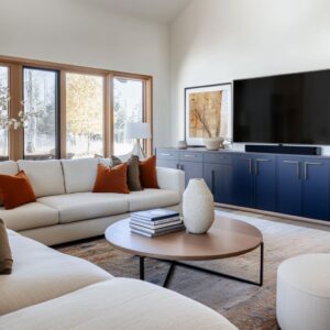
2) Slightly deeper anchor: A small deepening of value grounds the seating zone without breaking the calm. It might show up on a corner return, a short wall that wraps the sofa, a built-in run, a media cabinet base line, or a single chair that sits one notch darker than the sofa.
The key is restraint: the anchor is deeper, but not dramatically deeper. A tiny wall-tone shift on a corner return can do a surprising amount of work.
It gives the sofa wall a boundary, makes the seating feel placed, and creates a gentle gradient as daylight moves across the room. Because the shift is small, it reads like depth rather than decoration.

3) Dark punctuation: Greige interior designs still need a few crisp dark moments to keep edges from dissolving. The punctuation is usually one or two dark rectangles and a handful of thin dark lines: the TV, a charcoal chair, a metal frame, a band in artwork, or the shadow line of a cabinet base.
This is not about adding many dark accessories; it’s about letting a few dark notes clarify the whole composition. A practical rule that shows up often: decide whether the dark note should be vertical (TV/art) or low (table/console base).
If the room already has a heavy window grid outside, a single dark vertical rectangle inside can stabilize the view. If the room has tall pale planes and little visual weight near the floor, a low dark anchor—like a substantial table—can keep the room from floating.
Either can work, but mixing many small dark bits in both zones tends to feel restless. Trim can help—quietly.
Crisp trim outlines edges and adds precision, but the most successful greige rooms keep trim definition thin. The trim reads as a clean border, not a stripe pattern.
When trim contrast becomes too sharp, the room turns into a map of lines and loses its softness.

Use metal like an outline, not a spotlight
In high-end greige rooms, metal often works the way a thin ink line works in a drawing: it clarifies edges without grabbing the whole scene. You see it as a narrow band at a cabinet base, a slim border around a TV, a warm rim on a side table, consistent lamp hardware, or a restrained picture light above art.
The pattern is simple: small repeats beat one oversized shiny statement. A warm metal finish repeated in several minor places tends to look richer than a single large reflective object that dominates the room.
Repetition makes the metal feel like part of the room’s construction language—quiet, consistent, and intentional. A useful detail: metals read more refined when they show up as thin geometry—a base band, a frame, a rim—rather than as bulky decorative shapes.
Even a long media cabinet can feel lighter when a narrow warm-metal line lifts it visually.

Texture stacking replaces color contrast
When the palette stays close, the room still needs enough variation to keep the eye engaged at close range. That variation often comes from a controlled stack of textures, each one doing a different job.
The room stays calm from the doorway, but it feels layered when someone is actually sitting in it.
A three-surface stack that stays in the same family
A consistent pattern in successful greige rooms is a quiet three-part structure:
- Base field (largest): rug, drapery, and walls stay low-contrast. Pattern—if it exists—shows up only when you get closer. Rugs often use oversized, hazy shapes that read like tonal movement rather than a crisp motif. Drapery adds vertical shadow lines through folds. Walls stay matte or softly finished so light reads as a gradient rather than glare.
- Mid layer (body-contact): sofa and chairs lean on tight weaves or performance fabrics that look smooth from afar but have a fine grain up close. This is where the room should feel comfortable, so the textures usually avoid anything overly shiny or fussy. The interest comes from weave density and stitch lines—seams, piping, tailored edges.
- Accent texture (small, precise): pottery, a matte bowl, a woven tray, clear glass, a reflective rim on a tray, a mirror frame, a sculptural lamp base. These pieces add punctuation without pushing the room into clutter. The accent textures also tend to be grouped, not scattered.
The most important part is sheen variation. Matte upholstery next to a lightly textured pillow.
A soft rug field next to a reflective lamp base. A clear glass object near a dense woven shade.
The room gains depth because light behaves differently on each surface. Pattern scale tends to stay large and hazy.
Rugs often use big, softened shapes—like stone pieces seen through mist—so the floor supports the seating zone without turning into decoration. In daylight, it reads calm.
At night, lamp light skims the surface and reveals more structure.

Pillow strategy as a gradient
Pillows are one of the easiest places for greige rooms to go wrong. Too many small pillows become visual noise.
Too many distinct patterns make the seating read busy even when the palette stays neutral. The more refined approach uses pillows like a slow gradient:
- Fewer pieces, bigger presence. Oversized pillows reduce clutter because each one has enough mass to matter. The sofa reads plush and intentional rather than sprinkled.
- Short gradients work best. A common progression is ivory → oatmeal → warm gray → charcoal, but the steps stay limited. Two or three tonal moves are usually enough.
- Edge discipline matters. Piping, seams, and trim lines create thin definition so pale seating keeps its shape. When everything is pale, those small edge cues help the sofa and chairs stay readable against a pale rug and pale walls.
Even when pillows introduce pattern, the pattern tends to be low-contrast and texture-driven. A pillow can feel active because it catches side light, not because it shouts.

The center piece sets the room’s luxury level
If there is one place where scale signals quality fast, it’s the center surface. In many high-end greige rooms, the coffee table or ottoman is not treated as an afterthought.
It is treated as the room’s anchor—wide enough, low enough, and calm enough that the seating group feels stable.
Pick one main anchor surface and commit
Four center options show up repeatedly in expensive-feeling greige rooms, and each solves a slightly different layout problem.
- Large upholstered ottoman:
Soft, lounge-friendly, circulation-friendly, especially in tighter plans. The ottoman works well when the room wants comfort at the center. It usually needs a tray to keep styling intentional and to provide a firm landing area for objects. - Upholstered bench table:
Long sightlines, hotel-like order, and a sense of a spine through the room. A long bench works especially well in narrower rooms because it reinforces the room’s length and keeps the center visually clean. It also reduces the temptation to add extra side tables, since the bench gives a generous surface. - Low, wide platform table:
A strong horizontal base that stabilizes the whole seating rectangle. When the room has multiple seats—sofa plus chairs—this kind of table gives the group a center of gravity. Styling can stay sparse because the table itself carries presence. - Round drum table:
A countershape for rooms full of rectangles—windows, TVs, paneling, cabinets. The circle improves circulation and softens the seating cluster. In darker greige or charcoal rooms, a round drum in a deeper tone can ground the center without sharp edges.
Scale matters here. A small table looks lost when seating is generous.
A generous table or ottoman makes the plan feel finished because the furniture appears planned around a center, not placed around an empty middle. Low-profile tops also matter.
When the center stays low, the room holds a long view from seating to windows. The window wall keeps its impact, and the interior design feels larger because the eye is not stopped by tall tabletop objects.

Table styling as zones
Expensive-looking greige interior design is usually organized into zones so the center reads contained and calm. A design logic shows up often:
- One containment zone: tray or shallow box
- One base: stacked books or a low slab
- One organic form: compact flowers or branches
- One accent material: warm metal or clear glass at a small scale
The height rule is what makes this feel clean: objects stay below seated sightline. The center remains a low cluster with negative space around it, so the room keeps a clear long view.
Notice how this changes the room’s energy. A tray makes an ottoman feel intentional.
A low stack of books makes the center feel grounded. A compact living shape keeps all the rectangles from turning stiff.

Layout geometry that keeps greige from feeling bland
Greige designs often depend on layout clarity because the palette is not doing the separating work. When the geometry is clear, greige looks composed.
When the geometry is messy, greige tends to amplify the mess because nothing visually edits it.
The conversation rectangle and why it works in greige
A frequent successful layout is the conversation rectangle:
- A sofa acts like a soft wall on one side.
- Two chairs counterbalance on the other side.
- A single large center surface stabilizes the middle.
This works well in greige because it creates legible edges. Even if the palette is tight, the room has a clear seating boundary and a clear center.
Variations tend to keep the same logic:A U-shape built from mixed seat types: sofa plus bench plus swivel chair can avoid a box of rectangles. A bench under a window can feel built-in without being permanent and can act as a visual bridge between seats.

Two identical window chairs: a paired set at the bright end wall creates order without adding color. The pair forms a wide visual base under the window, so the far wall feels anchored.
Each chair often carries one oversized pillow—simple, tailored, not busy. Pathways usually stay open near glazing.
Rounded chair silhouettes and tight chair footprints help keep a window lane clear. In many city living rooms, this matters: the window wall is the room’s main source of depth, so blocking it with bulky furniture quickly shrinks the space.
The center also stays simple. One large anchor beats multiple small tables, especially when the palette is close.

Long sightlines are a design feature
A greige room often feels larger when the entry view runs cleanly to the window wall. That long run makes a compact city footprint read longer and calmer.
A wide cased opening can help too. When the living area reads as the first scene and a dining area reads as the second scene beyond, the room gains depth without needing a dramatic paint change.
The opening behaves like architecture: it frames a second layer of space and gives the eye somewhere to travel. The important part is that furniture does not interrupt that through-view.
Low center surfaces, disciplined tabletop height, and open circulation lanes preserve the depth.

Walls that carry structure so furniture can stay soft
A lot of high-end greige rooms succeed because the walls do some of the structural work. When walls carry rhythm—panel lines, built-in runs, long cabinet bases—furniture can stay pale and comfortable without washing out.
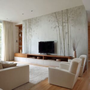
Media walls that feel like compositions, not tech corners
The most composed greige media walls tend to follow a few repeat moves:
- A long, low cabinet line: This prevents the TV from floating. The cabinet gives the screen a base and turns the media zone into an elevation, not an object on a wall.
- Panel rhythm on cabinet fronts: Subtle vertical lines or framed doors add shadow lines. Even in pale finishes, those small breaks keep the cabinet from reading like a blank slab.
- A tall soft counter-rectangle near the TV: Artwork or a framed piece balances the TV’s hard rectangle. The wall reads like a composition: one dark rectangle, one soft rectangle, and a base line under both.
- A warm sconce as a hinge: A warm vertical light between TV and art creates evening depth and helps the wall feel intentional after dark. It also adds a human-scale marker so the wall does not feel too blank.
Styling typically stays restrained and low on the cabinet. Objects are arranged in small clusters with a clear height rhythm—low, medium, tall—but kept controlled so the cabinet surface does not turn into a shelf display.
Tall objects can counter the TV’s width, but too many of them can start competing with the window.

Built-ins as a calm backdrop
Tall paneling and long cabinet runs let pale furniture look intentional rather than washed out. The room gains shadow relief and rhythm even when the palette is quiet.
Symmetry can stabilize a greige room in a very useful way: centered art, sconces flanking, a consistent cabinet run. Then furniture can stay slightly relaxed—soft chairs, plush cushions—without the room feeling messy.
This is one of the reasons greige rooms often pair well with paneling: the wall provides structure, the furniture provides comfort, and neither has to shout.

Windows, drapery, and the city-grid problem
In many urban settings, the exterior view is already busy—a grid of buildings, brick textures, window mullions, and repeating rectangles. The interior tends to look calmer when it lets the exterior be the pattern and keeps interior surfaces large and restrained.
Let the exterior be the busy pattern
When the exterior view has a dense grid, interiors often work better with calm fabric planes and low-contrast rugs. Heavy pattern inside can stack on top of the exterior pattern and make the room feel visually crowded.
Curtains close to wall tone also help corners feel continuous. When edge contrast at the window is minimized, the opening often appears wider.
The window becomes a large calm destination rather than a cutout framed by strong stripes.

Two-layer window treatment that stays clean
A common high-end approach is a two-layer system:
- Roman shade for glare control and a crisp upper boundary
- Full-height drapery for architectural framing and vertical softness
Hanging high and wide matters because it allows fabric to stack to the sides, not over the glass. Hardware stays visually minor so the top edge remains clean and the window reads tall.
This approach also supports the day-to-night shift. The shade filters daylight.
The drapery adds depth and softness at night, when lamp light starts to matter more.

Lighting that gives greige a night-time identity
Greige rooms often look best in daylight, but the rooms that feel truly finished keep their depth after sunset. That usually comes from assigning lighting roles rather than relying on one central fixture.
Split lighting into roles
A layered lighting plan tends to include:
- Ceiling wash: small recessed points that stay visually secondary. They provide coverage, but they do not become the room’s main feature.
- Wall glow: sconces at eye level that create gradients on returns, paneling, or corner planes. Wall light makes greige feel deeper because it creates soft shadows and reveals texture.
- Task pools: a floor lamp near a sofa corner, a table lamp near a window seat. These lights make the room feel usable and give warmth at human height.
- Art emphasis: picture lights or aimed track heads that keep walls active at night without needing extra objects. Art light is a strong move in greige rooms because it adds warmth and focus while keeping the room calm.
Warm nodes beat one big statement fixture
Multiple small warm points—sconce plus lamp plus picture light—tend to keep greige rooms layered without turning the ceiling into the focal point. This is especially useful in rooms where the window wall and media wall already provide strong rectangles; a dramatic overhead fixture can start competing with those elements.
Small warm nodes also help the room feel lived-in. The light appears to come from places where people actually sit, read, and gather.

Greige in open-plan rooms: continuity without blending everything together
Open plans often push greige toward one of two failures: everything blends into one undifferentiated field, or each zone gets its own set of accents and the room starts feeling stitched together. The more successful approach keeps continuity while still making zones legible.
Define zones with shape and materials, not walls
Open-plan rooms often stay cohesive when:
- One material repeats across zones—stone surfaces, a consistent warm metal finish, or a consistent upholstery family.
- One shape repeats across zones—circles in lighting plus a round table plus small rounded accessories, or a consistent rectangular rhythm in paneling and cabinetry.
Rugs act as soft borders. Two pale rugs can separate dining and lounge without a patchwork look if they share the same tone family and similar visual weight.
Dark floors can also help: the floor becomes a strong base, and pale rugs become islands that define function.

Carry one finish story through the whole plan
A finish story is often what makes an open plan feel expensive. Warm metal in kitchen hardware and pendants can echo in living-room details: side-table rims, lamp stems, picture lights, subtle nailhead trim, or a thin base band on cabinetry.
Upholstery consistency between living and dining helps too. When dining chairs and living seating share a related fabric tone and texture family, the plan reads unified even as functions change.
The point is not sameness. It’s a controlled set of repeats that keeps the eye from constantly resetting.

The darker greige and charcoal version: depth without heaviness
Darker greige rooms can feel rich and tailored when they use structure and controlled shine. Without structure, dark walls can feel like a flat void.
With structure, they feel deliberate.
Trim and paneling give dark walls structure
Dark walls tend to look refined when panel frames, trim lines, or wallcover texture adds shadow relief. The wall gains depth because light catches edges.
Warm metal frames and thin brass edges help prevent dark cabinetry and tables from reading as heavy blocks. A round table often becomes particularly useful here.
When the room has many rectangles—paneling, windows, media walls—a circle breaks the grid and makes the seating cluster feel more fluid.

Contrast stays limited but clear
The most convincing darker greige rooms usually keep contrast disciplined:
- One dark anchor surface (a round drum table or a wide platform table)
- A few reflective notes (mirror, lamp base, tray rim) to bounce light back into the seating zone
- White blooms used as a concentrated highlight rather than a full color scheme
That last detail matters. In a darker room, a small cluster of pale flowers can become the room’s brightest object.
Because it’s compact, it reads as a focal point, not a new palette.

Why this greige approach keeps working in high-end rooms
Greige tends to succeed when the room treats it like a discipline rather than a default. Big forms—sofas, rugs, cabinets, art—set the structure.
Micro-contrast and texture add depth at close range. Low-profile styling keeps the long view intact, so the room feels spacious even in a city footprint.
One closing angle fits this set of rooms especially well: greige as architecture. Fabric and cabinetry start behaving like part of the envelope.
Metal becomes a thin outline. Lighting creates gradients on corners and walls.
The room stays calm from the doorway, but it still feels layered when someone sits down and lives in it.
Related Posts
Harmony Home Design brings 10+ years of residential interior design experience to the ideas shared here. We publish design concepts, layout thinking, and practical styling notes.