
Backyard paths can do far more than guide footsteps. In many of the most charming outdoor spaces, they shape how the whole area feels—sometimes even how it’s remembered.
These walkways combine tactile materials, playful art references, and emotional cues in ways that turn everyday walking surfaces into small story scenes. Some use painted stones or carved motifs that quietly suggest a mood.
Others build rhythm with unexpected shapes, spacing, or a surprising change in texture underfoot.

These designs often look simple at first glance. But with closer observation, they reveal careful thought in every detail—how a fish in mosaic form lines up with a real pond, or how soft mulch beside a concrete slab makes the hard surface feel warmer.
There’s often a strong link between the walkway and its surroundings, with repeated color schemes, visual echoes of nearby plants, or illustrations that seem to react to their garden neighbors. In quiet ways, these cute walkway ideas use creative design to do something memorable.
They balance structure with emotion, make everyday materials feel expressive, and turn outdoor paths into places where small design choices speak with lasting charm. Whether playful, poetic, or gently nostalgic, these garden walkways bring a sense of character that unfolds one step at a time.

Micro-Narratives Embedded in the Surface Design
Some of the most creative walkway ideas rely not on layout or material alone, but on the subtle power of visual storytelling. Instead of functioning as mere stepping paths, these surfaces begin to act like short illustrated books—each tile or stone carrying a little chapter in a quiet narrative.
The illustrations are never loud. They sit with restraint—etched, painted, or carved—yet they shift how the entire garden feels underfoot.
A walkway painted with a sleepy moon and stars doesn’t just mark direction. It hints at imagination, dreaminess, and slowing down—especially in a shaded corner under string lights.
A single crescent moon with a gentle smile can pull a backyard into a bedtime tale setting. In another example, oversized concrete pavers etched with floating dandelion seeds feel like a fleeting moment captured mid-breeze.
Those hair-thin lines across a sunbaked surface subtly nudge the viewer into reflection, adding a layer of mood rarely associated with hardscape. Bug-etched tiles, playful fruit slices, or smiling vegetables bring this same idea in lighter tones—charm layered over concrete, evoking childlike delight without becoming overly animated.
The true creative spark lies in how these small images create pauses: tiny artworks that slow the walk and shift the user’s mindset. They create a soft visual dialogue between materials and emotions—proof that a cute walkway design can do far more than lead from point A to B.

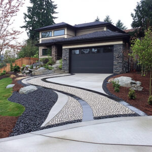
Surface Disruption as a Spatial Technique
In contrast to the typical predictability of paving grids, these path designs break the surface rhythm deliberately—and with clear impact. Garden paths here act almost like choreographed beats in a visual rhythm, alternating form, spacing, and texture to change the pace and mood of the experience.
Circular stepping stones splashed with painted crayon strokes create a sense of bouncing energy, especially when surrounded by lush grass or bright flowers. Their irregularity is intentional—there’s no neat repetition, and that’s what makes it playful.
In other cases, petals are turned into softly cut stone shapes, laid like overlapping scales or clouds. The path moves not in straight lines but in waves, mimicking nature’s own loose symmetry.

A zigzag of cream pavers, traced with subtle diagonal blue lines like kite strings, becomes a quiet trick for guiding the eye. While the layout is linear, the lines tug diagonally across the surface, gently softening the march-like quality of a typical paved strip.
Some designers take it even further by playing with spacing—tightening stones where attention should sharpen, or stretching them apart where space is meant to feel open and light. These are not random acts of layout.
They form a system of visual pacing without the need for signage or instruction. This approach gives everyday pathway ideas an unexpected depth—transforming function into form, and order into something looser and more personal.

Integration of Art Forms Unrelated to Gardening
What makes many of these garden walkways stand out isn’t only in their materials or landscaping choices—but in how they pull inspiration from creative fields that rarely touch ground level. Music, astronomy, illustration, quilting—these visual languages appear across surfaces in subtle and surprising ways.
Take the engraved flagstone path that carries a flowing musical score along one border. The light carving of treble clefs and notes, carefully etched into pale stone, turns a traditional curved front yard path into something that reads like a composition.
Or the series of stepping stones swirling with white linework resembling galaxies—where every whirlpool pattern seems to pull the eye inward, giving the illusion of movement where none exists.

Mosaic fish swimming across a backyard path bring in the tone of mural work, especially when those tiles shimmer under sunlight beside water features. Even painted polka-dot stones in soft Mediterranean gardens borrow from modern color field paintings, with muted yet deliberate color blocking.
This fusion of disciplines results in outdoor spaces that feel not only shaped, but curated. These are walkway ideas built to translate familiar creative impulses into physical, walkable art—something viewers feel not only under their feet but also in their minds as they connect the visual clues.

Juxtaposition of Hard vs. Soft
One of the quiet strengths of these paths lies in how they use contrast—not with color, but with material. Solid elements like concrete and stone are intentionally set against softer borders made of mulch, moss, or lush plantings.
This isn’t just a case of hard against soft textures. It’s a visual and emotional contrast that changes how the whole space is felt underfoot.
In some gardens, a clean rectangular paver might carry a fine etching of a tulip or thistle—its linework so delicate it feels more like an ink sketch than a construction detail. Surrounding that, moss creeps gently to the edges, making each stone feel placed, not installed.
Or in a small backyard where square slabs carry carved bear faces with gentle smiles and closed eyes, the use of volcanic mulch and ferns nearby creates an unexpected warmth. The hard surface becomes expressive—not cold—and the softness of the plants around it extends that emotional tone outward.
This style of contrast works especially well when the overall composition is quiet. It allows the details to take center stage without overstating.
It’s not only about visual balance—it’s about pairing structure with comfort in a way that adds subtle personality to the space. A thoughtful pathway design, in this way, becomes more than an organizer of direction—it becomes a medium for mood.

Slowness as an Embedded Spatial Theme
There’s something unique about a walkway that naturally slows people down. In many examples, this isn’t accomplished through barriers or tricky footing.
It happens emotionally, almost subliminally. Visual softness, spaced stonework, and playful faces all invite pause—sometimes with a smile, sometimes with a hint of nostalgia.
In a suburban garden where white cloud-shaped pavers are painted with sleepy faces, movement becomes gentle. These cartoon-like expressions, each one slightly different, create a rhythm meant to be absorbed at a calm pace.
Or consider a dandelion path where etched seeds appear to float across the surface as though caught in a breeze—each step feels like walking through a suspended moment.

Even the citrus-themed stepping stones painted with sleepy fruit faces bring a lighthearted tone that shifts the way people interact with the space. Movement becomes slower, almost by instinct, as the visual cues favor strolling over walking.
These backyards are subtly edited to remove any sense of rush. The visual language—clouds, seeds, curved paths—signals stillness without needing explanation.
There’s a soft push toward reflection, toward looking down and noticing, instead of moving through without seeing. This kind of spatial control adds a whole new layer to how backyard walkway design can influence mood.

Highly Controlled Color Theory Application
Color in these designs feels easy and casual, but behind that lies a careful balancing act. Whether the palettes are bold and bright or pale and chalky, there’s always an anchor—a point of reference in the garden or house that helps the color choices settle into place.
In one garden, round pavers painted in goldenrod, mint, coral, and lavender match the hues of planted flowers and painted shutters on the nearby patio doors. The color choices feel playful, but there’s structure: no shade is repeated too often, and every one echoes something growing nearby.
It creates a visual cohesion that draws the eye in and holds attention without effort.

In another example, a koi mosaic path running beside a water feature repeats the colors found in the water, the tiles, and the garden plants. Blue, coral, and teal shimmer both in the stone and the pond itself, which lets the whole space feel quietly unified.
This kind of repetition and placement gives the color real purpose. Instead of clashing or competing, the shades act like a thread running through the garden, tying features together.
For homeowners and designers, this is a key idea that can bring unexpected charm into even small backyard walkway layouts—proof that great use of color isn’t about how much is used, but about how thoughtfully it’s repeated.

Material Layering to Create Textural Microenvironments
What sets many of these backyard paths apart is how they layer materials to build subtle transitions in feel and appearance. It’s not only about using stone or concrete—it’s about pairing those main elements with gravel, mulch, moss, or other textures to shift the mood step by step.
This layered approach forms mini-environments within the same path, drawing attention to the way materials touch and contrast. In one example, a galaxy-themed path runs through a garden bed of pea gravel and river stones.
The river rocks are placed by size—largest hugging the slate stones, then tapering outward into smaller pebbles. This gradient acts like a ripple, leading the eye gently away from the central slab while still grounding it.
In a dry-climate design, a tile trail etched with spinning windmill blades appears framed by gravel that’s allowed to shift naturally into the edges of each stone. Instead of a rigid frame, the walkway feels embedded in its setting—as though time and weather shaped it.
This idea of controlled imperfection creates a sense of age and ease. The path doesn’t fight its surroundings; it folds into them.
Where precision might feel rigid or overly polished, this method brings softness and character. The result is a pathway design that looks settled—not installed—like it has belonged in the garden all along.

Sympathetic Object Dialogue Between Garden Features and Path Illustrations
In some of the most visually engaging path ideas, the walkway doesn’t stand alone. It interacts with what surrounds it.
These paths form visual relationships with plants, architecture, or nearby garden features, creating a sense that each element is aware of the others. It’s a kind of quiet conversation—where the illustrations on the stones mirror, echo, or play off what’s nearby.
One standout example is a mosaic path where koi fish are tiled into the surface, their curved placement aligned with an adjacent lily pond. The result is seamless: the fish feel like they’ve swum from the water straight onto the stone.
In another backyard, a trail of painted vegetables—carrots, pineapples, tomatoes—smile upward beneath tall rows of living sunflowers. The path artwork and the real plants above it create a light storybook feeling, where garden and ground appear to react to one another.
These relationships aren’t loud. They happen through positioning, color, or theme—subtle clues that tie the environment together.
It’s a form of visual matching that makes the design feel personal. These aren’t random decorations placed on a surface; they’re part of a setting that responds, echoes, and tells stories through quiet links.

Shape Language and Emotional Tone
Shape in garden path design does more than organize space—it affects how that space is felt. Here, the forms of the stones themselves carry emotional weight.
Rounded circles, scalloped petals, cloud silhouettes, and citrus slice cutouts each bring a distinct mood. These shapes act almost like symbols, setting a tone that goes beyond what color or material could express on their own.
A path laid with overlapping flower-petal pavers doesn’t just feel organic—it feels soft, graceful, and gentle. When the shapes are playful—like citrus slices with cheerful faces—the message becomes brighter, fresher, more spirited.
Cloud-shaped stones painted with sleepy eyes signal calm and comfort, guiding the pace and behavior of the walker without any signage. Designers use these non-standard shapes as visual cues, creating emotional rhythms through the very form of the path.
It’s not only about being unique; it’s about setting a tone the moment a foot touches the ground. Whether evoking nature, childhood, or daydreams, the stone forms become emotional anchors—small gestures that influence how the space is used and remembered.

Pathway as a Liminal Space Between Architecture and Experience
Some of the most thoughtful garden paths are the ones that do more than connect spaces—they mark a shift between one mode of living and another. These walkways often sit right at the edge of a patio, pool zone, fence line, or pergola, acting as gentle transitions between the built environment and the more expressive parts of a backyard.
In one garden, a zigzag of cream pavers marked with blue linework leads directly toward a hammock under a shaded pergola. The pavers catch the eye and pull it forward, but they also slow the pace as the hammock comes into view, turning the path into a soft invitation rather than a route.
Another layout places rounded, swirling stepping stones in front of a teepee-like tent in the corner of a front yard. That setup doesn’t just connect the entry with the garden—it tells a story of movement from daily structure to play or retreat.
Elsewhere, a cloud-shaped stepping path flows gently from a porch to the lawn, with painted sleepy faces hinting at rest, making the porch feel like part of the same narrative as the grass and trees. Each path here functions as a quiet arc—starting in routine, ending in a different kind of experience.
Through form, color, spacing, and direction, the walkway creates a mood shift that users feel without needing to think about it. These moments of subtle transition are often what make a backyard feel whole and well-balanced.

Closing Thoughts
What gives these backyard paths their staying power isn’t only the use of fun motifs or charming materials. It’s the thought behind every shape, spacing choice, and placement within the broader yard.
Each path carries a layered purpose—some lead with story, others with texture, emotion, or visual relationships to nearby plants and features. The cutest paths are often the most complex beneath the surface.
They pull from visual arts, build pacing into the layout, create emotional rhythms, and fold into their setting with a sense of care. While they may include cheerful faces or playful shapes, these are not accidental designs.
They are crafted with attention to mood, use, and even memory. In the end, these paths succeed not just because they look nice in photos—but because they feel good to walk.
They create small moments that linger: a koi fish beside a pond, a smiling vegetable beneath a sunflower, a dandelion seed caught in concrete mid-flight. These are the details that turn walkway paths into experiences worth noticing—sometimes again and again.
Related Posts

Harmony Home Design brings 10+ years of residential interior design experience to the ideas shared here. We publish design concepts, layout thinking, and practical styling notes.